In part seven of this task, you learned how to make search work within the app, and how to ensure that one user does not see another user’s data by properly configuring row-level security on the todos table of your database hosted at Supabase.
In this continuation of that tutorial, you will learn how to add some niceties to the user interface, such as:
- clearing the input field
- disabling the Add button when the user types nothing, or only spaces
- using a sheet that slides up to hold the user interface for adding an item
- a cue to the user about how to get started, when there are no to-do items
TIP
Learning how to make these changes will be useful to learn for anyone whose culminating task app involves the user creating new data within an app.
After those changes are made, in an optional part 9 of this tutorial series (coming soon), you will learn how to add support for attaching an image to a given to-do item.
Here is a 90-second video showing how the revised app will function when you have completed today’s tutorial, and, the tutorial coming in our next class to show how to work with images:
Clearing the input field
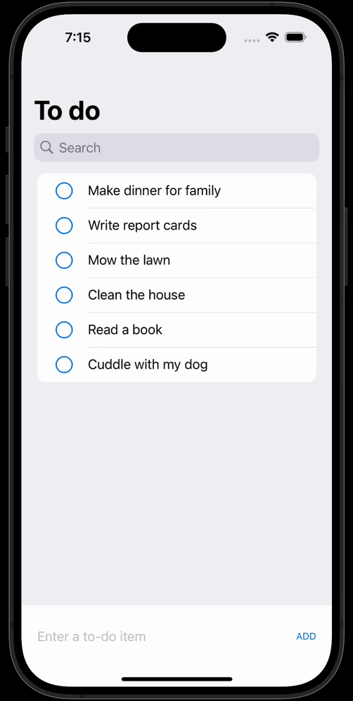
You may have already added this functionality, as it’s quite irritating to have to do this manually! Here is how the app functions at the conclusion of part seven:
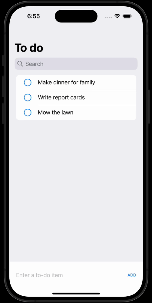
Clearing the input field was an exercise much earlier on in this tutorial series. Let’s add this code now if you have not already, so you do not get the urge to throw your computer out the window as you complete further testing! 🫠
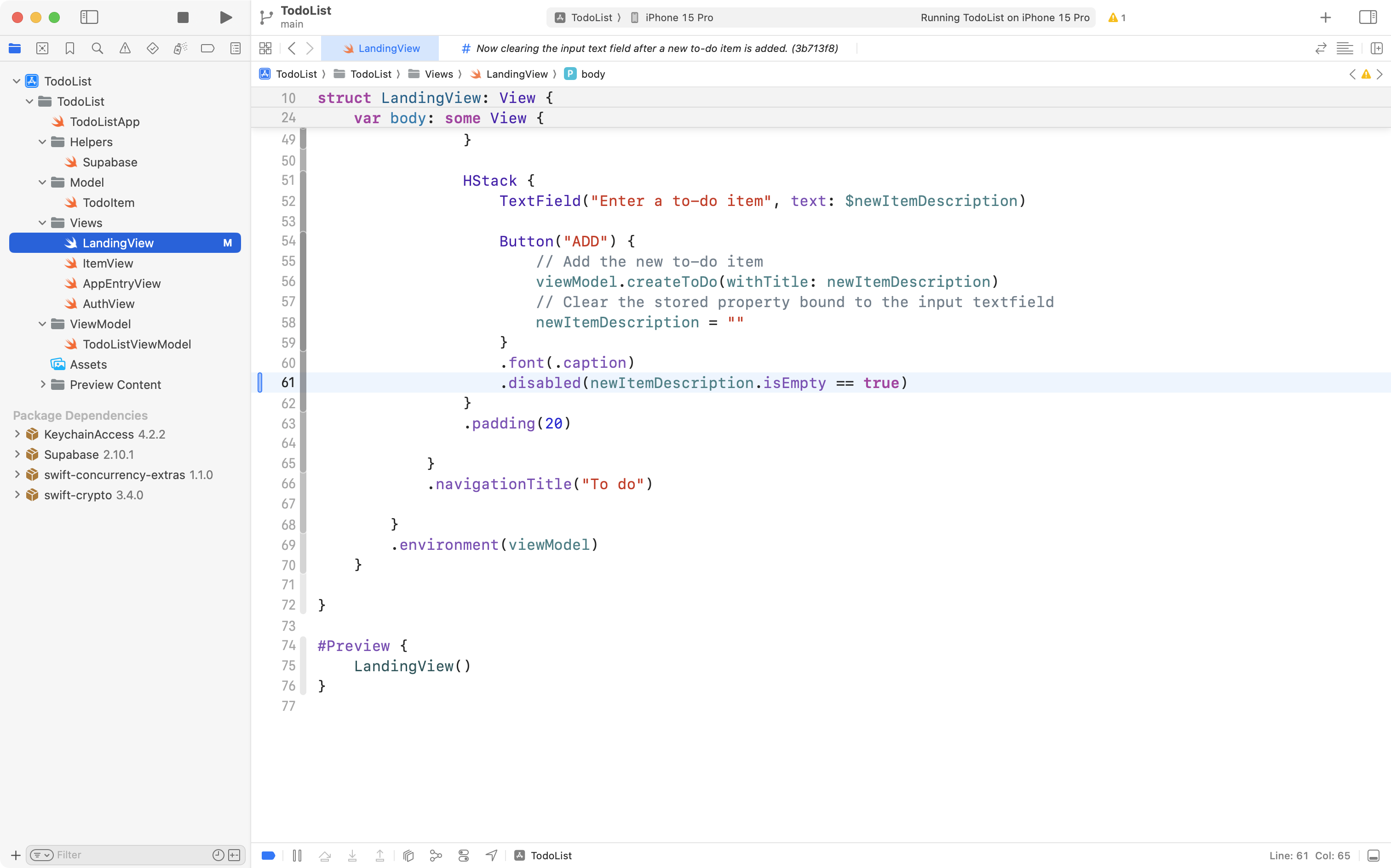
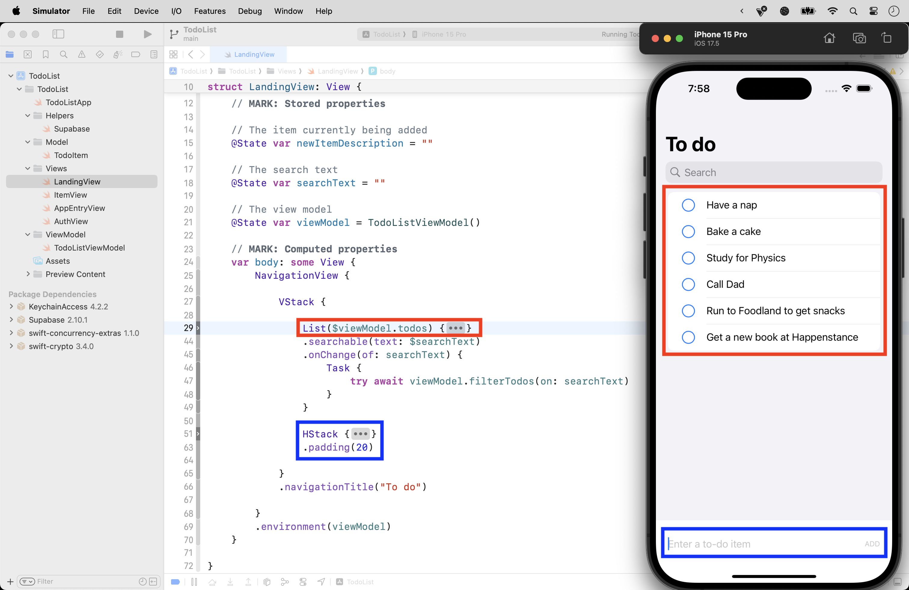
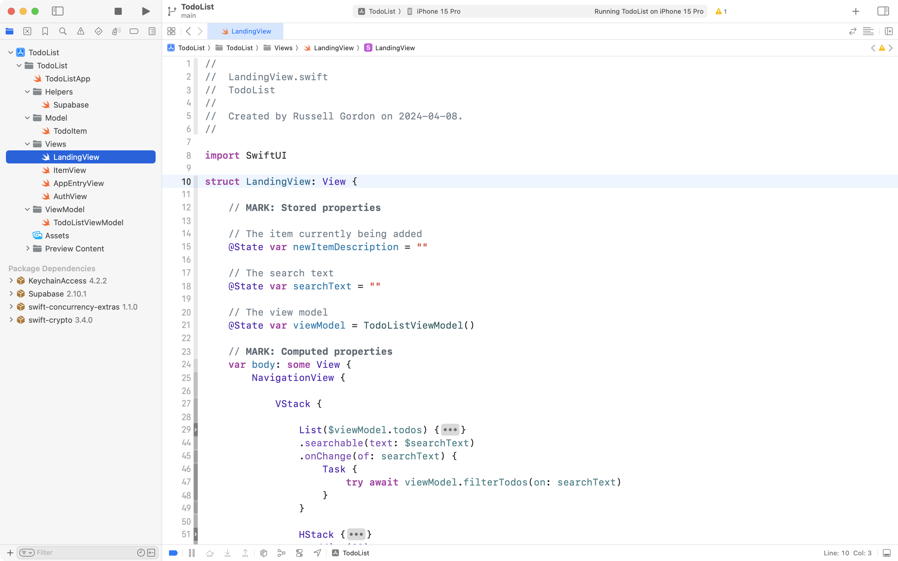
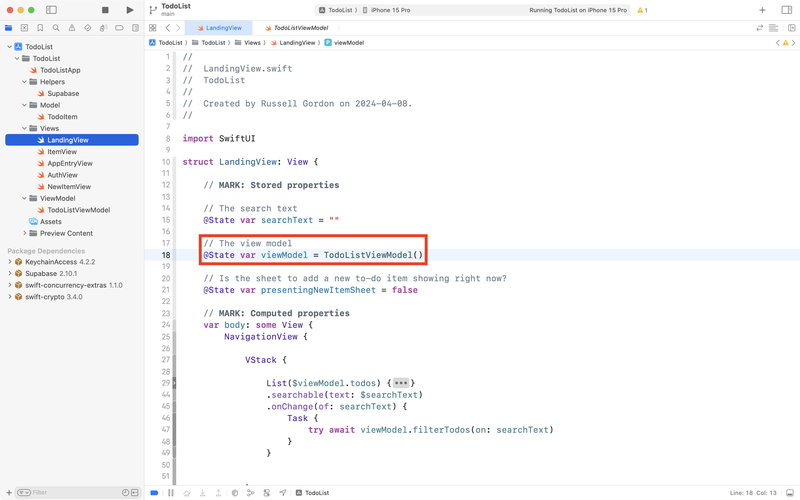
Navigate to LandingView and review the list of stored properties that maintain state in this part of the app:
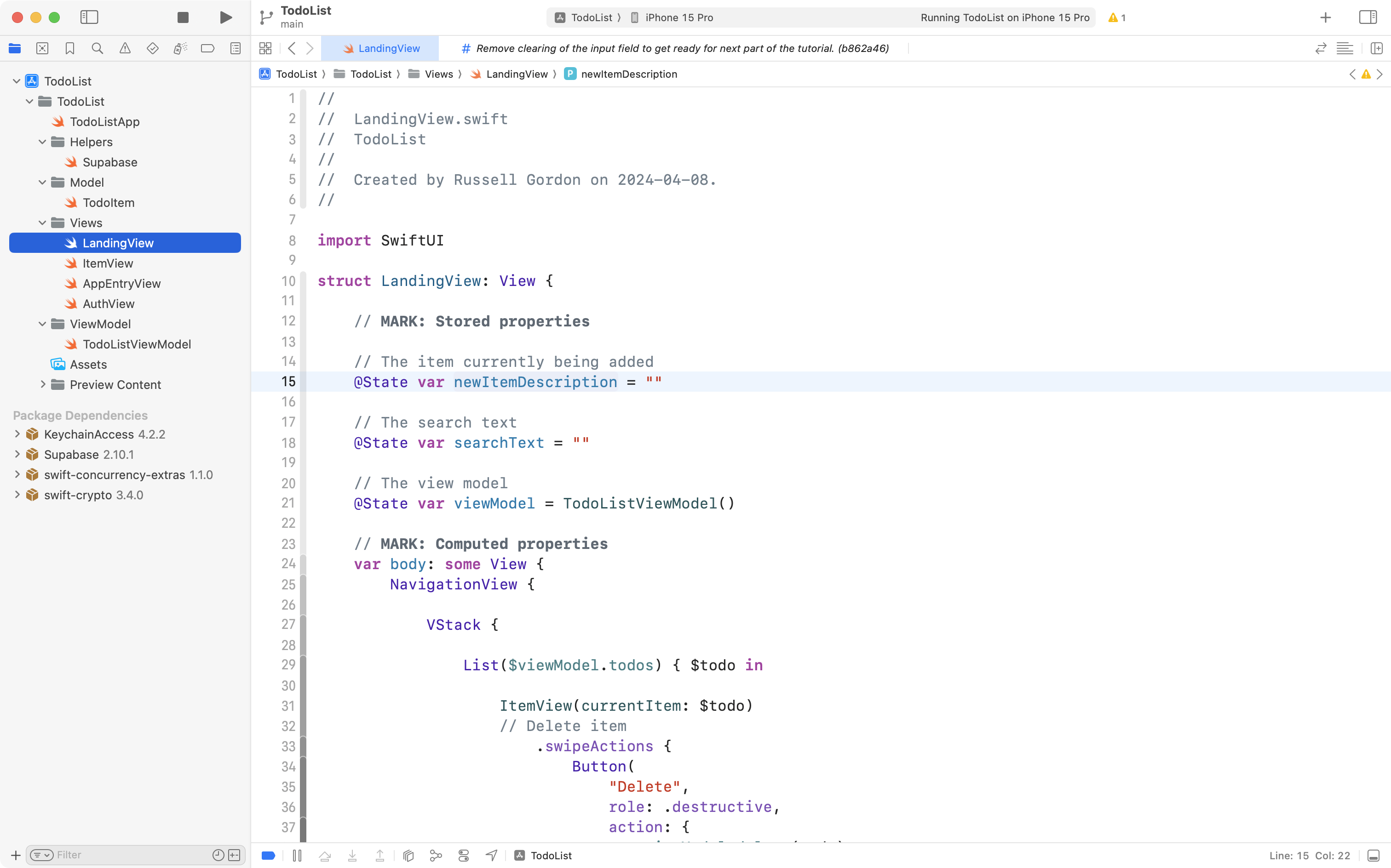
From the comments, we see that newItemDescription appears to hold the text the user is entering for a new to-do item.
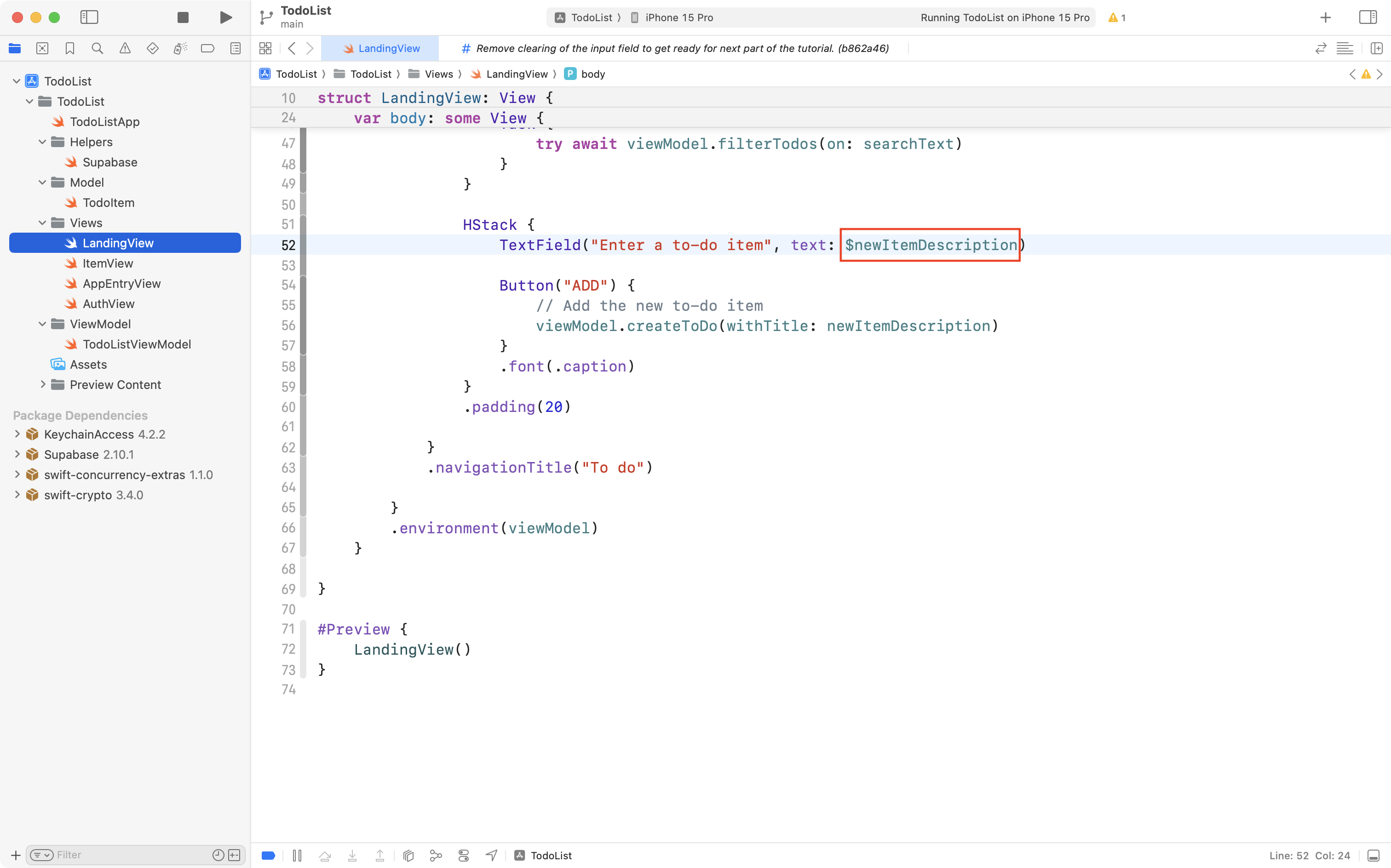
By scrolling down a bit and looking for the TextField structure, we confirm that the text field is bound to the stored property. So – we definitely need to do something with newItemDescription to clear the input field. What, though?
When trying to think through a situation like this, remember that SwiftUI reacts to changes in state. Put another way, if we change the data, SwiftUI will update the interface.
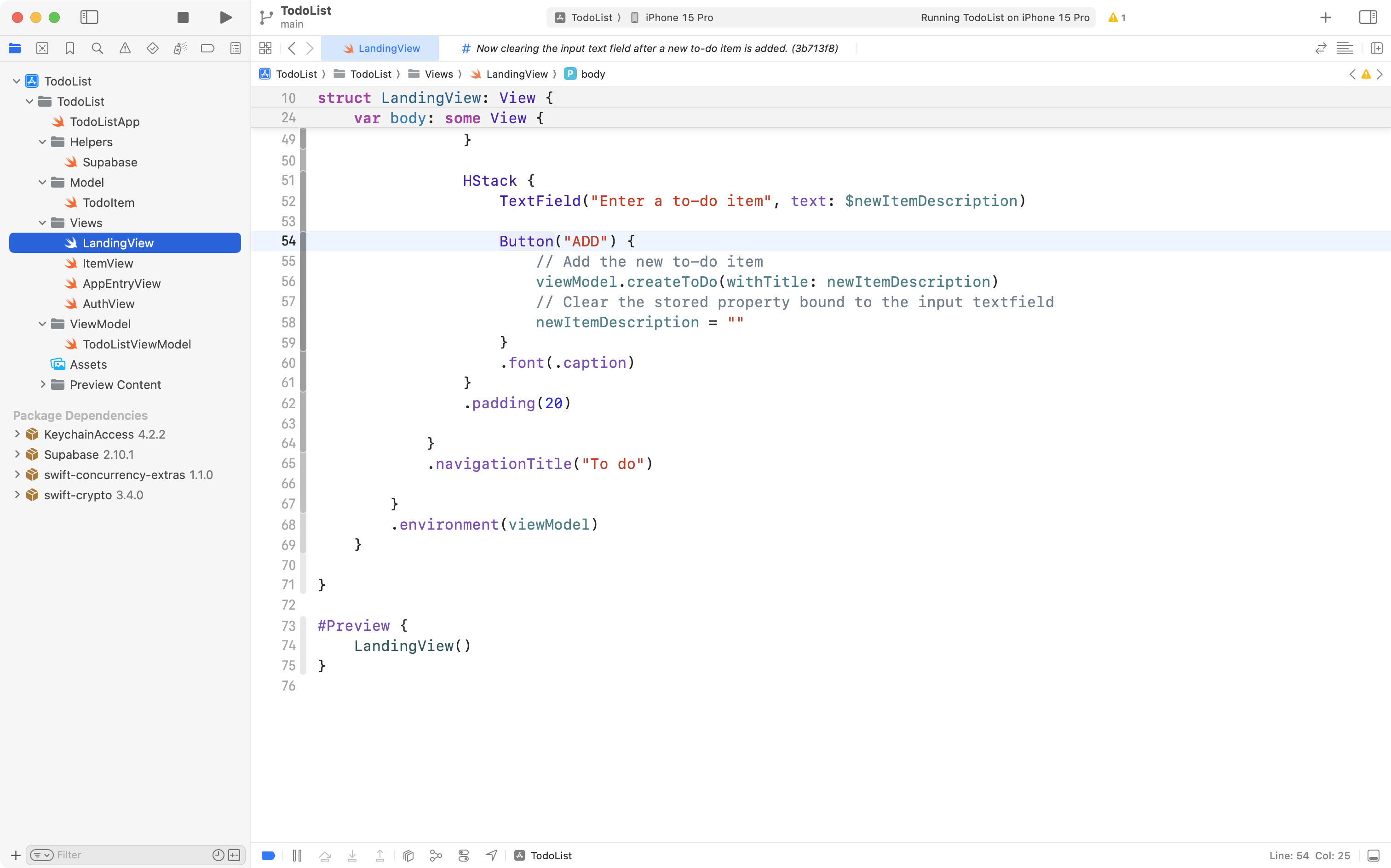
So… after a to-do item has been safely stored in the database and added to the list, what should happen to the data that was in newItemDescription?
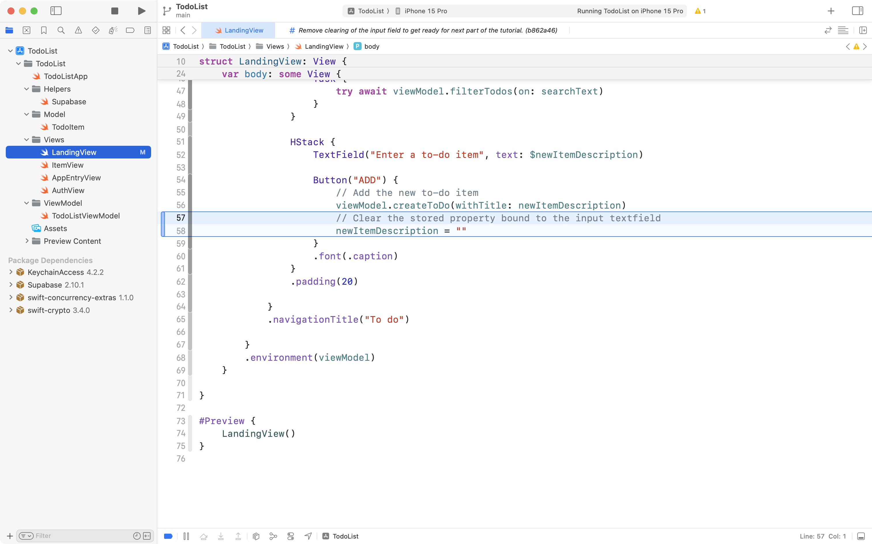
It needs to be cleared! We will assign an empty string to newItemDescription. SwiftUI will then update the user interface to reflect this change in state.
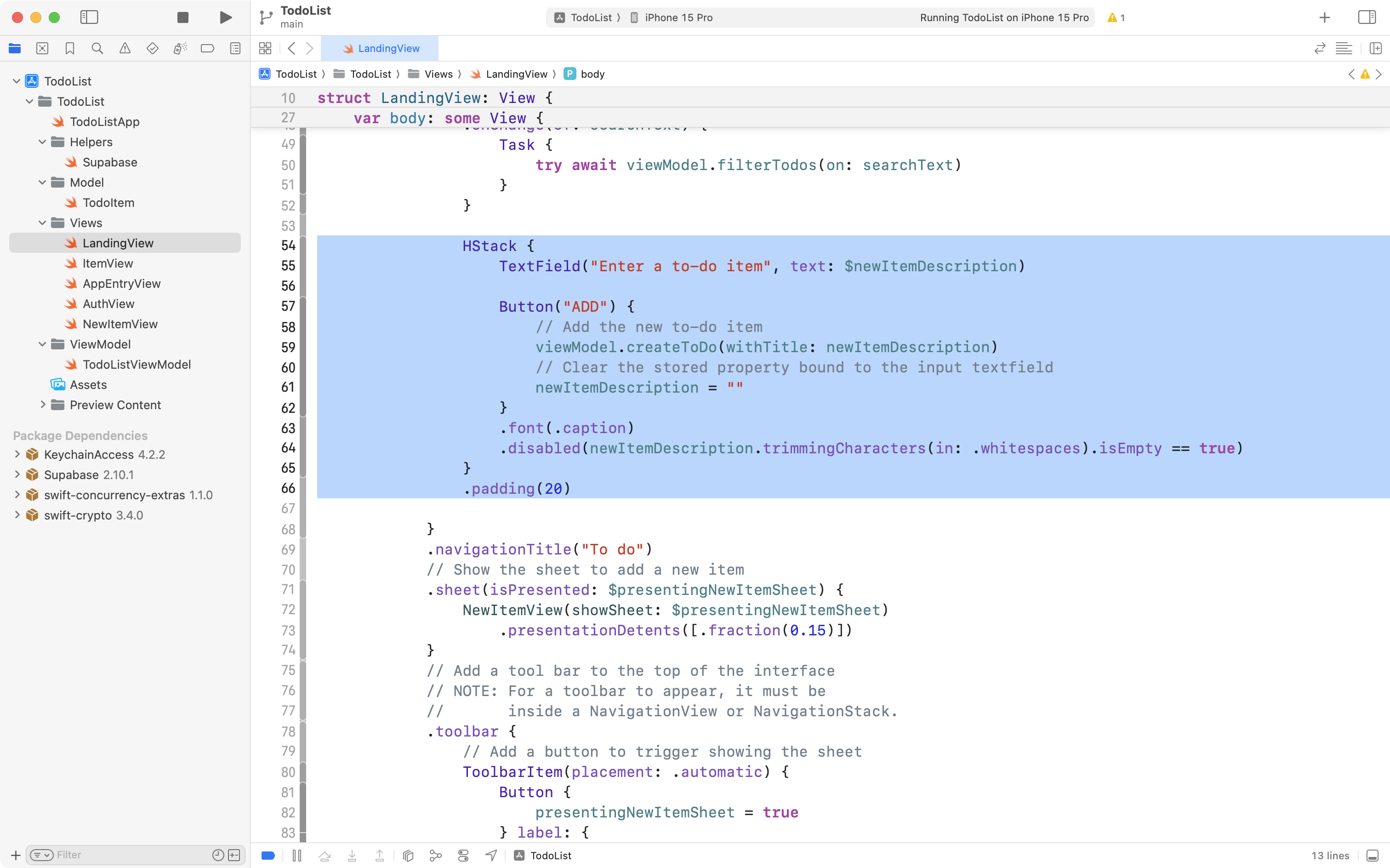
So, look just below the TextField to the Button that the user presses when adding a new to-do item. Add the code shown:
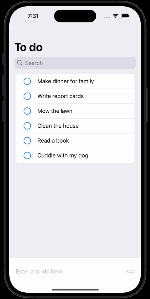
Now run and test your app. Ah, that’s better! A quick change but a huge improvement in the usability of the app.
Although this is a tiny change, never co-mingle code that makes multiple features happen within your app.
We just added a small, but important feature, so it’s time to commit and push our work with this message:
Now clearing the input text field after a new to-do item is added.
Now we can continue and add additional features.
Conditionally disable the Add button
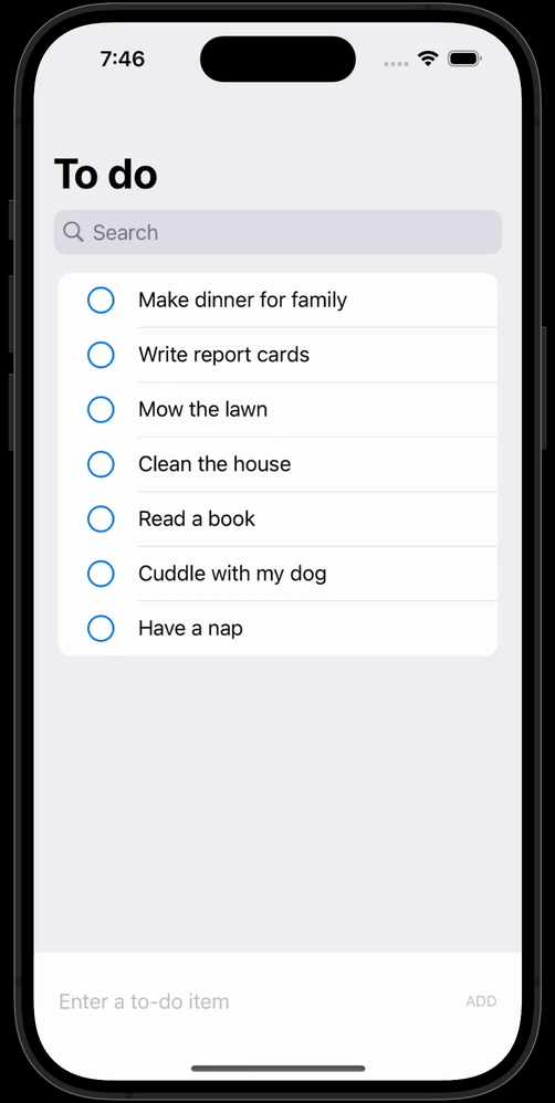
At the moment, the user can add to-do items even when they contain a bunch of spaces, or even a completely empty input field:
We can prevent this situation by disabling the Add button when newItemDescription is empty or contains just spaces.
Move down just a bit and add the code shown here just after the .font(.caption) view modifier that is attached to the Button structure:
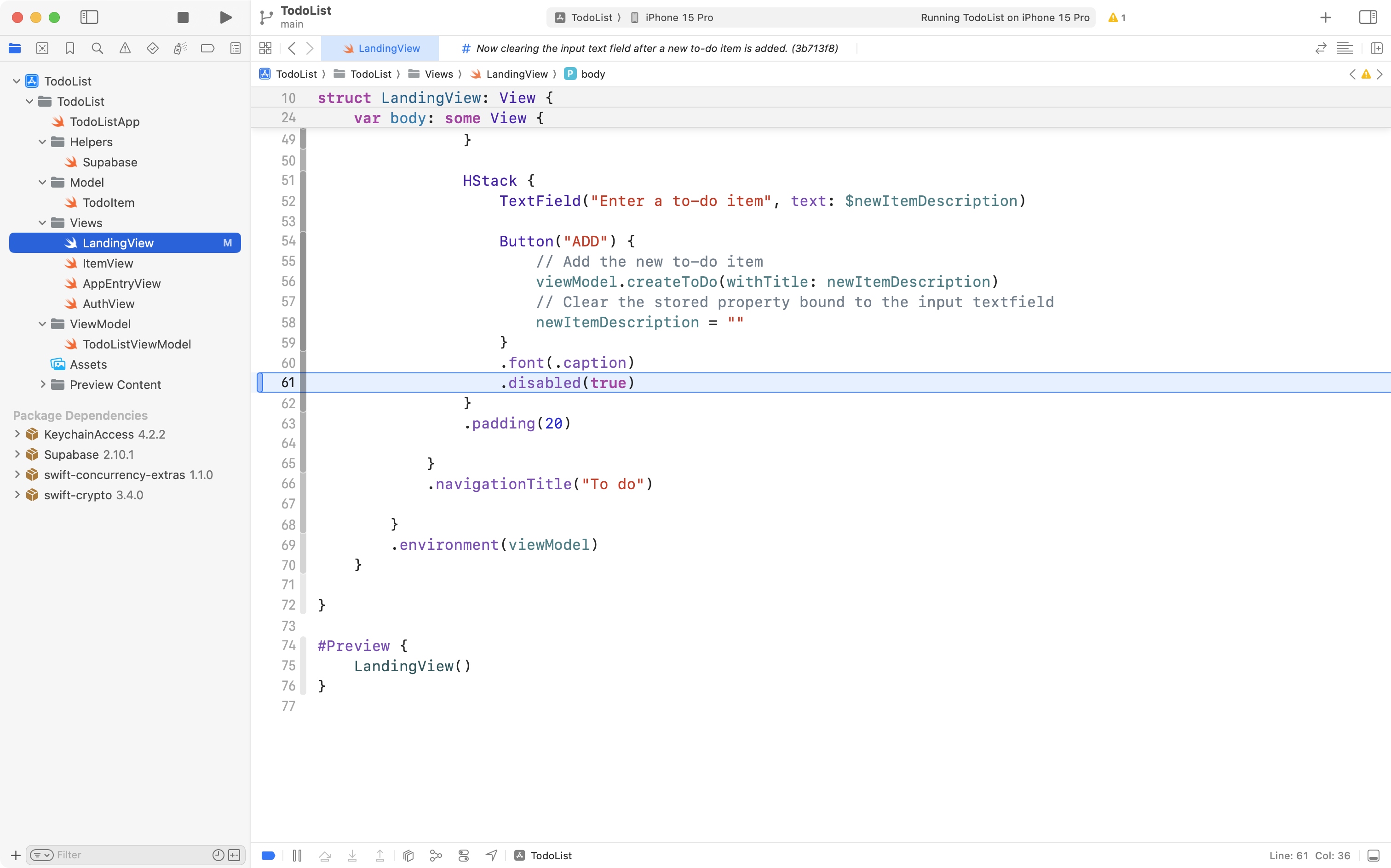
Now run your app. You will notice that the Add button is always disabled:
This isn’t what we want, but it illustrates how the .disabled view modifier works. It accepts a Boolean value – true or false. When it receives true the button is disabled.
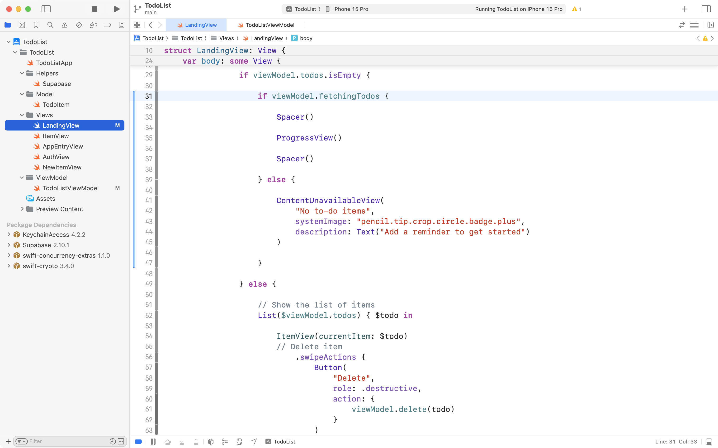
Change the code so it reads as follows, then try running your app again:
We have added a conditional statement:
newItemDescription.isEmpty == true… as the input to the .disabled view modifier.
Every variable or constant in Swift that is a String has a property named .isEmpty that returns true when… the string is empty!
So we are testing for this situation by adding the code above.
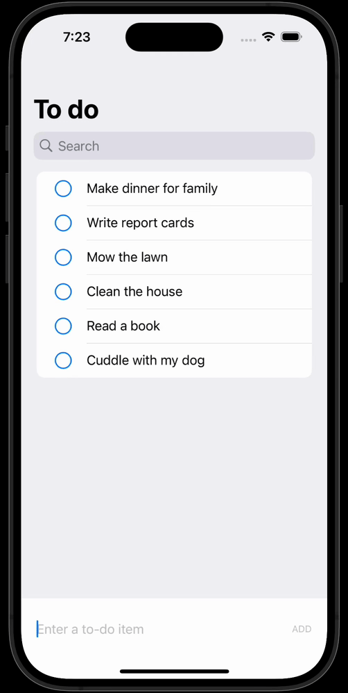
When you tested your app just now, you should see this:
The button is disabled when the string is empty, but if the user (silly, silly user) types in a bunch of empty spaces, a to-do item can still be added.
DISCUSSION
On a more serious note, a general rule of app development – of authoring usable apps – is to let the user be in control.
Have you ever used a website that prevented you from typing certain characters into an input field?
The website developer was likely well-intentioned, but usually, disabling certain keystrokes, or perhaps disabling cut and paste in an app or on a website… these things are deeply irritating to users.
However, in this case, in this context – it seems highly unlikely that a user would want to enter a completely blank to-do item.
It’s always important to carefully consider how you build out a user interface within an app – and it’s usually a good idea to seek the input of others to see if your plans are good.
So, we can make one more adjustment. Replace this code:
.disabled(newItemDescription.isEmpty == true)… with this instead:
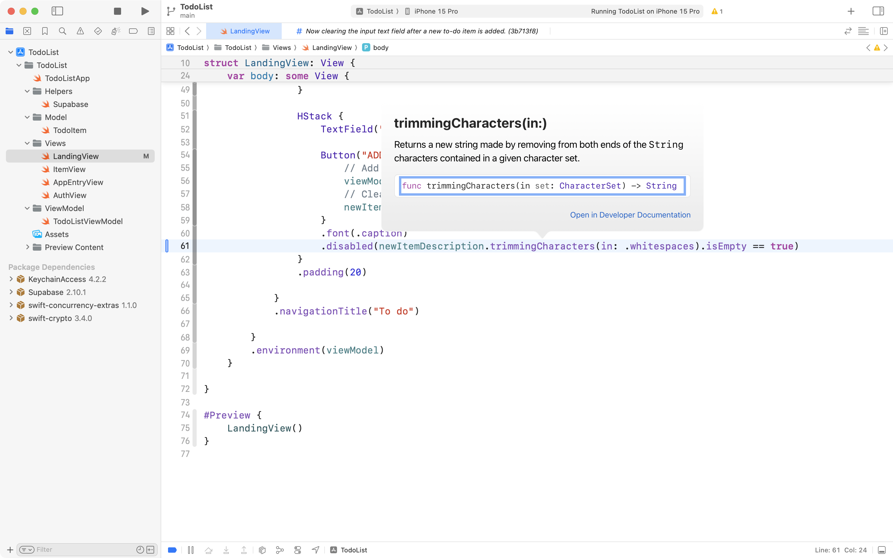
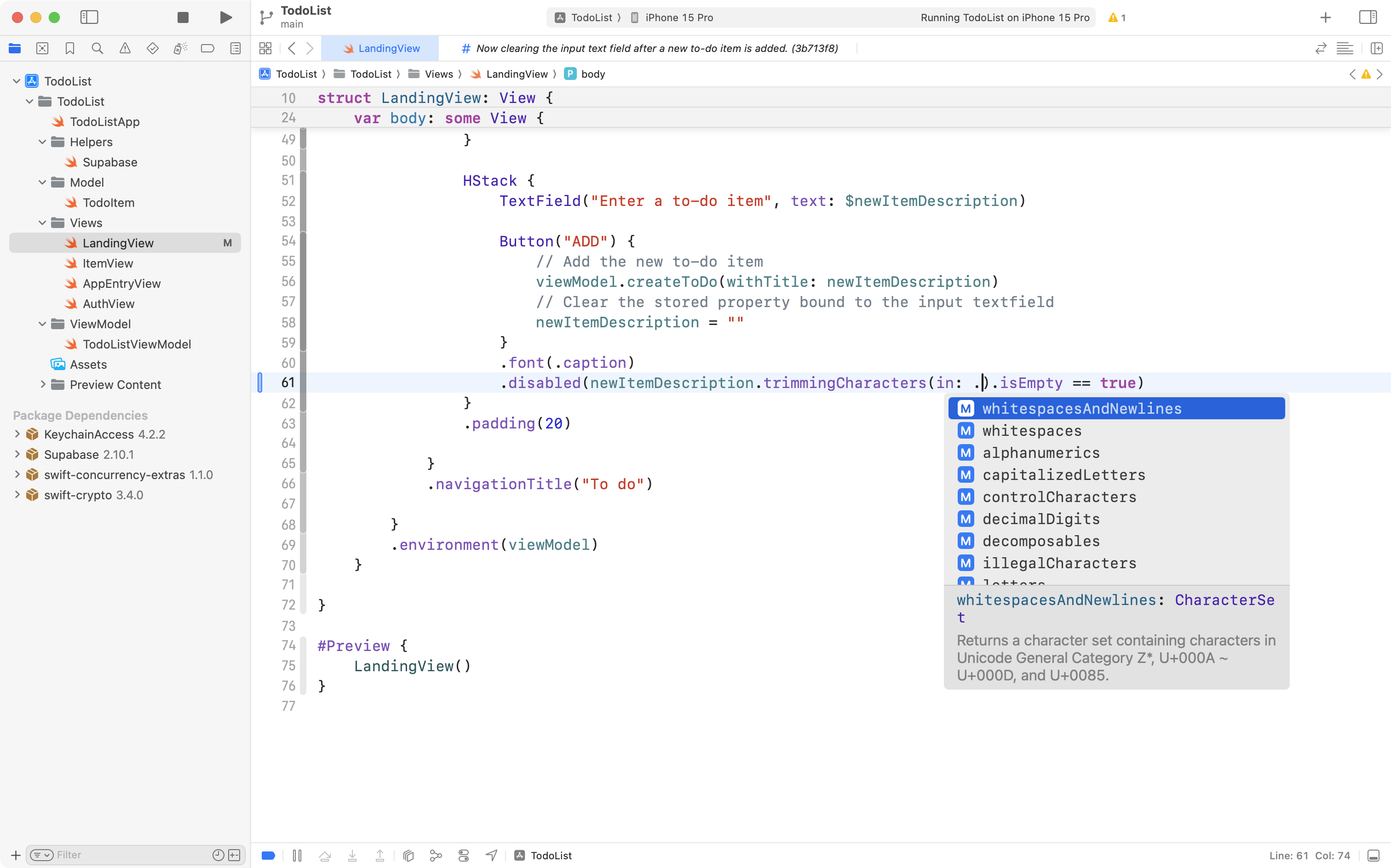
.disabled(newItemDescription.trimmingCharacters(in: .whitespaces).isEmpty == true)The .trimmingCharacters(in:) method is also built-in to any variable of type String in Swift. It is a very useful method that allows you to trim all sorts of different characters from the start or end of a string:
There are many options for what type of characters you might like to trim:
In this case though, we want the code to look as follows:
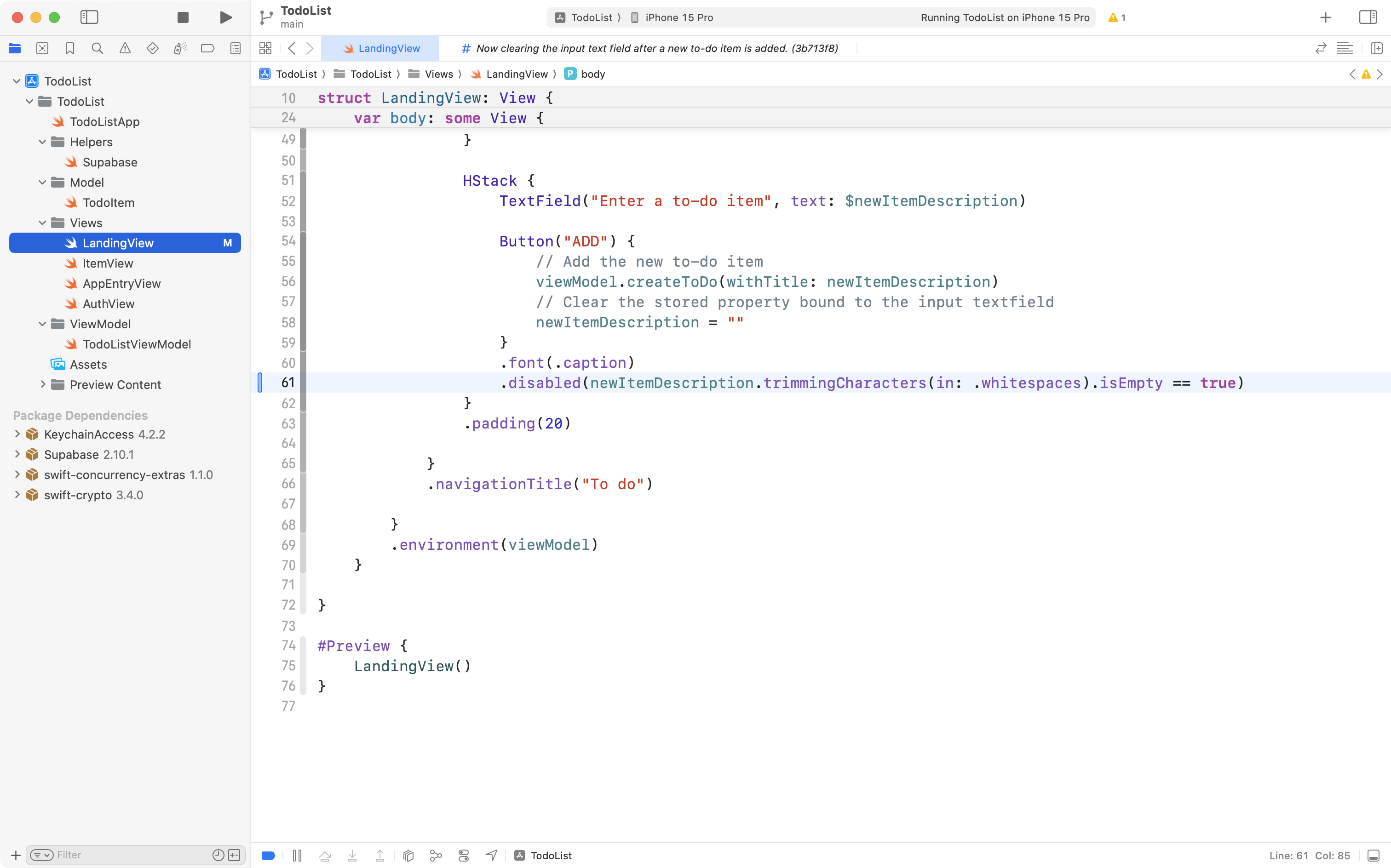
So now, in order, first whitespace characters (spaces, tabs, and so on) are trimmed from both ends of the string. Then, second, we test for whether the string is empty. If it is, the Add button is disabled.
Now we have the behaviour that we want:
Commit and push your work now with this message:
Ensure that you cannot input a to-do item that is blank.
Using a sheet to add new items
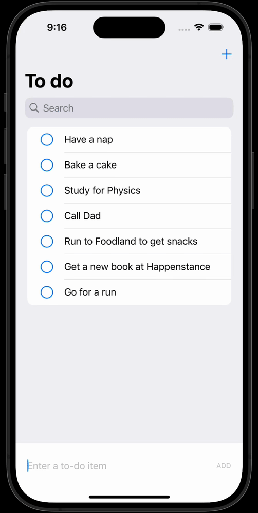
At present, LandingView has two main parts of it’s interface showing at all times.
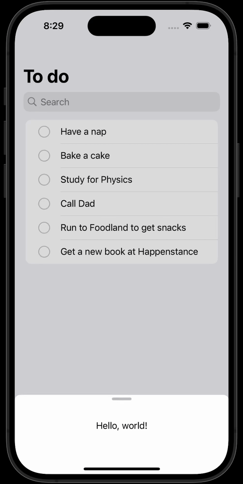
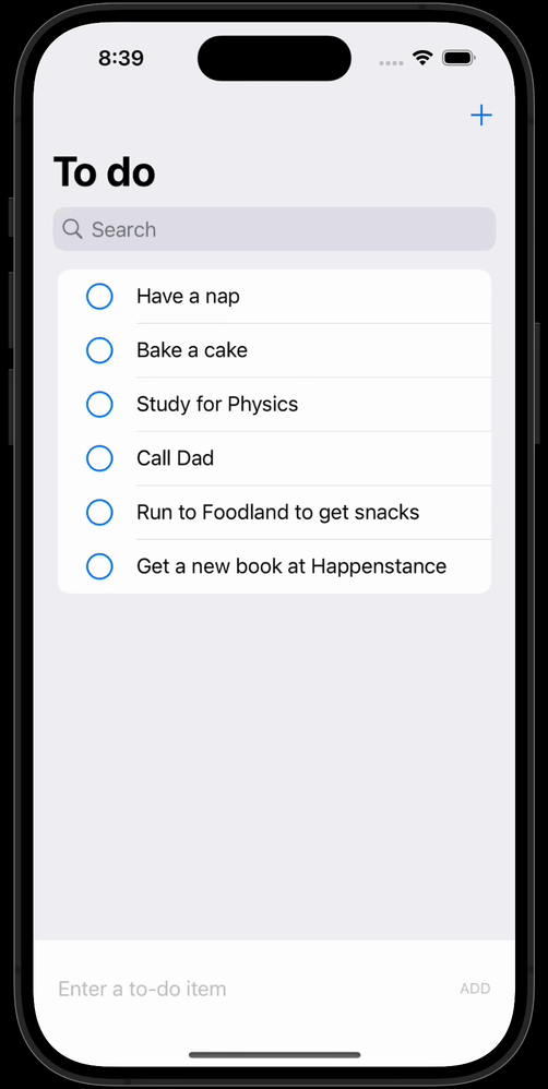
The list, and the horizontal stack at the bottom where you can enter a new to-do items:
This works well enough when there is only a short bit of text being provided for each to-do item.
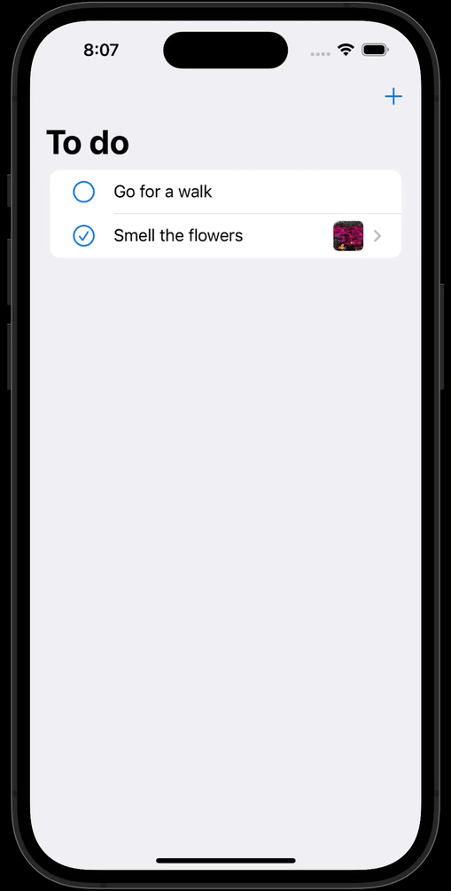
However, later on we will make it possible to attach an image to a to-do item, which will make the input area at the bottom of the window take up more space.
A solution to this is to use a tool bar button, a + symbol, to trigger the appearance of a sheet.
The user can add as many to-do items they like, and then dismiss the sheet when they are done, like this:
Let’s get started.
Trigger the sheet’s appearance
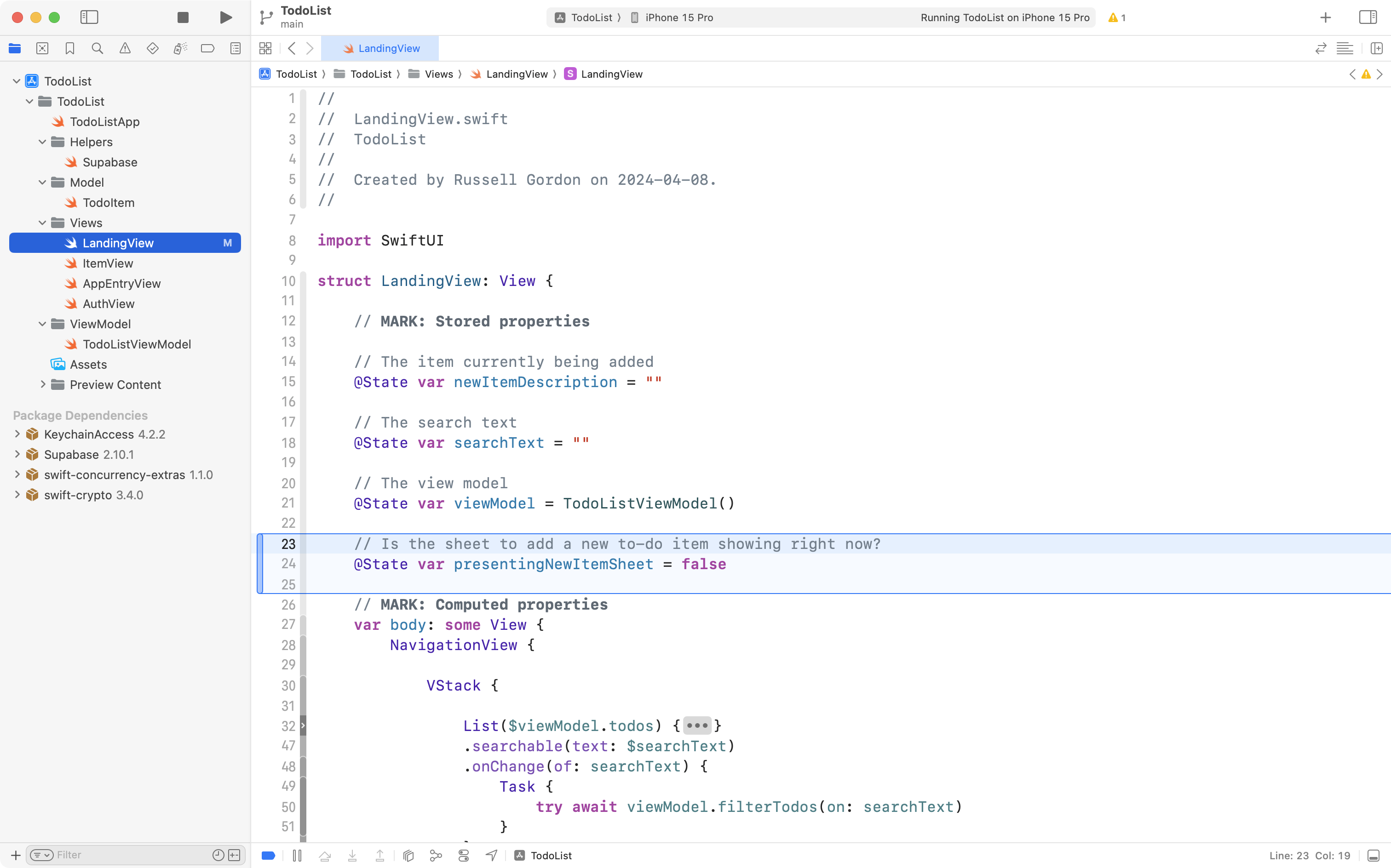
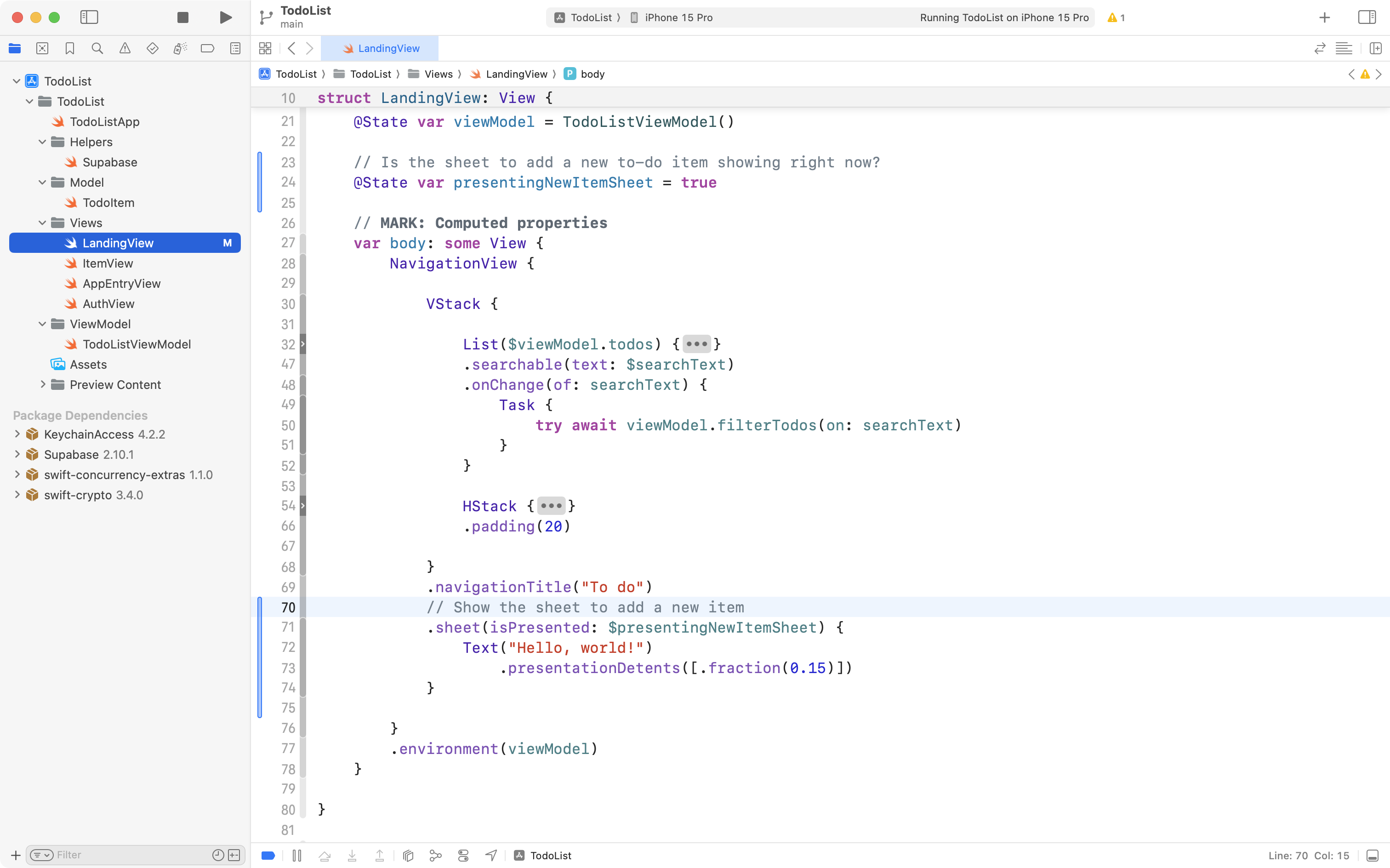
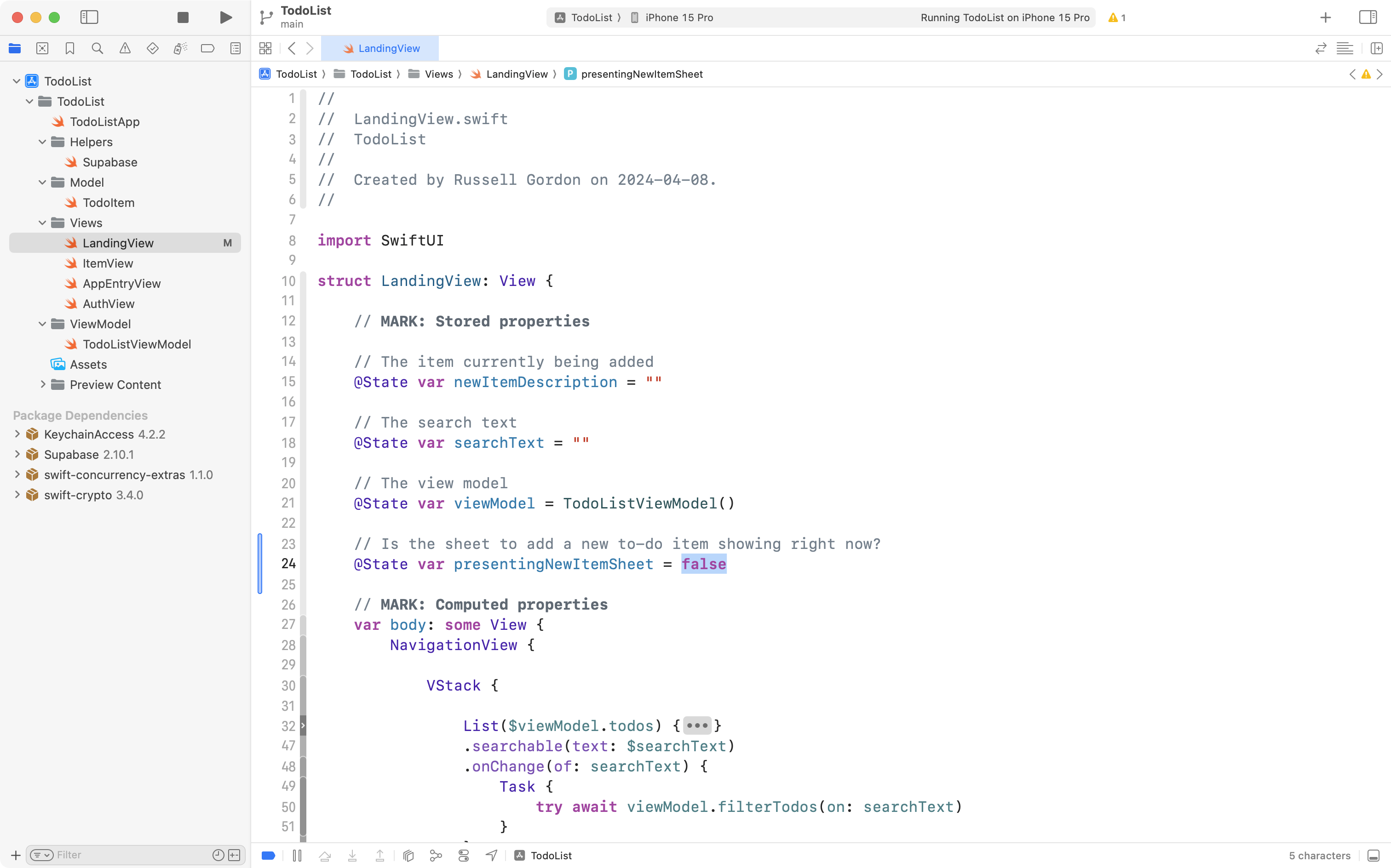
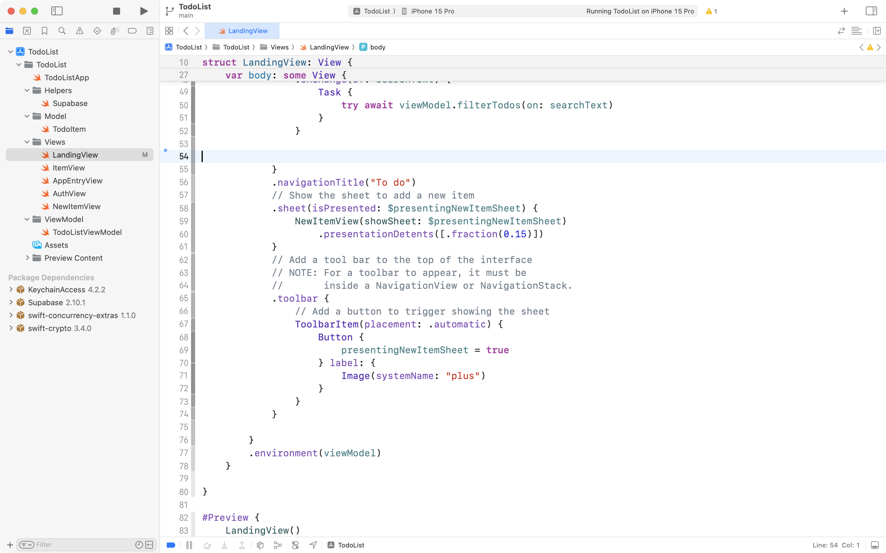
Ensure that you are in LandingView and then scroll up to the stored properties section of the structure:
User interface updates are triggered by state changes in SwiftUI, so we need a stored property to control whether the sheet is visible or not.
Add this code:
Then scroll down and add this code:
.sheet(isPresented: $presentingNewItemSheet) {
	Text("Hello, world!")
}
… right after the .navigationTitle view modifier that is attached to the VStack, like this:
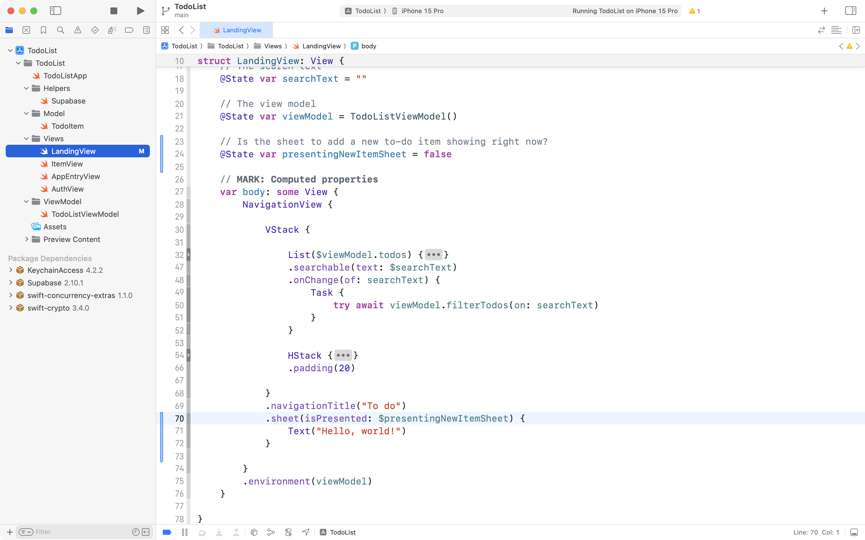
If needed, press Command-A and then Control-I to re-indent your code and keep it tidy.
The way the .sheet view modifier works is that when presentingNewItemSheet is true, the sheet is shown. Run your app now and notice that the sheet does not show up:
Now go back into your code and initialize presentingNewItemSheet with true instead, then run your app:
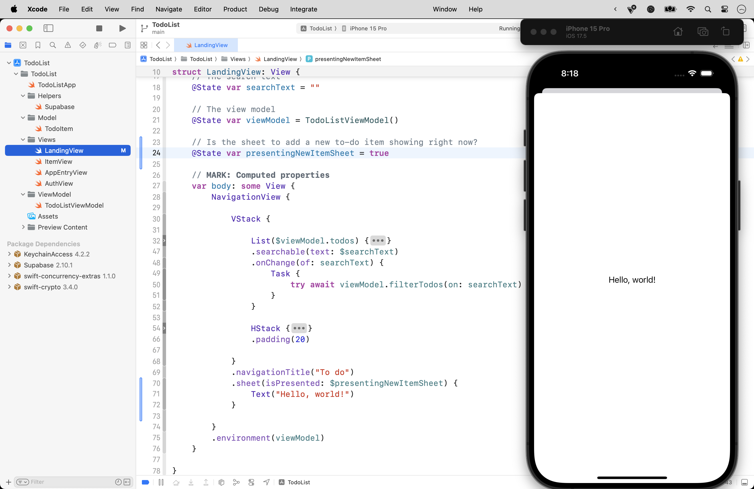
Notice that the sheet is immediately visible and that it covers the entire to-do list.
We can control how big the sheet is on our screen by using the .presentationDetents view modifier on the view the sheet is showing.
TIP
You may not have heard the word detent used very often – Mr. Gordon hadn’t when this feature was introduced!
The word detent means to hold something in place.
We can use built-in detent sizes, or provide our own custom detent size to control the height of the sheet.
After the Text view, add this code:
.presentationDetents([.medium, .fraction(0.15)])… then run your app:
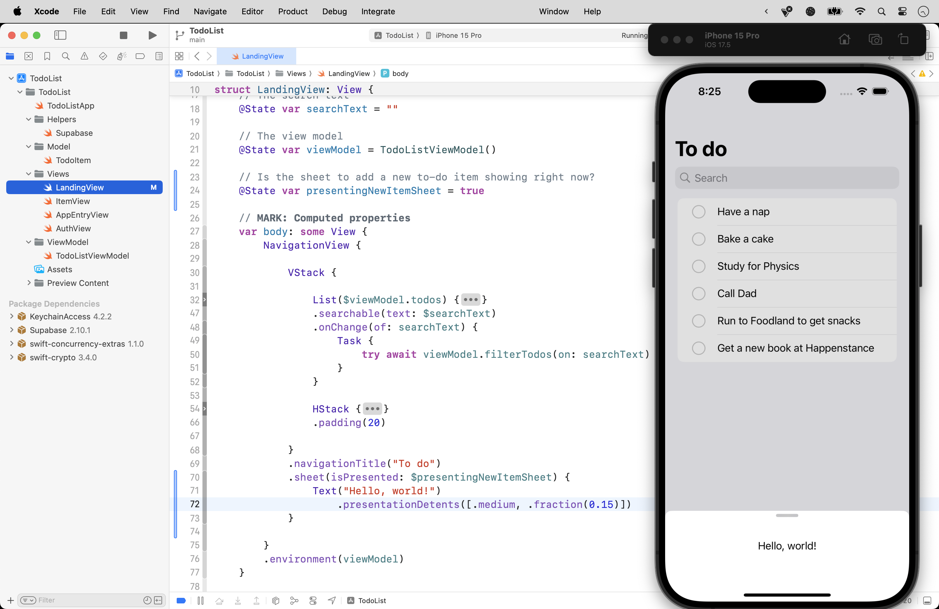
Here, we have used a built-in size, .medium, which is always half, or 50%, of the available screen height. We also provide a custom detent size, a fraction, set to 15% of the available screen height. When multiple size options are provided like this, SwiftUI will always present the sheet with the smallest size first, no matter what order you provide sizes in. However, the user is given a drag handle, which allows them to change the size of sheet in the app, if they prefer:
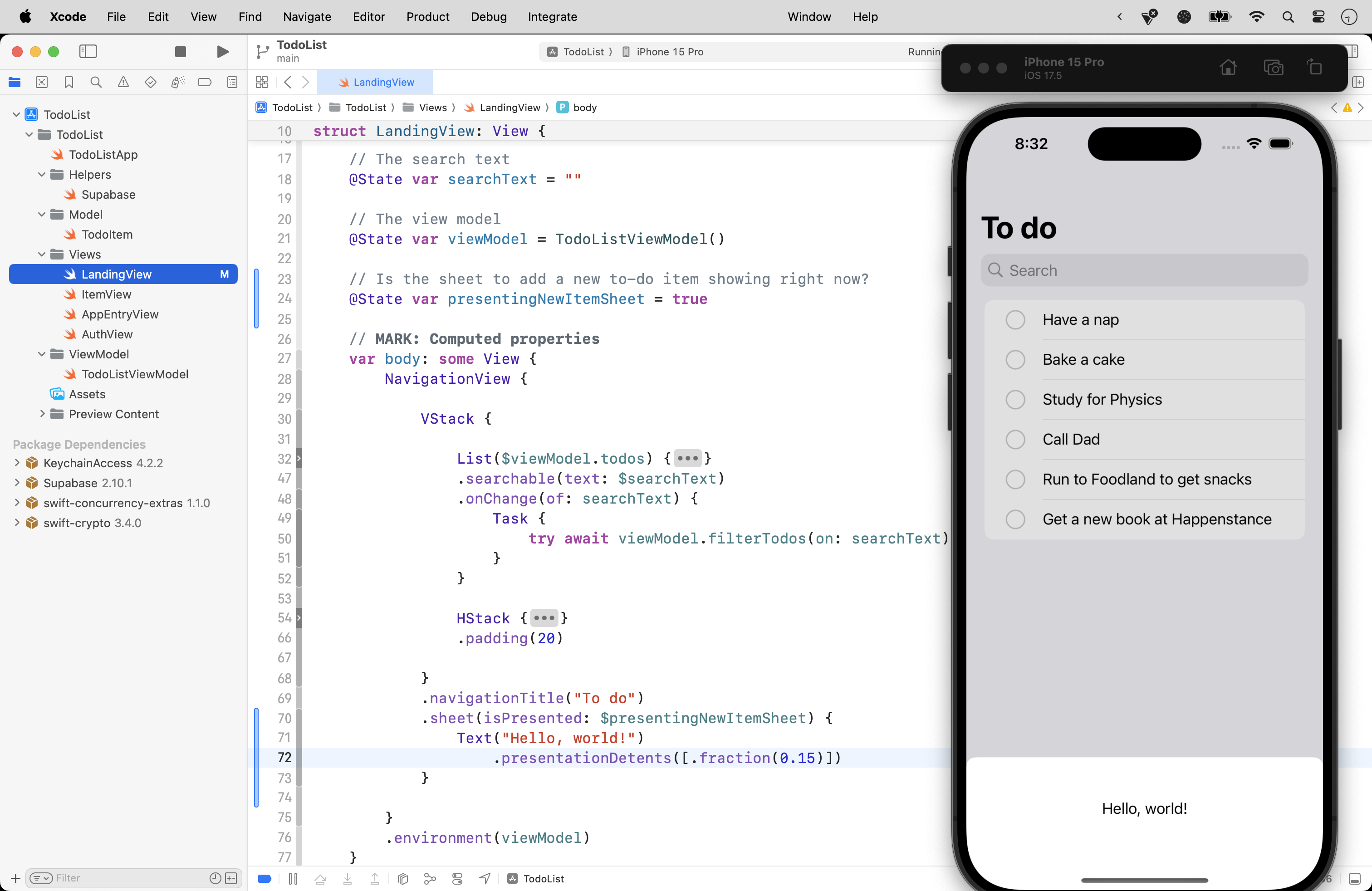
For now, we’ll use a sheet that’s just big enough to display our user interface for adding a new to-do item, so change the code to provide just a custom size of 15%:
Of course, we don’t want to show the sheet right away. We need the user to be able to trigger the appearance of the sheet only when they want to add a new to-do item.
To do this, we’ll add a tool bar button to the top right corner of the app’s interface.
Let’s first add a comment to our .sheet view modifier:
Then copy this code into your clipboard:
// Add a tool bar to the top of the interface
// NOTE: For a toolbar to appear, it must be
//       inside a NavigationView or NavigationStack.
.toolbar {
	// Add a button to trigger showing the sheet
	ToolbarItem(placement: .automatic) {
		Button {
			presentingNewItemSheet = true
		} label: {
			Image(systemName: "plus")
		}
	}
}
… or type it if you prefer to practice with that, and add it below the .sheet view modifier, like this:
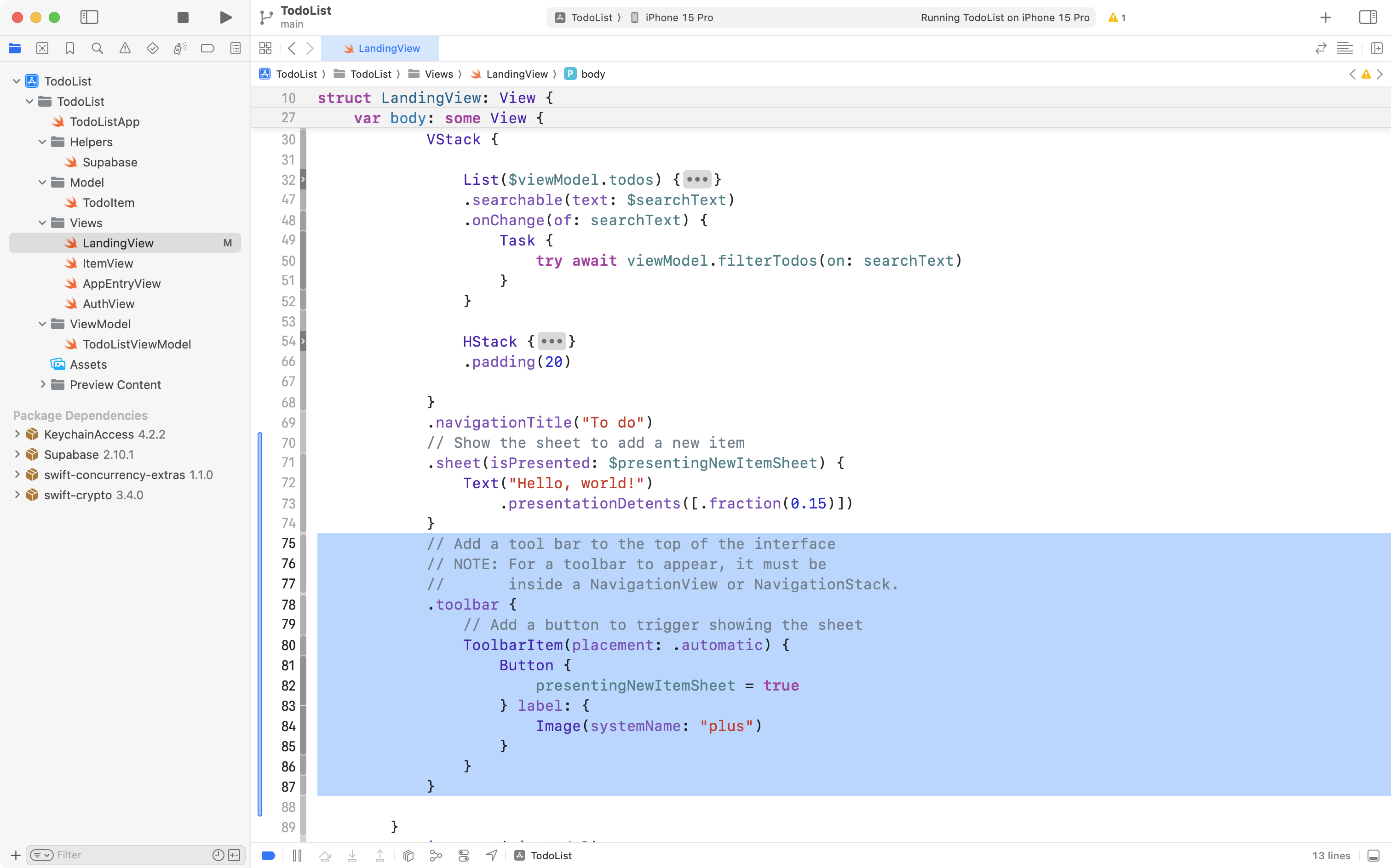
Finally, scroll up to the top of LandingView, and change the default value of presentingNewItemSheet to false, like this:
If you run your app, you should now be able to hide and show the sheet like this:
What’s happening here is that the toolbar button changes presentingNewItemSheet from false to true. SwiftUI sees this change, and since the .sheet view modifier is watching the value of presentingNewItemSheet, when it becomes true, the sheet is displayed. When the user taps outside the sheet, SwiftUI automatically changes presentingNewItemSheet back to false, and the sheet is hidden.
This is nice progress that we don’t want to lose if something goes wrong later on, so, please commit and push your work with the following message:
Added a sheet that can be shown by pressing a button in the toolbar.
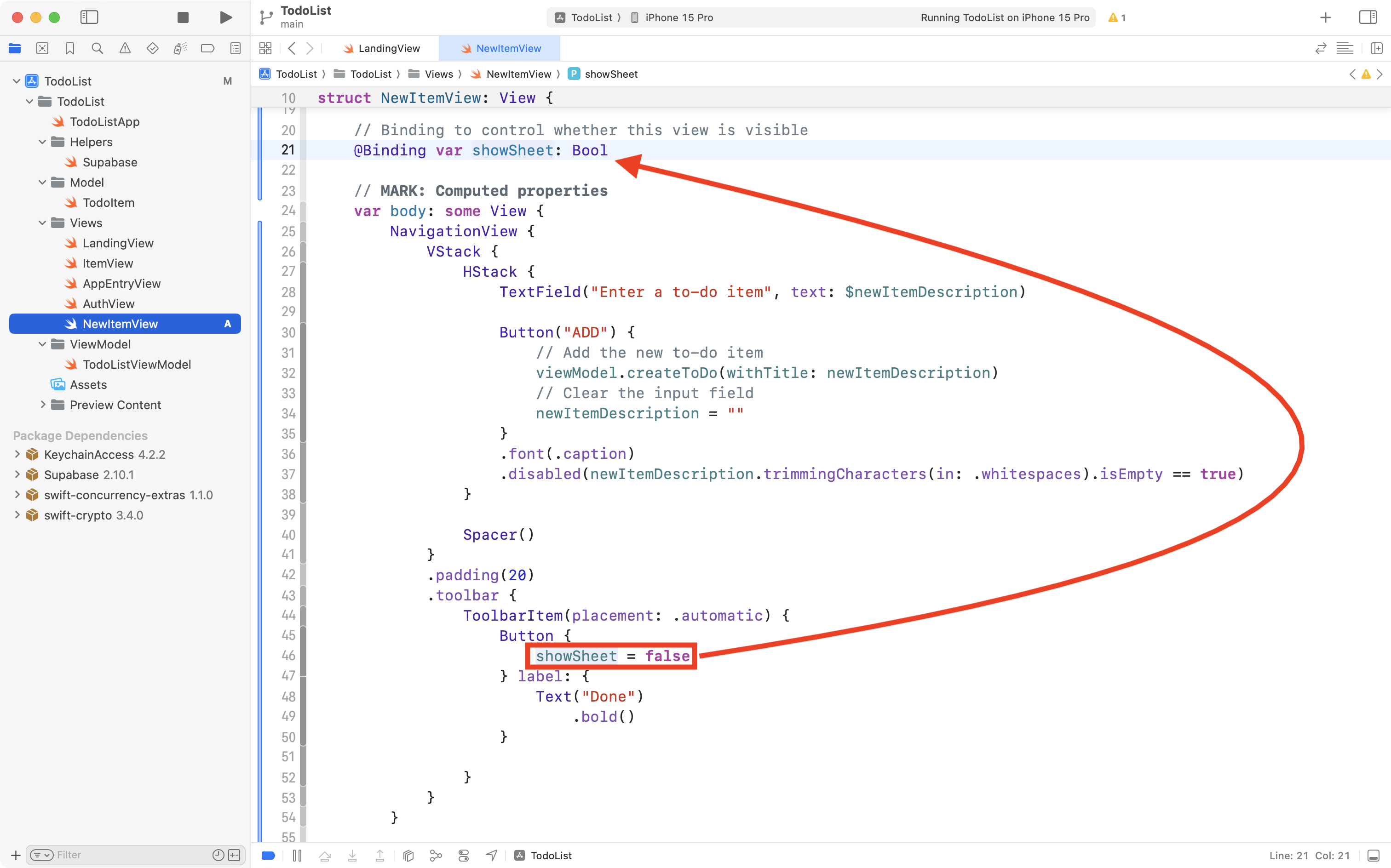
Add a new item from the sheet
Next we will make it possible to add a new item from the sheet, moving this code out of LandingView.
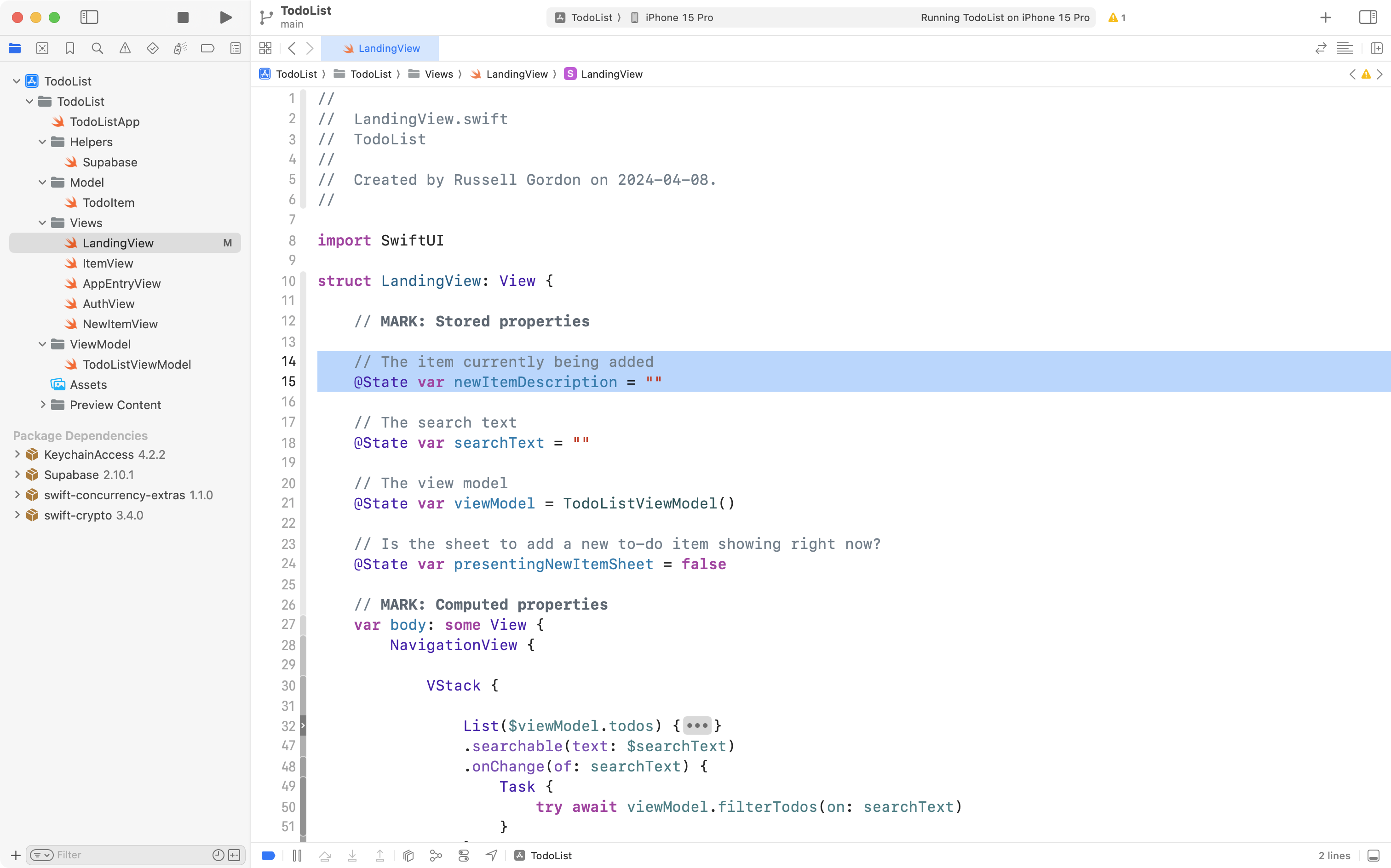
First we need to create a new file to hold that code. Add a SwiftUI View named NewItemView to your project:
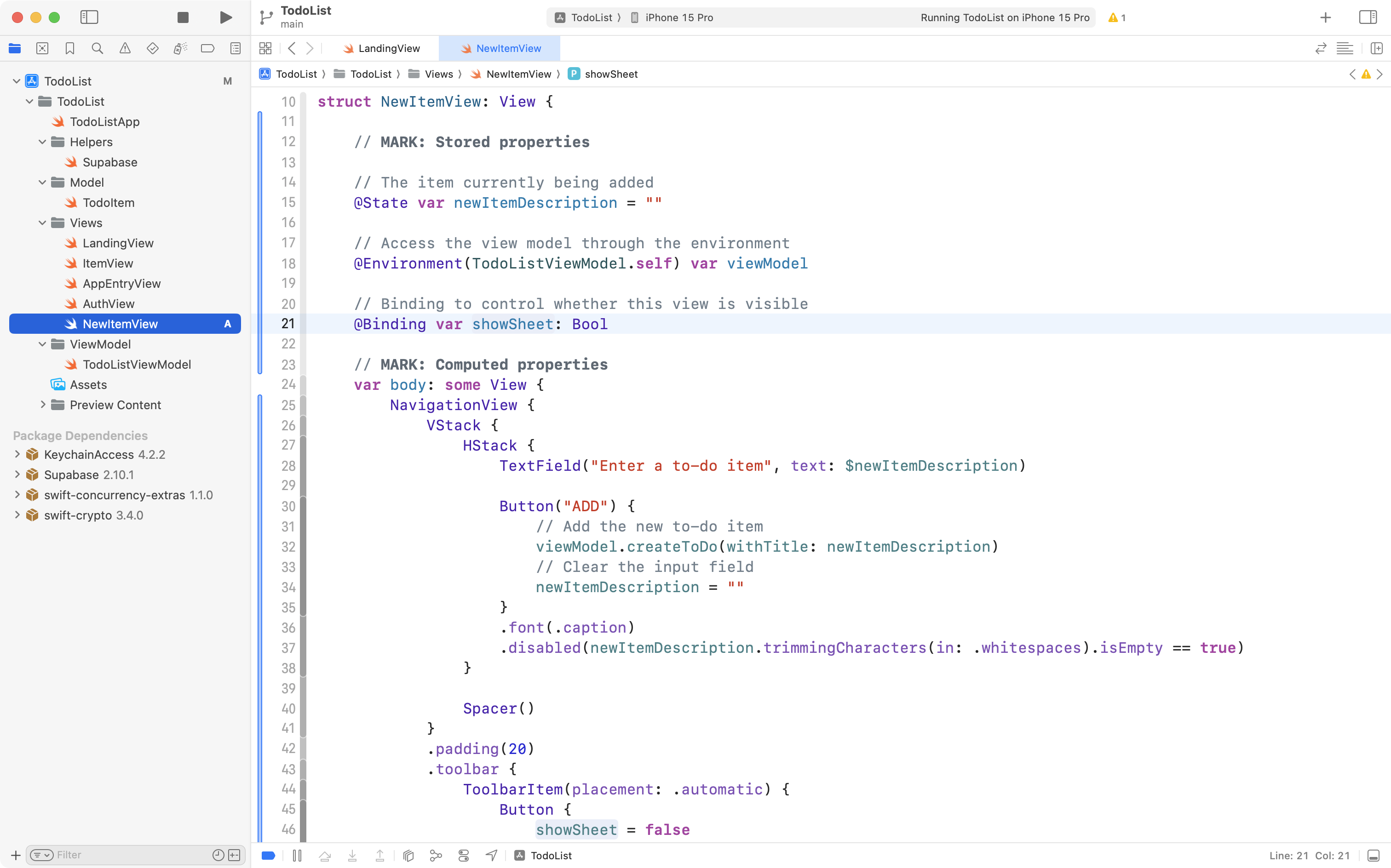
To save you a complicated series of edits, the code for this new view is provided below, which you can copy into your clipboard:
import SwiftUI

struct NewItemView: View {

    // MARK: Stored properties

    // The item currently being added
    @State var newItemDescription = ""

    // Access the view model through the environment
    @Environment(TodoListViewModel.self) var viewModel

    // Binding to control whether this view is visible
    @Binding var showSheet: Bool

    // MARK: Computed properties
    var body: some View {
        NavigationView {
            VStack {
                HStack {
                    TextField("Enter a to-do item", text: $newItemDescription)

                    Button("ADD") {
                        // Add the new to-do item
                        viewModel.createToDo(withTitle: newItemDescription)
                        // Clear the input field
                        newItemDescription = ""
                    }
                    .font(.caption)
                    .disabled(newItemDescription.trimmingCharacters(in: .whitespacesAndNewlines).isEmpty == true)
                }

                Spacer()
            }
            .padding(20)
            .toolbar {
                ToolbarItem(placement: .automatic) {
                    Button {
                        showSheet = false
                    } label: {
                        Text("Done")
                            .bold()
                    }

                }
            }
        }


    }
}

#Preview {
    NewItemView(showSheet: .constant(true))
}
Now replace the existing code:
… with the new code:
Take a moment to review that code. You will notice that, largely, it is the code that currently exists in LandingView that handles adding a new to-do item. We have simply moved that code into NewItemView.
There are a couple of parts of this new code worth highlighting.
First, there is a binding to control whether the sheet is visible – more on that in a moment:
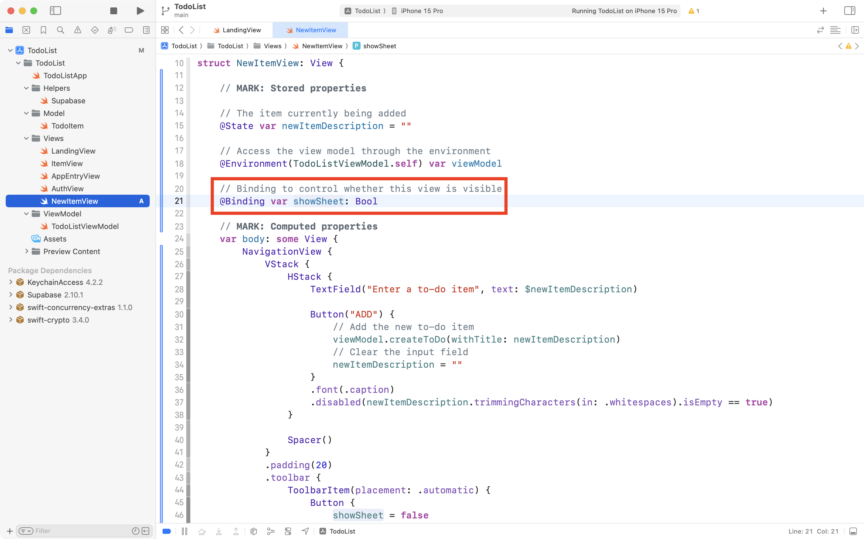
Second, there is a toolbar button that changes the value of that stored property back to false:
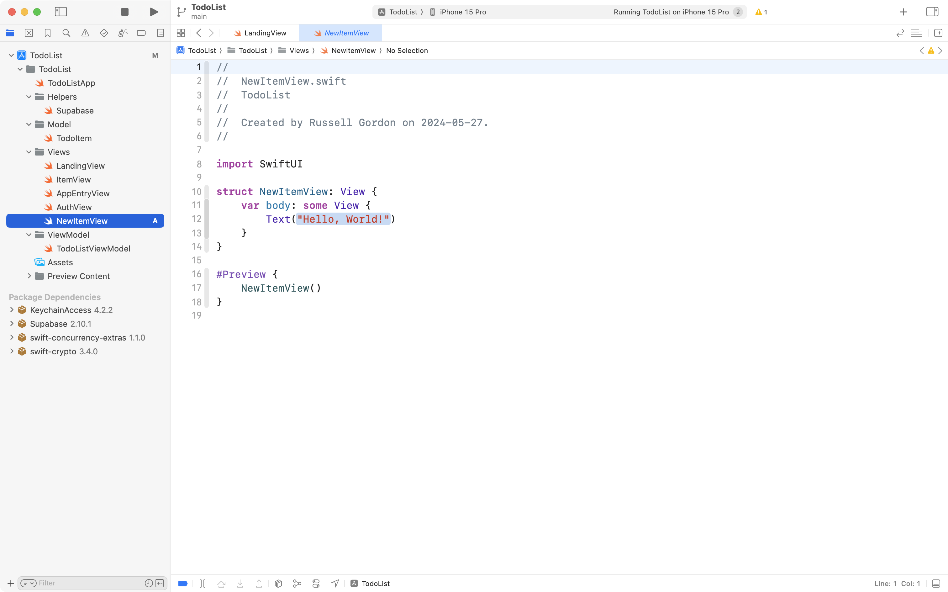
Let’s look at how this new view is used. Inside LandingView we still have all the code to add a new to-do item (this will be removed shortly) and in the sheet, we are simply showing a Text view that shows Hello, world!:
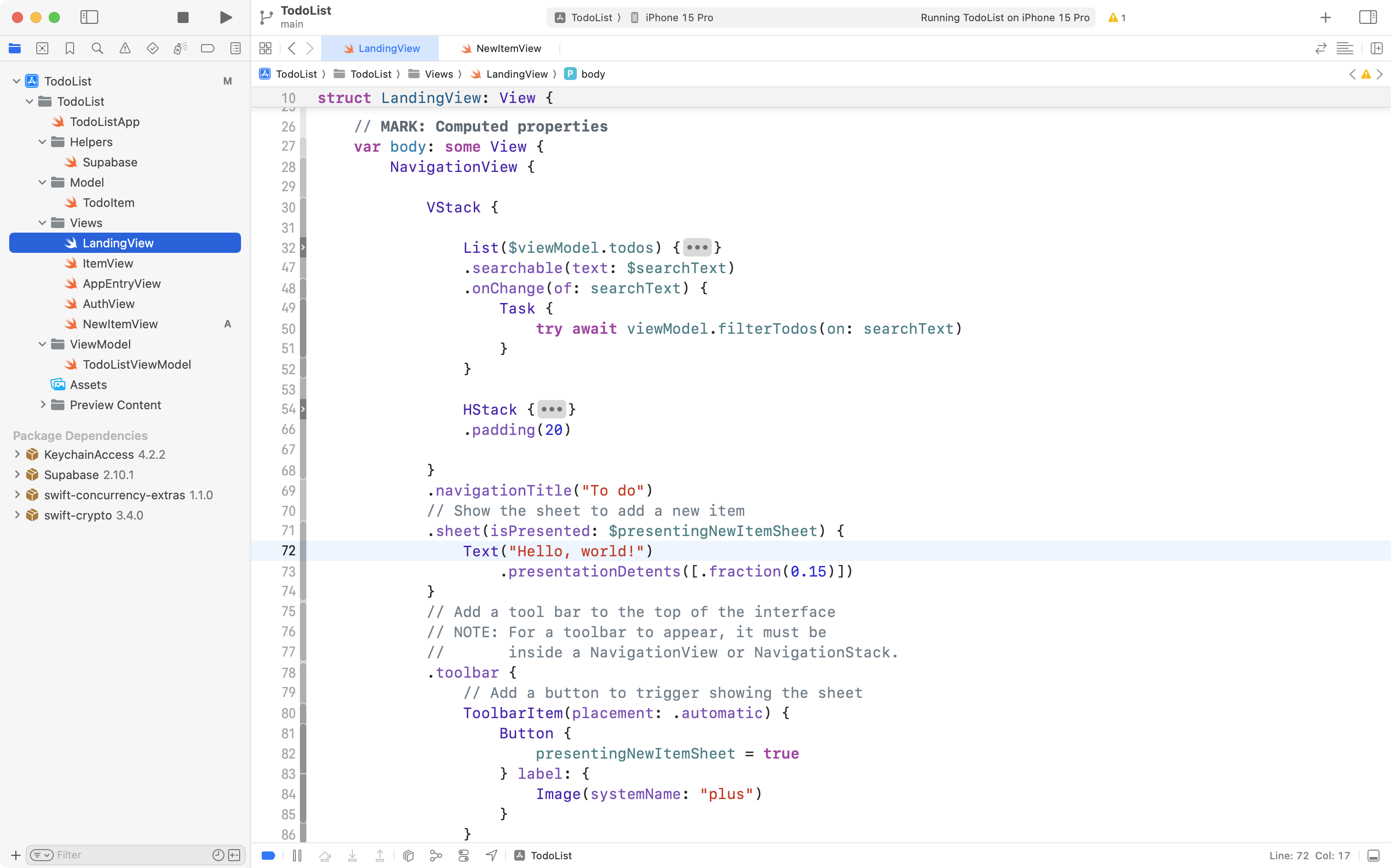
Instead, we want to show NewItemView within that sheet:
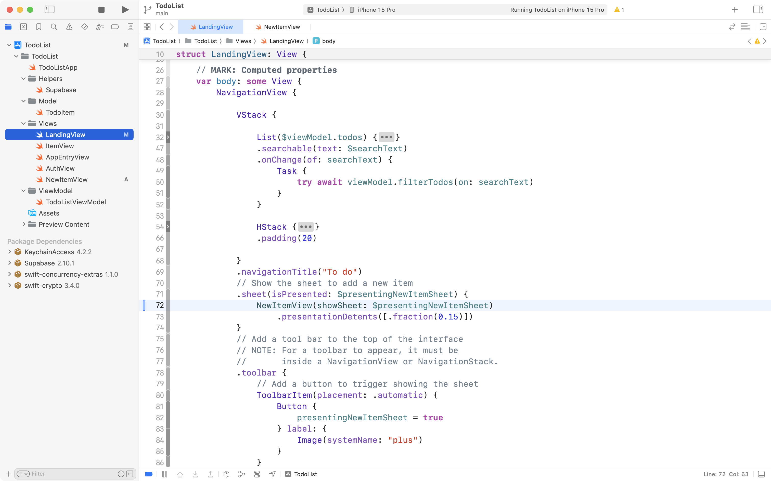
So, please make that edit, replacing:
Text("Hello, world!")… with:
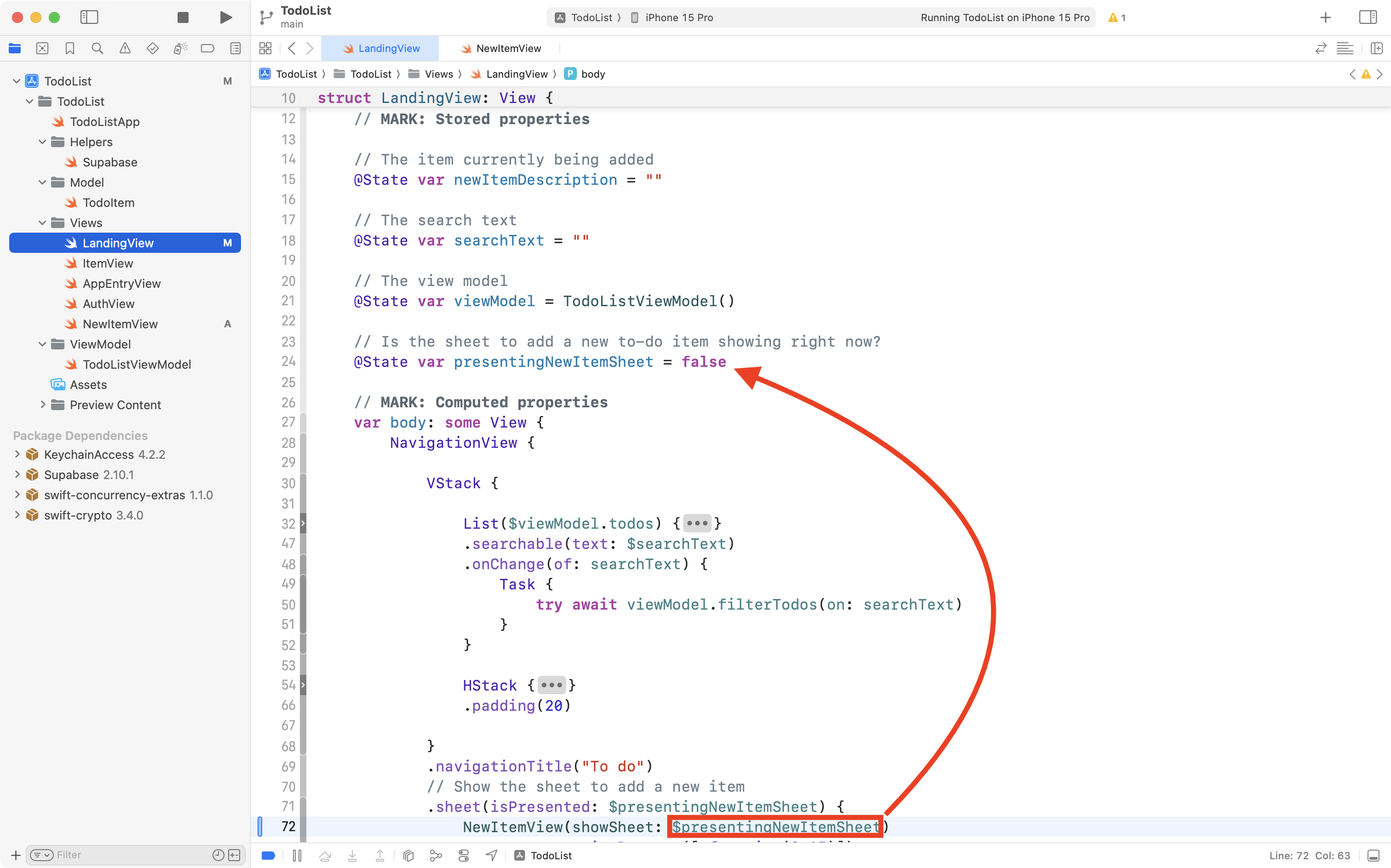
NewItemView(showSheet: $presentingNewItemSheet)Notice that there is a showSheet parameter:

… and that the argument we provide is a binding to presentingNewItemSheet:
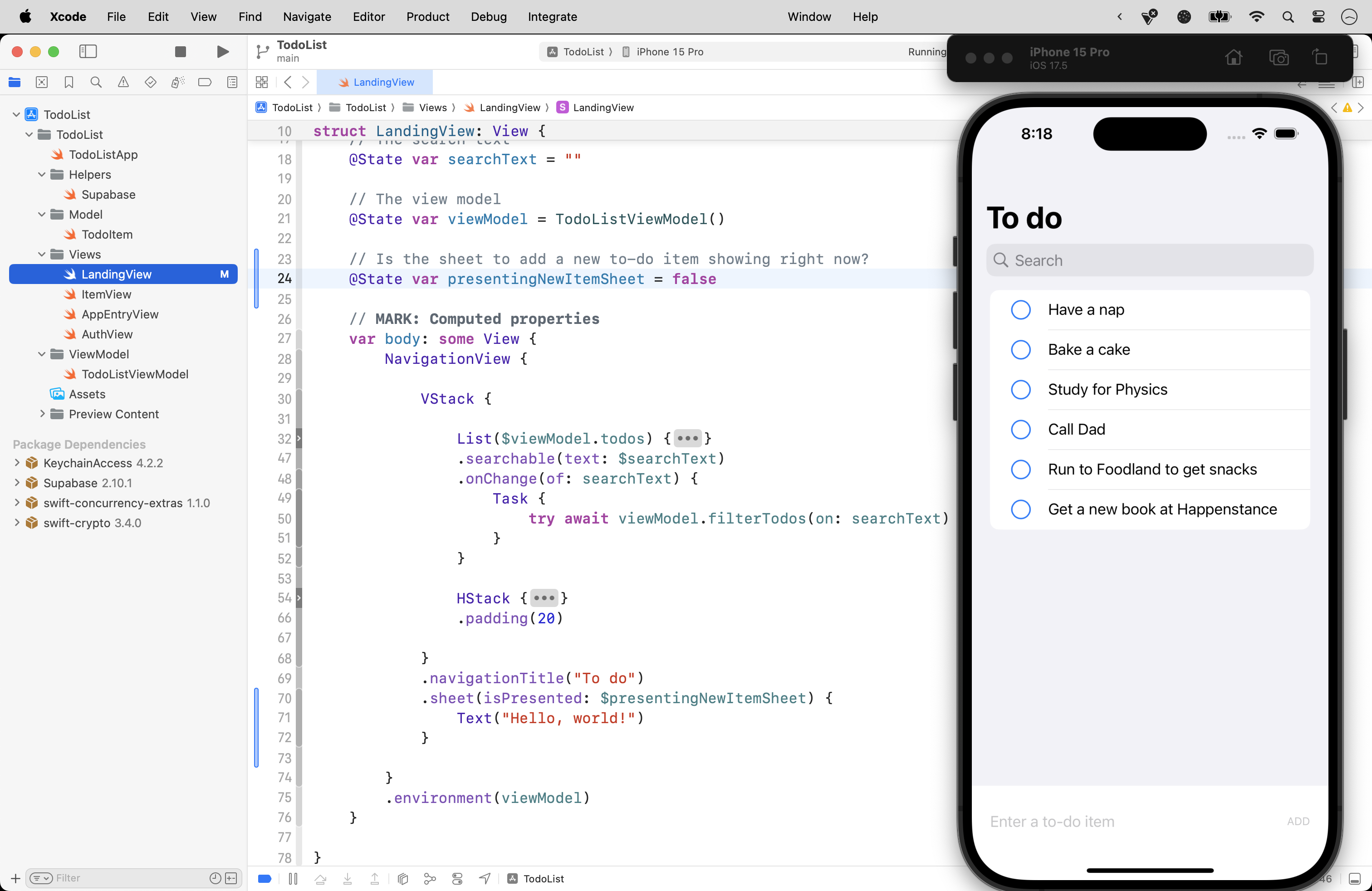
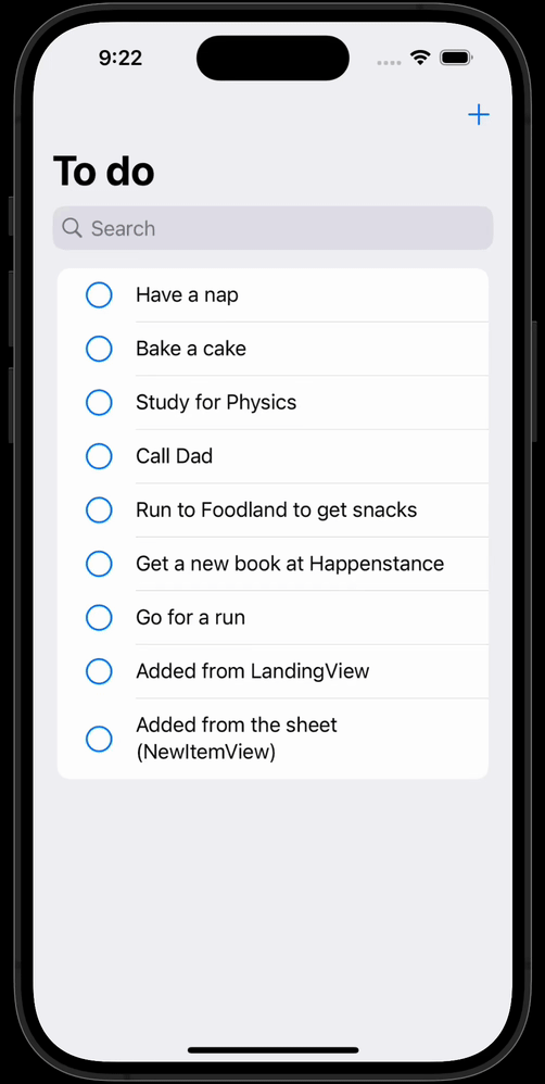
Run the app. You will see that you can show the sheet, and then hide it again, and even add new to-do items from the sheet already:

The sheet’s appearance is triggered from the + button in the toolbar of LandingView as previously explained.
When we tap the Done button, the showSheet stored property is changed to false. This stored property is bound to presentingNewItemSheet in the parent view, LandingView. In turn, when presentingNewItemSheet becomes false, the sheet is hidden.
We can add a new to-do item because NewItemView has access to the view model through the environment.
This is nice progress, so please commit and push your work with this message:
Can now add a new to-do item from inside the sheet.
Remove the duplicate interface
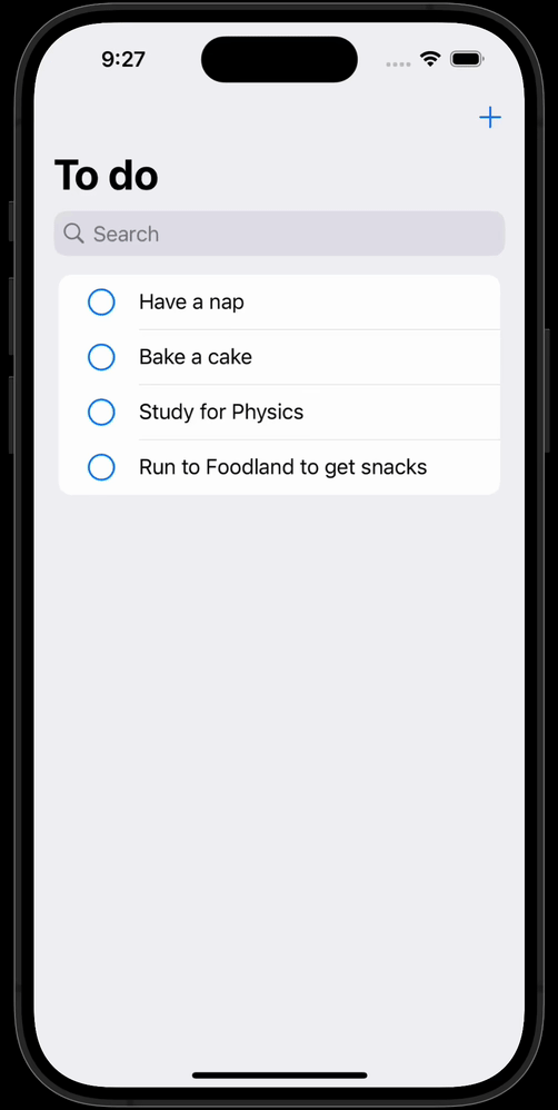
We still have the code that adds a new to-do item left inside LandingView, which results in duplicated user interface elements:
That code doesn’t need to be in LandingView any more, so let’s remove it.
First remove the HStack that contains the TextField and the Button:
… like this:
Then remove the stored property that held the new to-do item’s description:
… like this:
Run the app. You should no longer see the interface on LandingView for adding a new to-do item, but you should still be able to add a new to-do item from the sheet:
Commit and push your work now with this message before continuing:
Removed user interface for adding a new to-do item from the main landing view of the app.
Providing a cue to add items
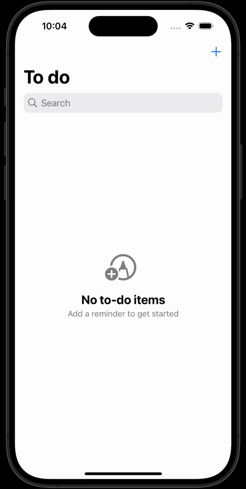
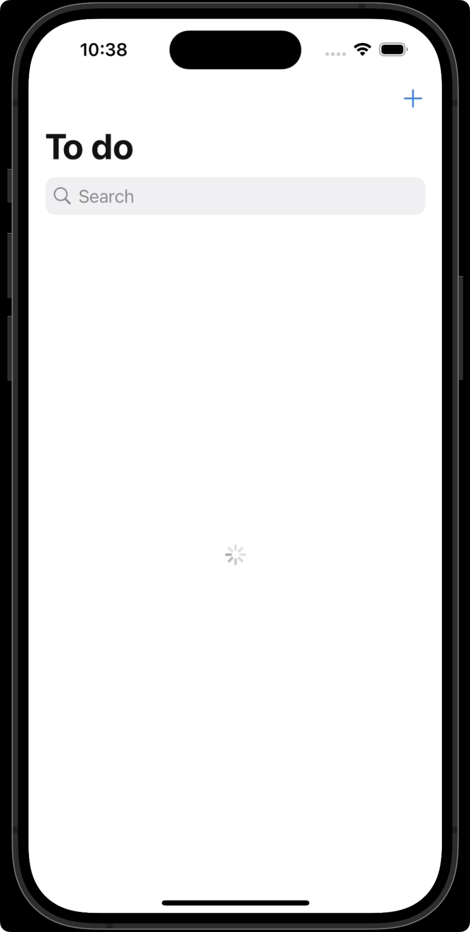
Try running the app now and deleting all the to-do items in the list:
The interface when no-to items have been provided is a bit bare.
A new user might not understand that the + could be used to add new items.
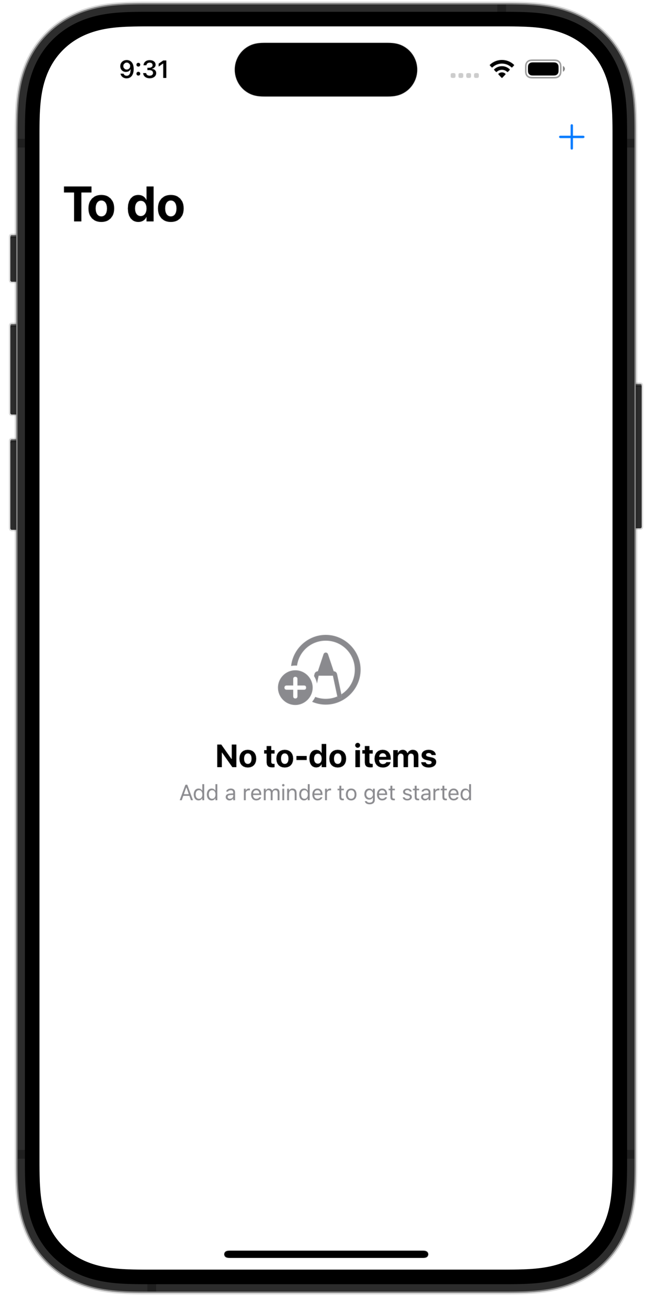
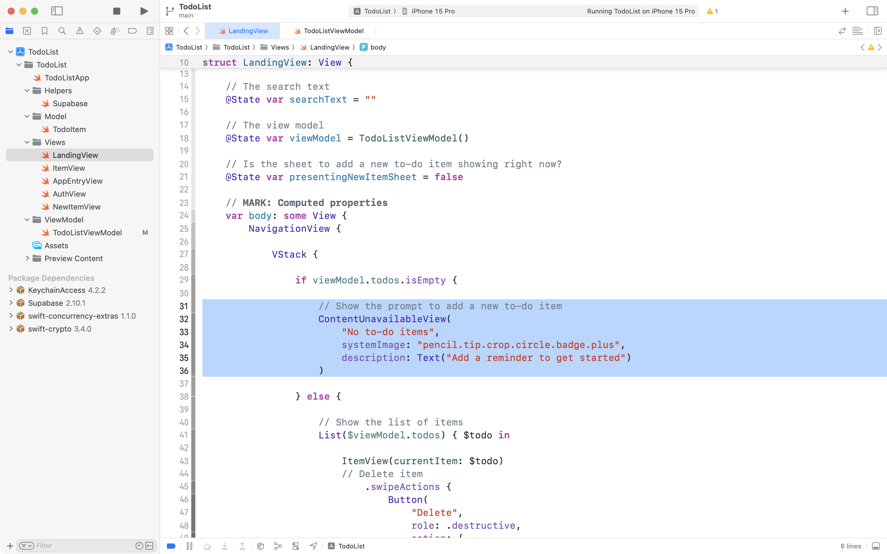
The SwiftUI framework provides a structure, ContentUnavailableView, that offers a standardized appearance for situations like these.
Here’s what that code looks like – don’t worry about adding this to your project just yet:
ContentUnavailableView(
	"No to-do items",
	systemImage: "pencil.tip.crop.circle.badge.plus",
	description: Text("Add a reminder to get started")
)
Here’s what the app will display when there are no to-do items:
Of course, the written prompts and the icon shown can be changed to whatever makes sense in a given app.
All we need to do is add some logic to our app to detect when there are no to-do items.
Recall that we create the view model within LandingView:
When that source of truth – the instance of our view model is initialized – the following sequence of steps occurs:
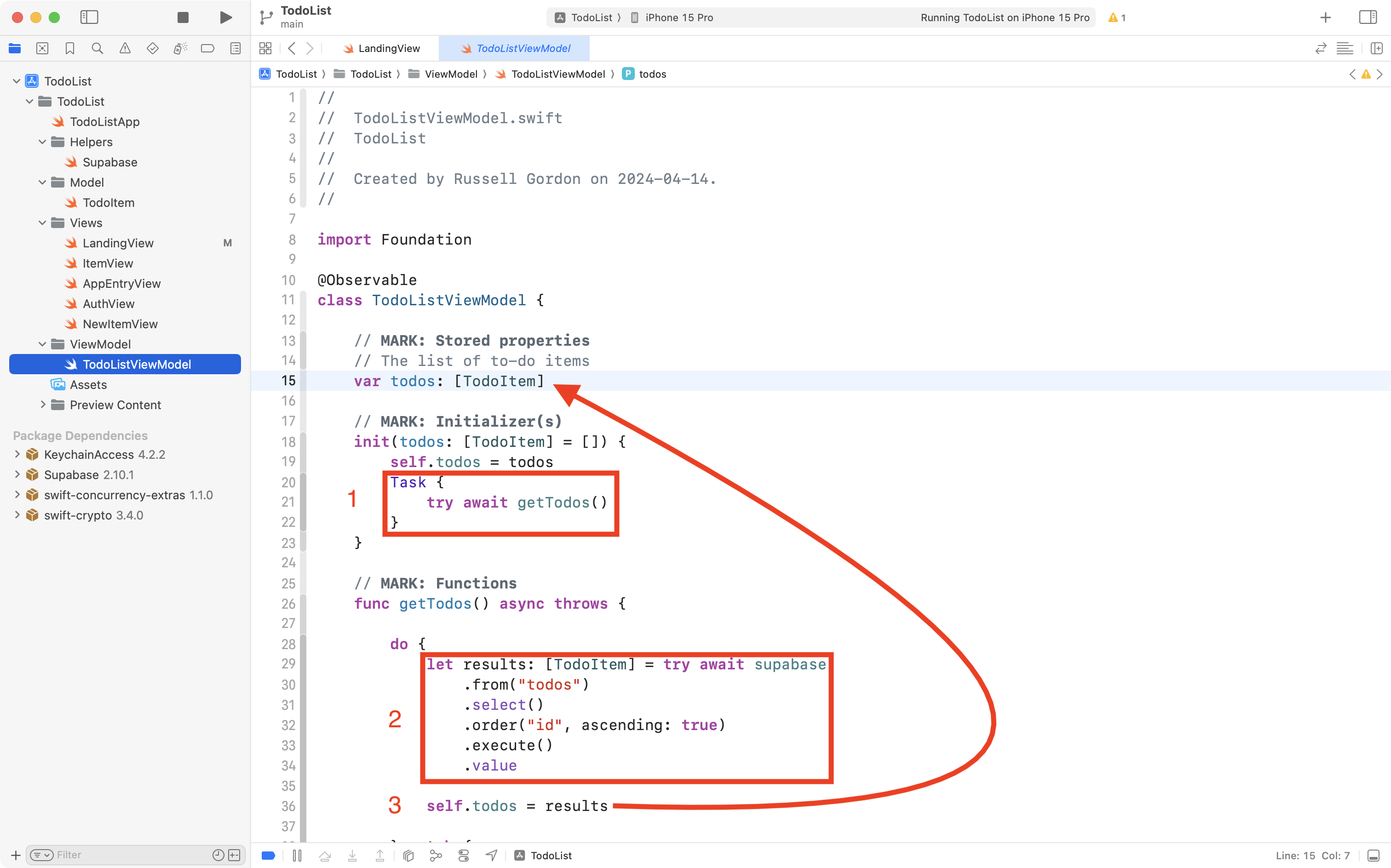
- The initializer is run, which invokes the
getTodosfunction. - The
getTodosfunction queries the database, receiving an array ofTodoIteminstances that matches the rows of data in thetodostable of our database which is hosted at Supabase. - We assign those results to the stored property named
todosin our view model. The to-do items are held in memory in our app, but they are always kept in sync with the rows in thetodostable in our database.
So, the key to detecting when there are no to-do items is to look at the contents of the todos array in our view model.
We can add logic to LandingView to look for this.
Here is a short video that you can pause where necessary – this shows the edits you must make – keyboard shortcuts used are displayed in an overlay, but these are not essential – just pay attention to what edits are being made:
Essentially, we:
- Move the view modifiers that make search work down so they are attached below the
.toolbarview modifier. - Add a selection statement – an
ifstatement – inside theVStackthat looks for whether thetodosarray is empty or not.
TIP
Here are what the different symbols shown in the overlays mean – what key they refer to on the keyboard:
⌘Command (or Cmd)⇧Shift⌥Option (or Alt)⌃Control (or Ctrl)⇥Tab↩Return␣Space←Left arrow→Right arrow↑Up arrow↓Down
If you run the app, this what you should now see:
This is great progress. Please commit and push your work with this message:
Used ContentUnavailableView to provide a prompt when no to-do items exist.
Detecting when to-do items are fetched
If you run your app in the Simulator, when to-do items are fetched for the first time, you might notice a problem after our recent changes – look carefully when the app loads, and pause the video here if needed:
Did you see it? Watch again when the app runs – it’s brief, but this screen shows for a moment:
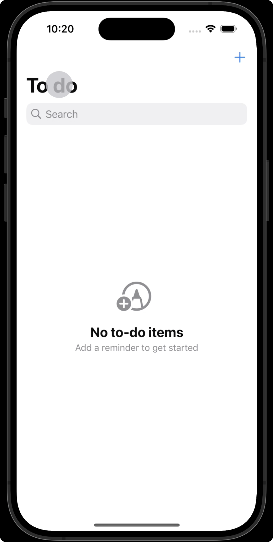
This behaviour is not correct.
What’s happening here is that the todos array is empty – but only because the to-do items have not yet been fetched from our database hosted at Supabase.
If the user has a slower Internet connection (entirely possible when out and about with a weak cellular signal) then this screen might be alarming for the user – they may think they have lost all of their to-do items.
What should happen instead is that we show a progress or “loading” indicator while fetching to-do items.
If no to-do items exist in the database, then we can show the ContentUnavailableView.
Differentiating between these two situations:
- loading to-do items
- no to-do items exist
… is not so hard, and just involves the use of a “flag” or a Boolean value of true or false to track when the view model is busy fetching to-do items.
Adjust the view model
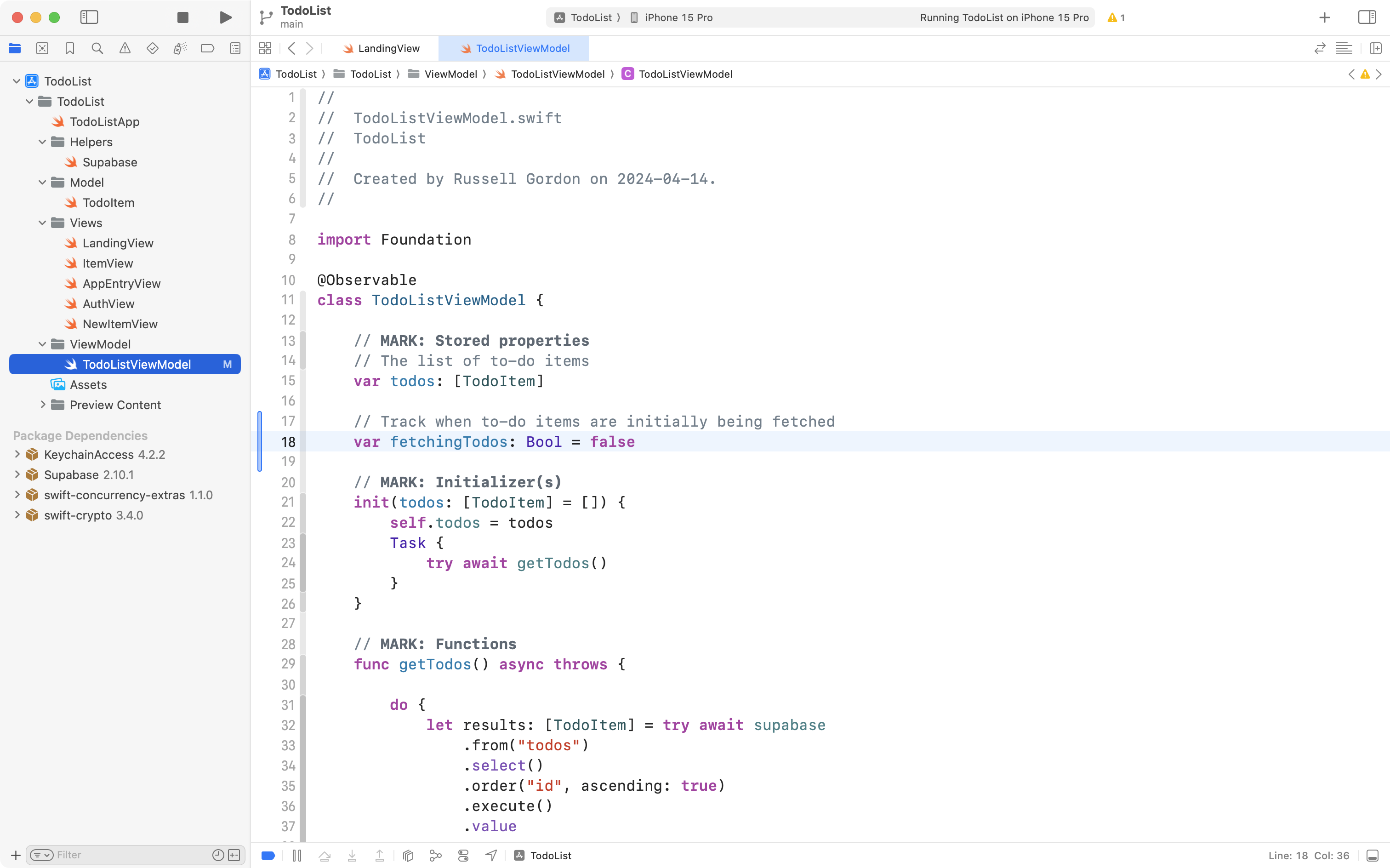
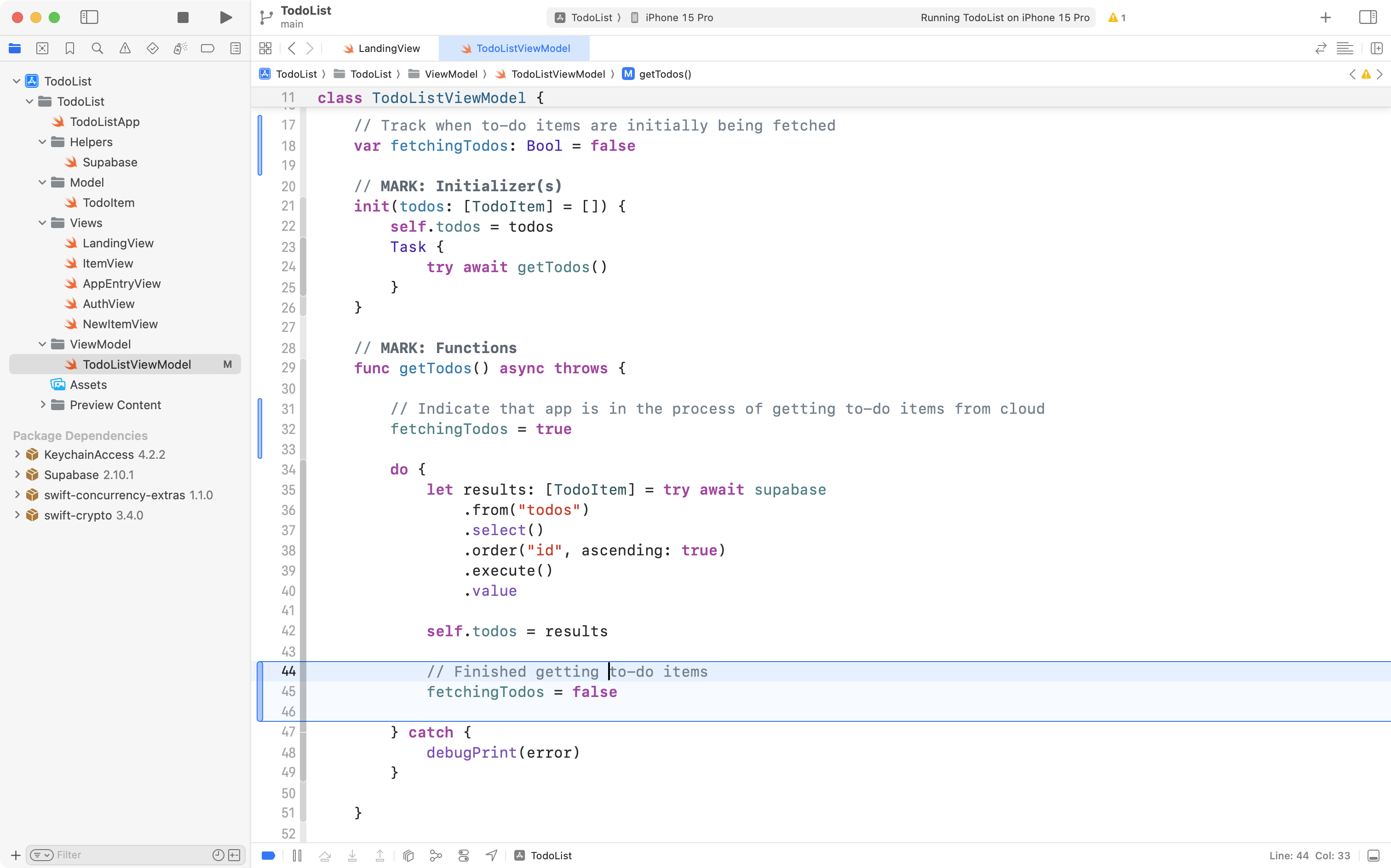
So, please switch to the TodoListViewModel file, in the stored properties section:
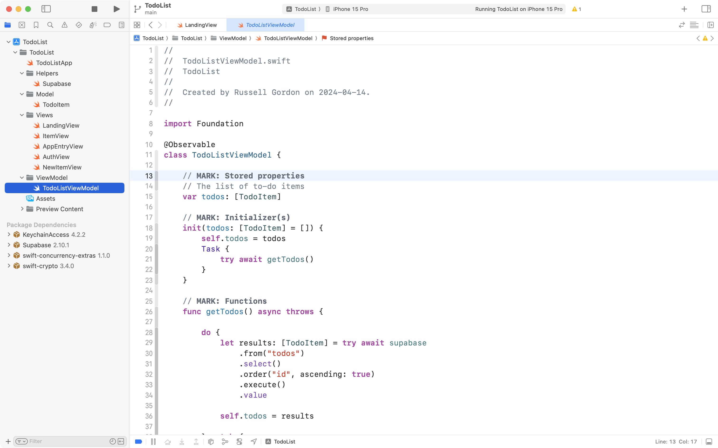
Add the following stored property:
// Track when to-do items are initially being fetched
var fetchingTodos: Bool = false
… like this:
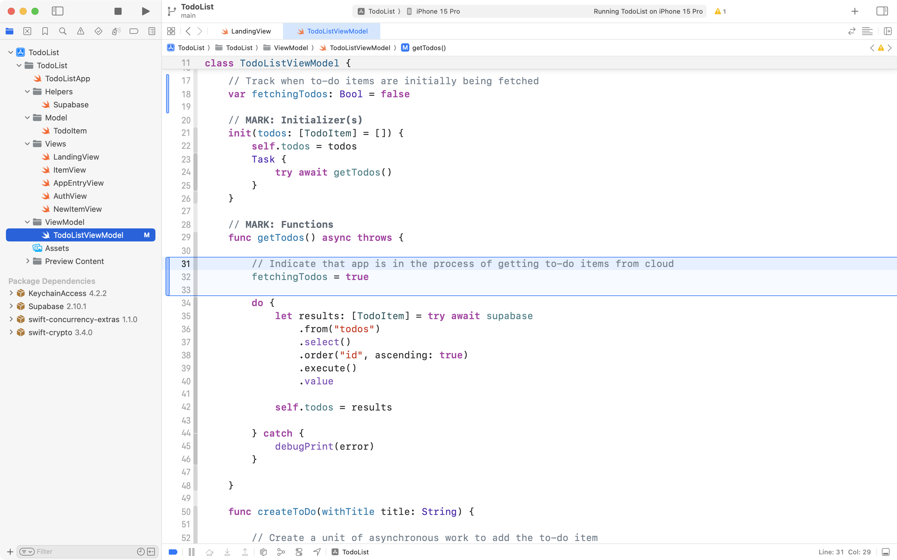
Then scroll down a bit further to the getTodos function:
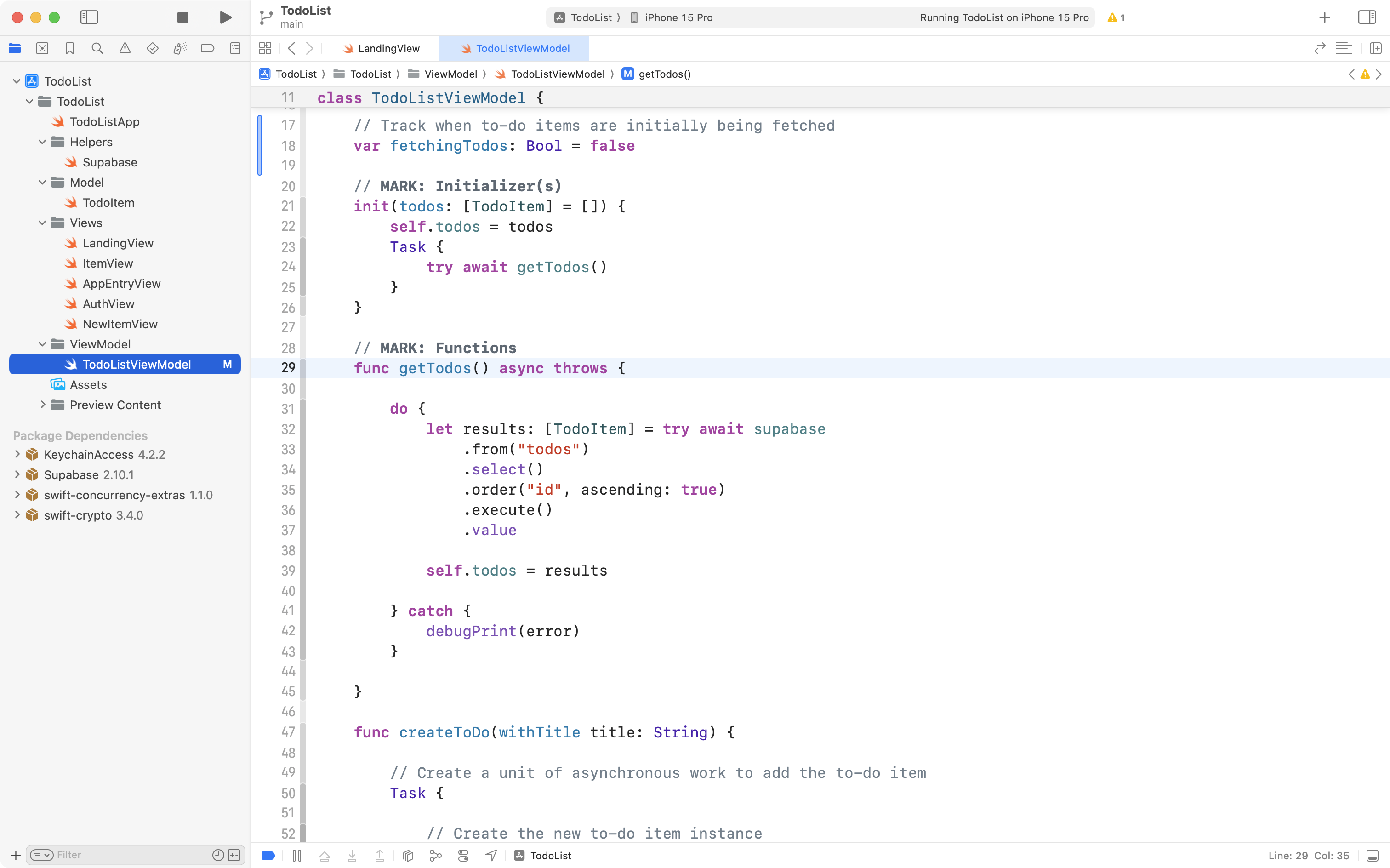
When the function begins, we need to use the new stored property – we’ll change it’s value to true to reflect the fact that to-do items are being fetched:
When the function has finished the asynchronous task of fetching to-do items from the cloud-hosted database, we can set this stored property back to false:
Adjust the view
In LandingView, replace this code:
… with the following code instead:
if viewModel.fetchingTodos {

	Spacer()

	ProgressView()

	Spacer()

} else {

	ContentUnavailableView(
		"No to-do items",
		systemImage: "pencil.tip.crop.circle.badge.plus",
		description: Text("Add a reminder to get started")
	)

}
… like this:
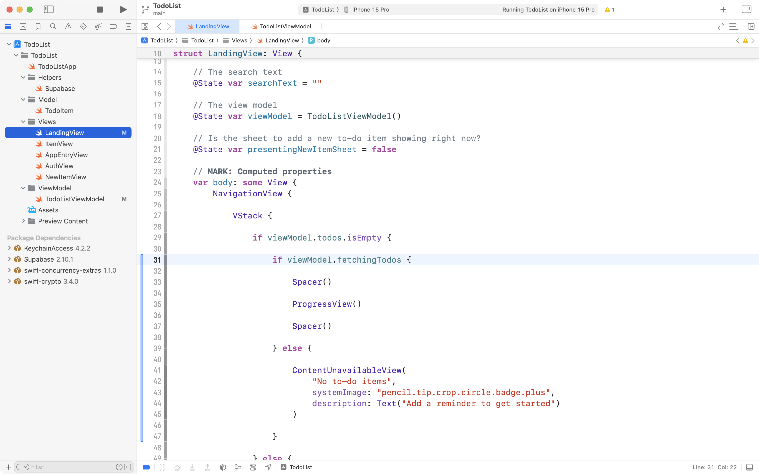
If needed, press Command-A and then Control-I to re-indent your code and keep it tidy.
Overall now – we first look for when the todos array is empty:
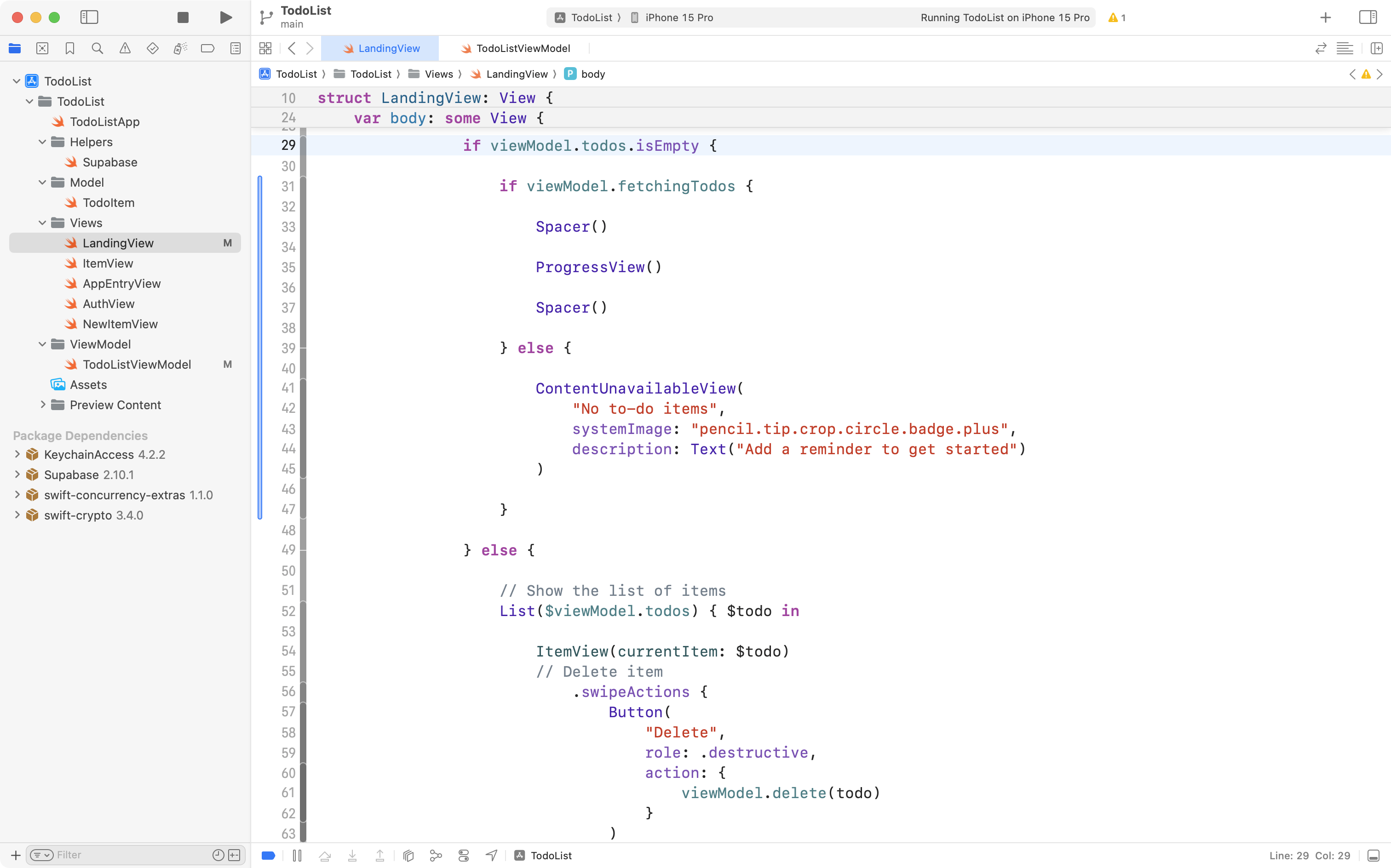
We then do an additional check to see whether to-do items are being fetched:
When that is true and to-do items are being fetched, a loading indicator will be shown.
When that is false and there truly are no to-do items (because we have finished fetching items and no to-do items were loaded) we show ContentUnavailableView.
Here is what the new behaviour looks like:
When there is a fast Internet connection, this progress indicator only appears very briefly, but it is there:
Touches like these are an important part of building a usable application.
So, please commit and push your work with this message now:
Added a flag to differentiate between state of having no to-do items and waiting to fetch to-do items.
This concludes the series of usability improvements we will make for today.
In the optional portion of this tutorial to come in our next class, you can learn how to attach an image to a to-do item and how to store those images in the cloud with Supabase.