The purpose of this lesson is to learn a little more about laying out a user interface with SwiftUI by reproducing the Stopwatch app on iOS.
It’s common in the art world to hone your skills by reproducing illustrations or artwork made by others. We can do the same with software!
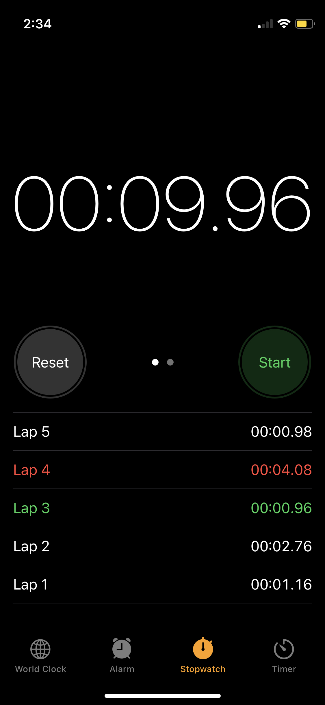
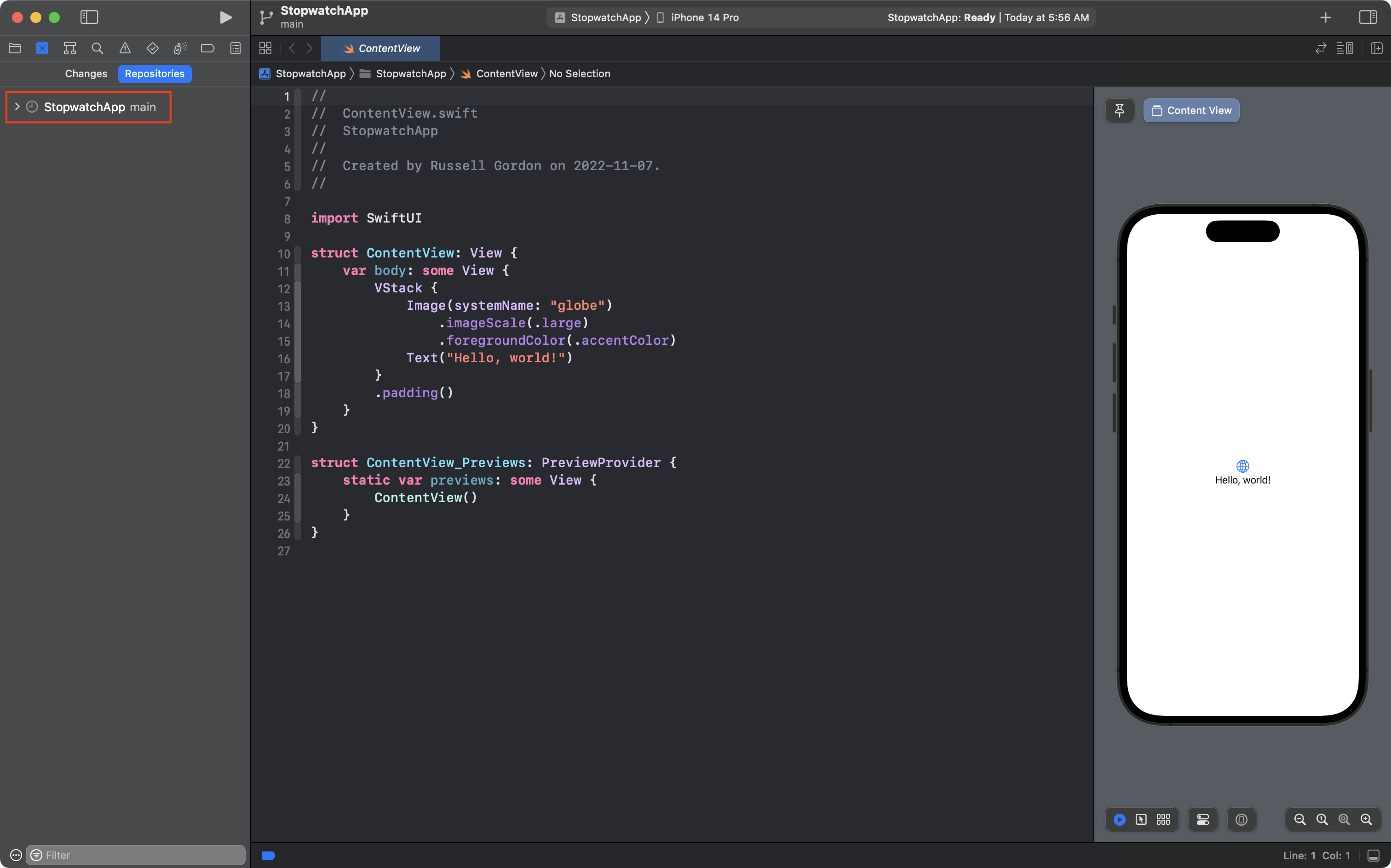
Here is the user interface we’ll reproduce today:
As you complete this lesson you will learn to:
- combine
HStack,VStack, andZStackstructures to express a layout - write custom structures to avoid repetitive code
- use color sets in Xcode and the Digital Color Meter app to manage color
- format a
Liststructure - use a
TabViewstructure
Let’s get started!
Xcode 15 vs. Xcode 14
This tutorial series was written a year ago using Xcode 14.
It is designed to guide you through creating a real user interface, step by step, and so, it contains many screenshots and animations.
Updating the tutorial to include all-new screenshots would be a large undertaking.
Only minor things are different between Xcode 14 and Xcode 15:
- When you see references to the iPhone 14 series simulators, you can use iPhone 15 series simulators instead – everything will work the same way
- The code to show a preview in Xcode 15 is much shorter.
Here is what the code to show a preview looks like in Xcode 14:
struct ContentView_Previews: PreviewProvider {
	static var previews: some View {
		ContentView()
	}
}
Here is what the code to show a preview looks like in Xcode 15:
#Preview {
    ContentView()
}
Just be aware that the this part of the code in your project will look a little different than what you see in the screenshots and animations.
Creating the project
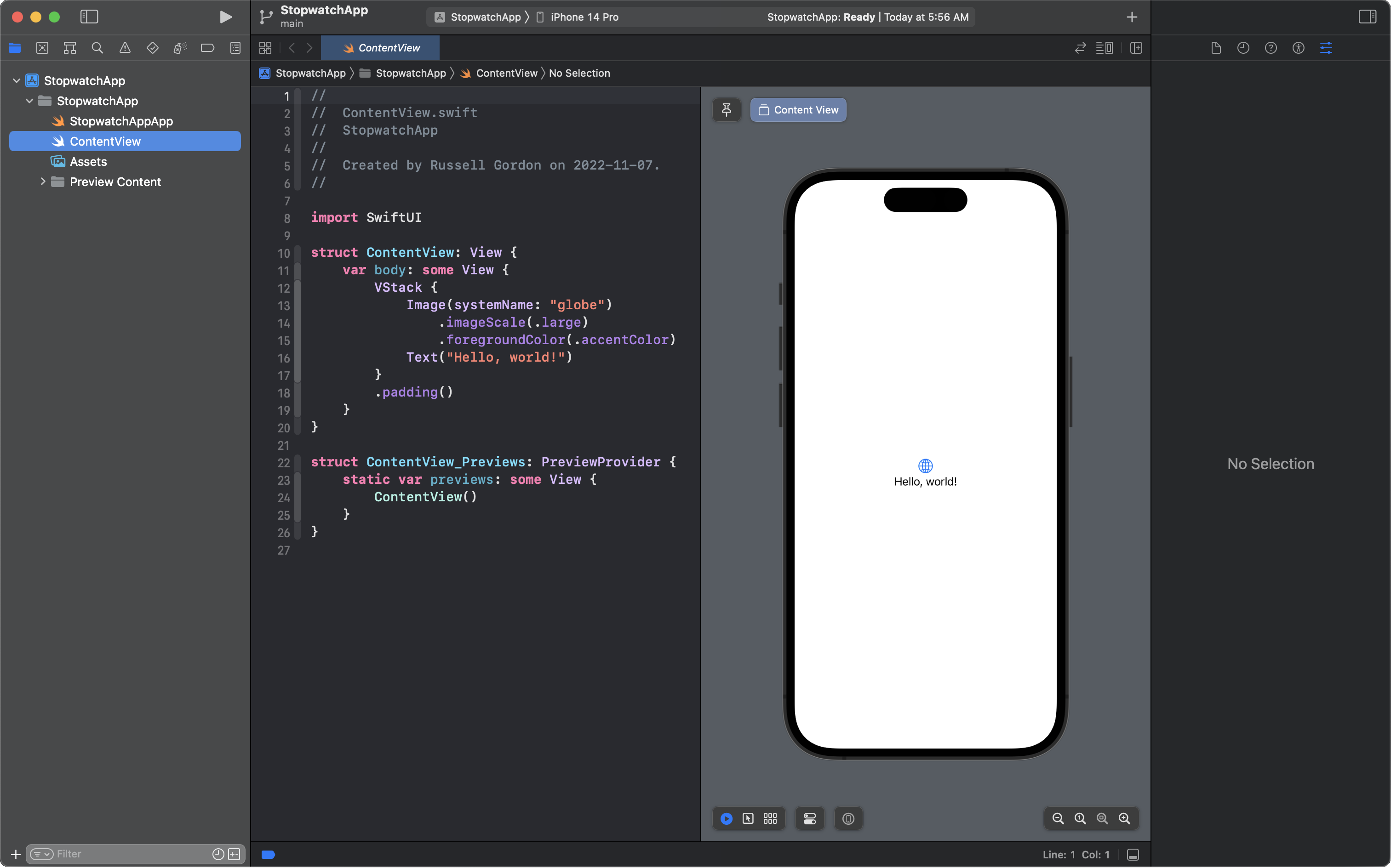
Create a new iOS project in Xcode named StopwatchApp.
When you’re done, this is what you should have:
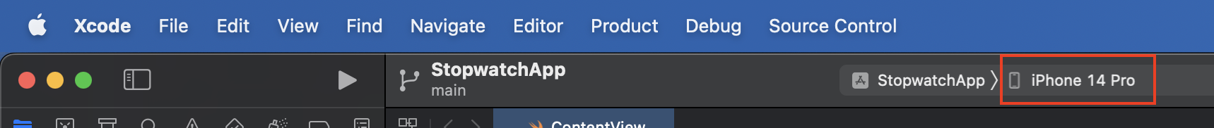
Make sure that have selected iPhone 14 Pro as the device to preview upon:
In a future lesson you’ll learn how to make layouts that work on devices of all sizes. For today, we’ll make a layout that works well on this device.
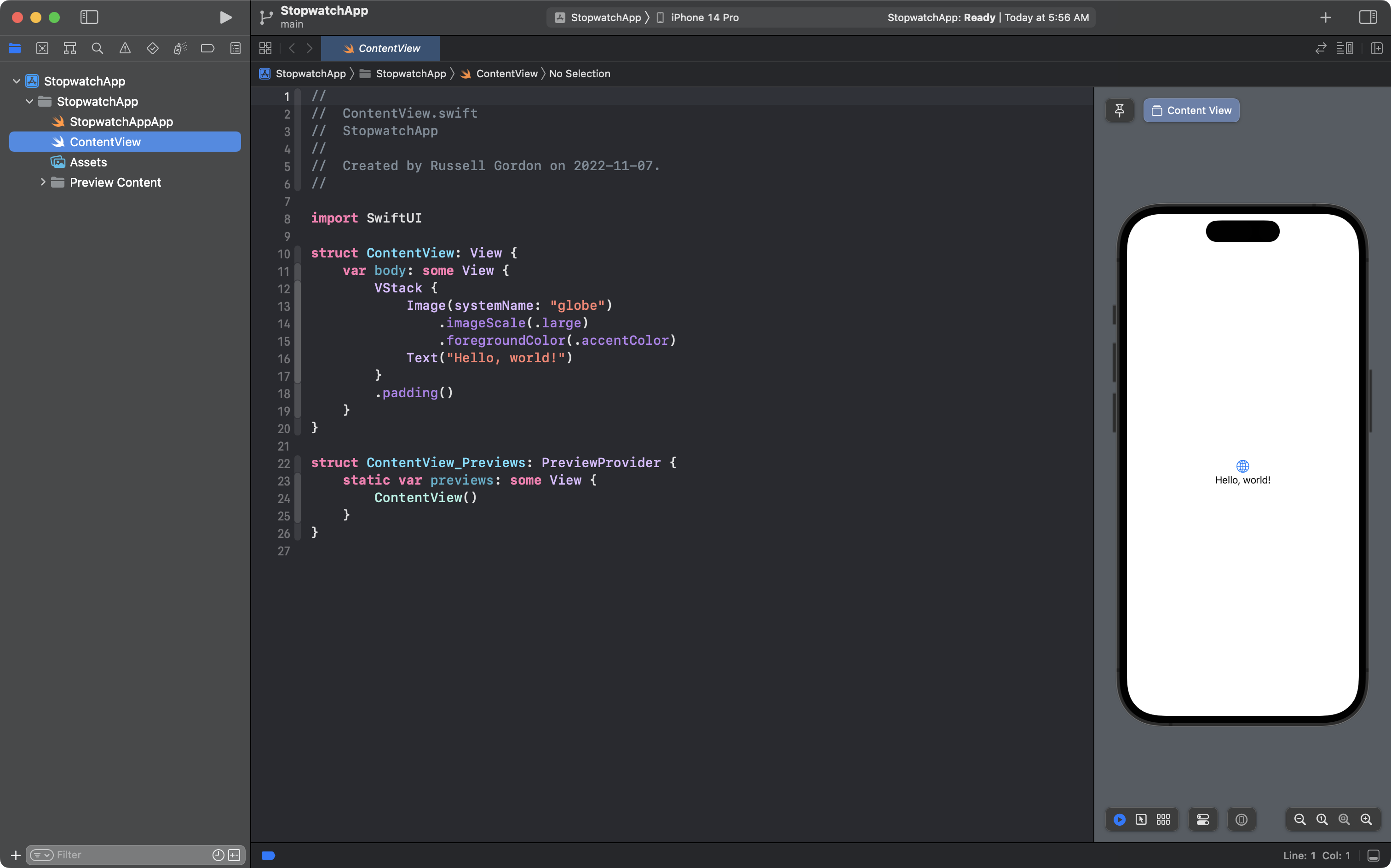
You can close the Inspector panel at right using Option-Command-0 and resize the code editor a bit:
Check source control
Double-check that you enabled source control by opening the Source Control navigator with Command-2 and then clicking the Repositories tab.
If you see this, all is well:
Create a remote, if necessary
If you don’t see a local repository named StopwatchApp you can create it using the menu sequence Integrate → New Git Repository. In the dialog box that appears, accept the default suggestion for the repository name and press the Create button.
Finally, we want to be able to push our commits to a remote.
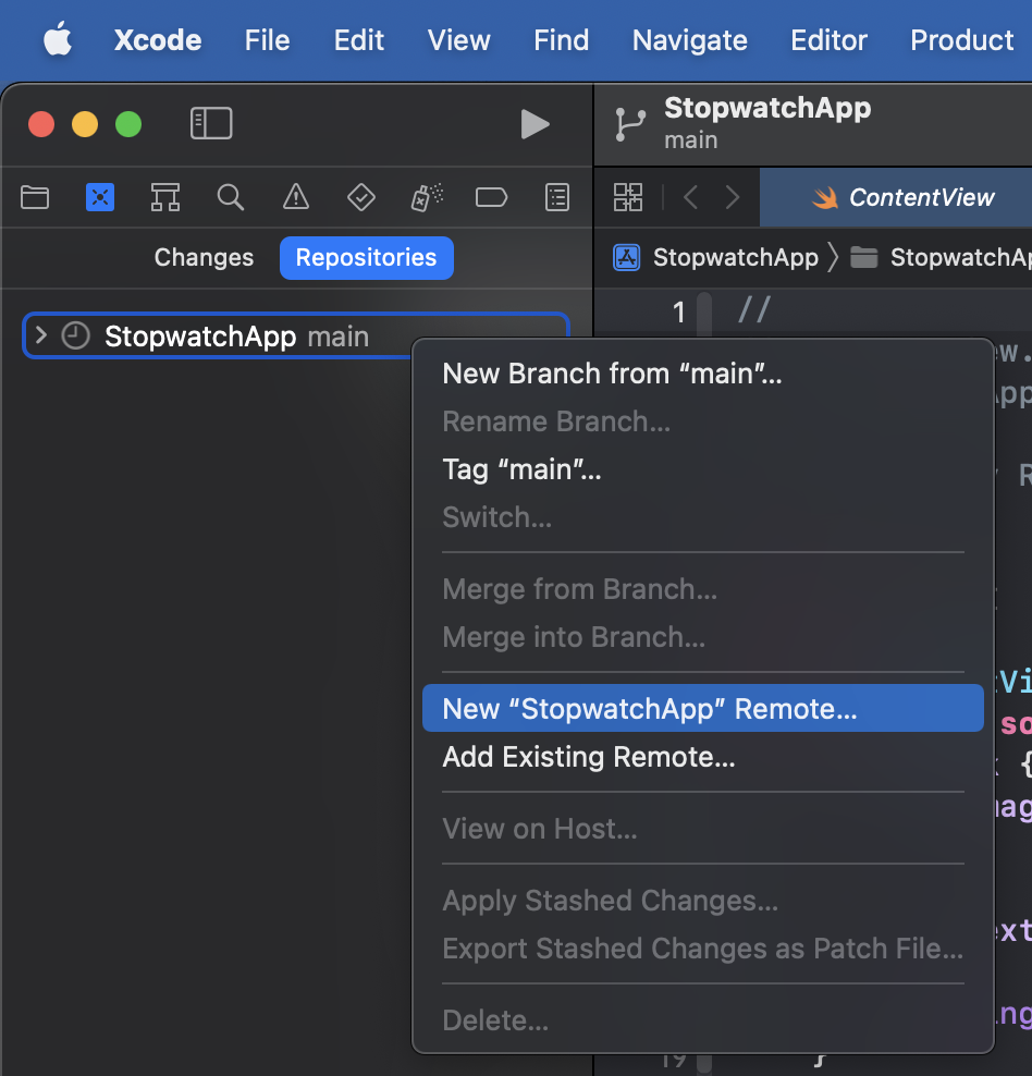
Create a remote by control-clicking the StopwatchApp local repository, and choosing New “StopwatchApp” Remote…
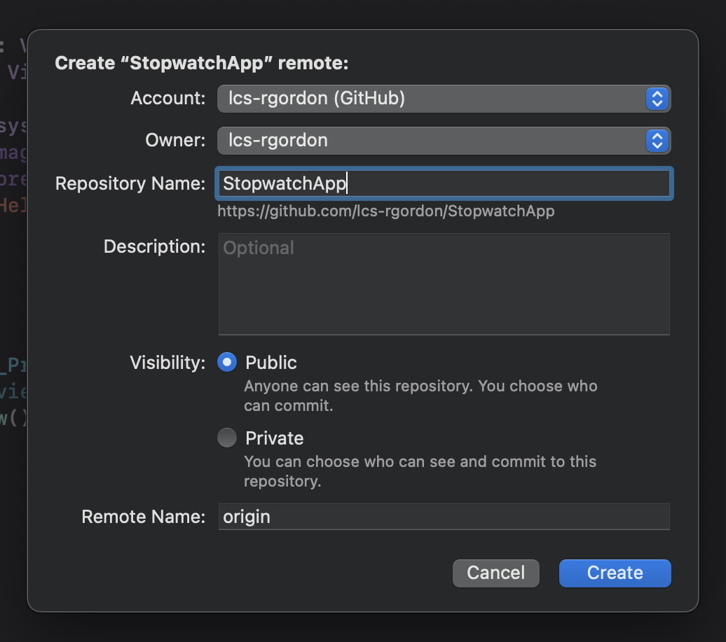
Accept the default options presented in the dialog box that appears, and press the Create button:
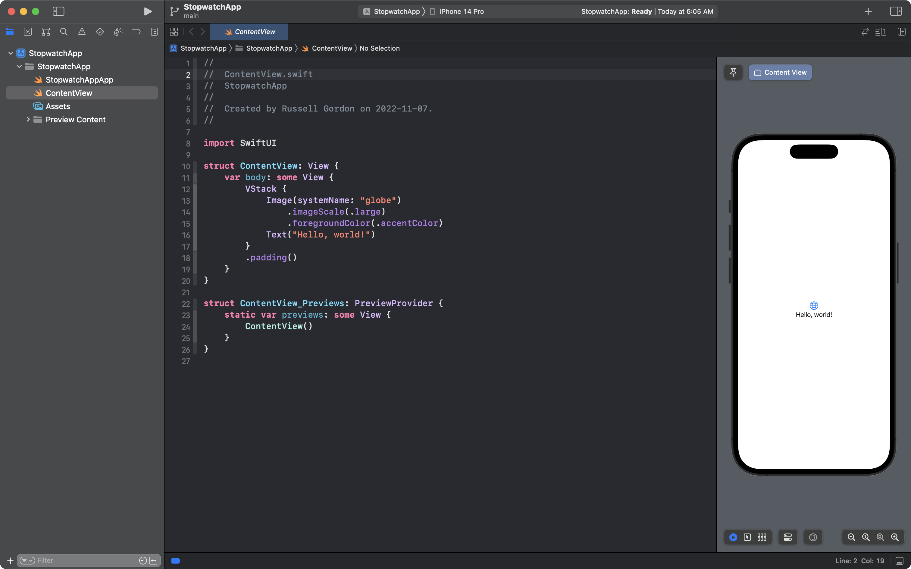
Then press Command-1 to open the Project navigator again:
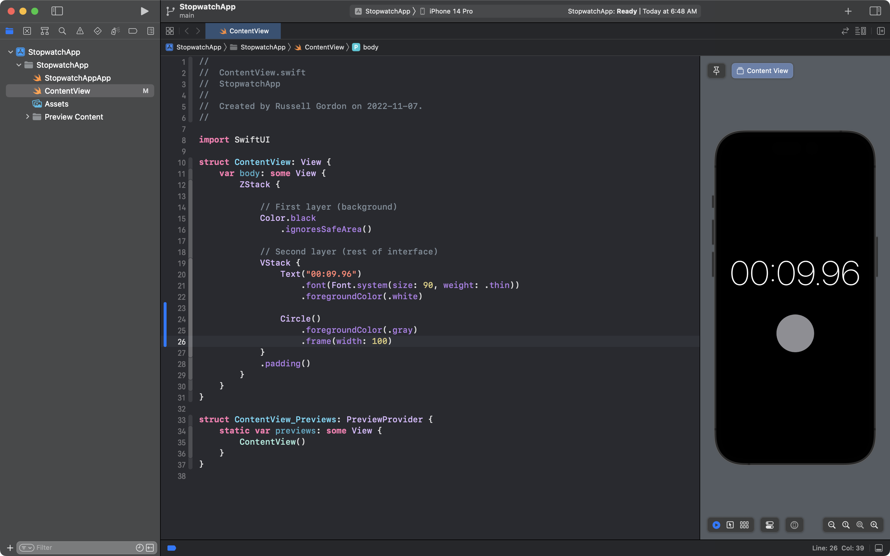
Background colour
The Clock app on iOS is a rare app that always appears with a black background, regardless of whether the users’s device is in light or dark mode.
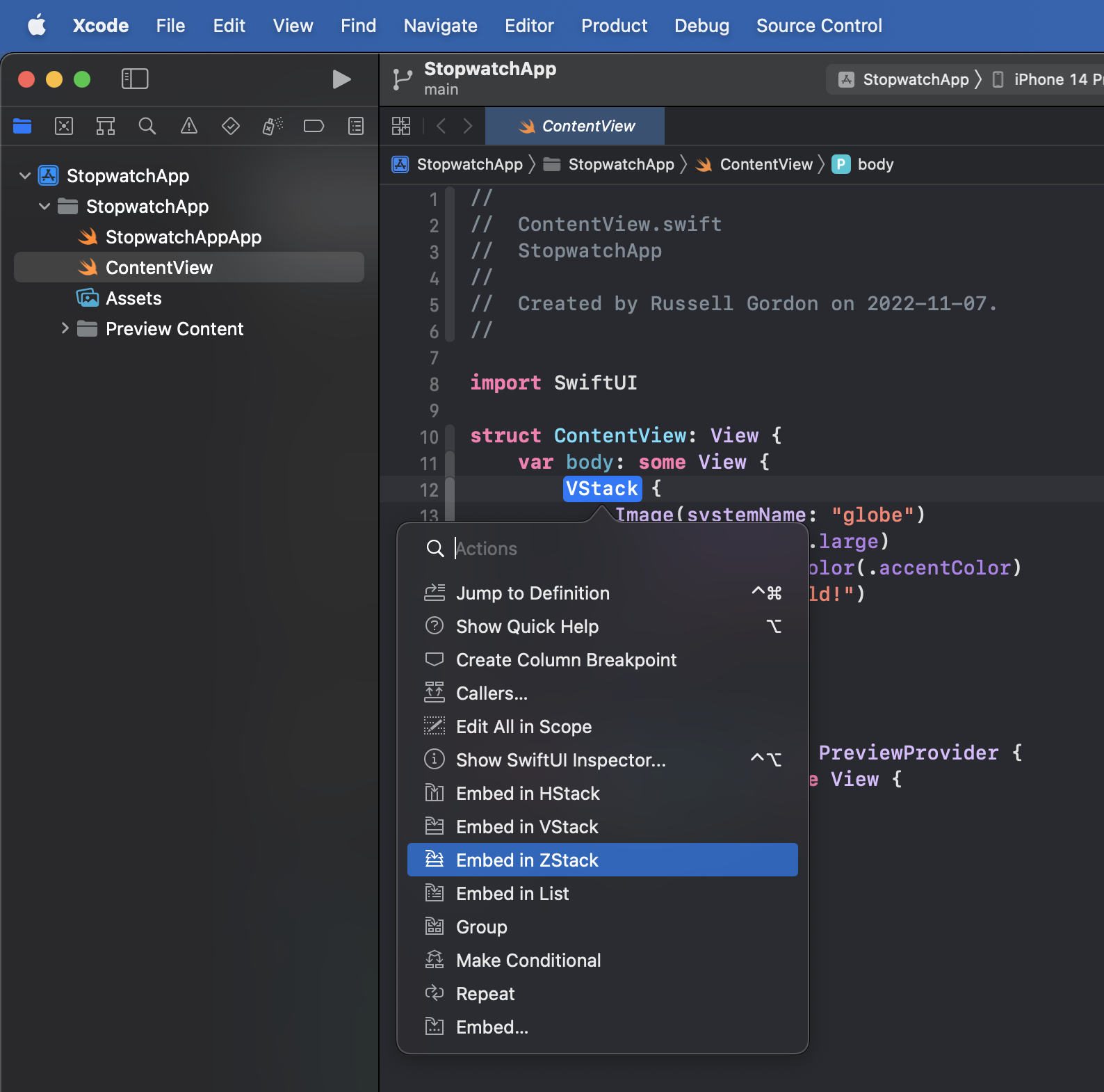
To make the background black, we’ll use a depth stack or ZStack structure.
The first layer will be the background with the rest of the user interface sitting on top.
Hold the Command key down on your keyboard, then click the existing VStack on line 12.
From the menu that appears, choose Embed in ZStack:
Then, within the ZStack, after line 12, add the comments and code shown from lines 13 to 17 in this screenshot:
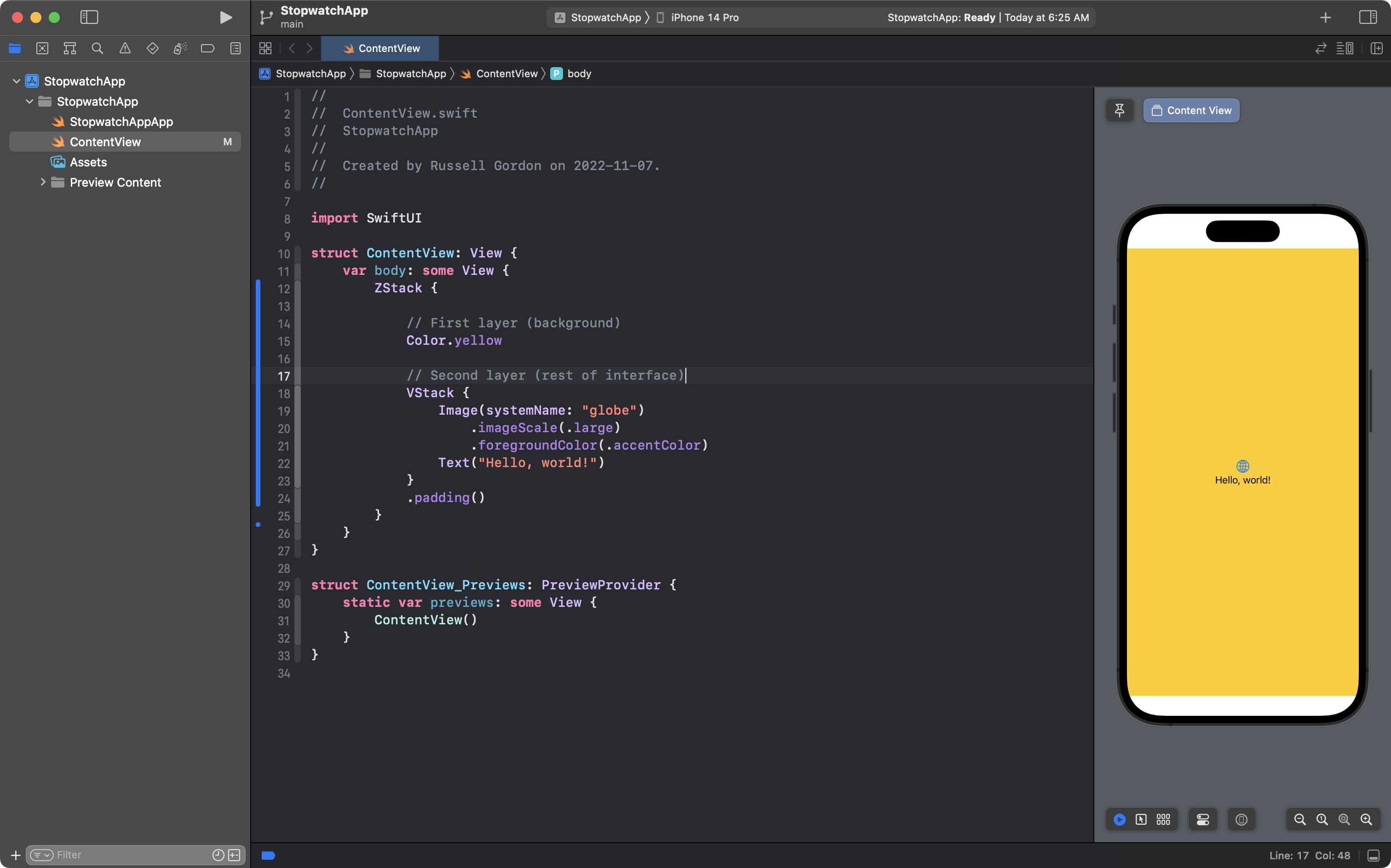
Of course, the interface won’t remain yellow forever, but for now, that color allows us to easily see the rest of the interface that sits on top, in the second layer of the ZStack.
The Color structure on line 15 conforms to the View protocol, and is a “push-out” view (see page 47 of SwiftUI Views Quick Start) so the yellow color expands to fill almost all of the available space.
What remains is called the “safe area” and this is not normally an area of a device’s interface where a developer would want to add user interface elements.
This is because the safe area is the part of a device’s screen where the operating system places information, such as the time, the strength of the cellular and WiFi signals, the battery power remaining, and so on.
In this case, we just want a background color to extend into the safe area – we are not adding user interface elements that would conflict with those provided by the operating system.
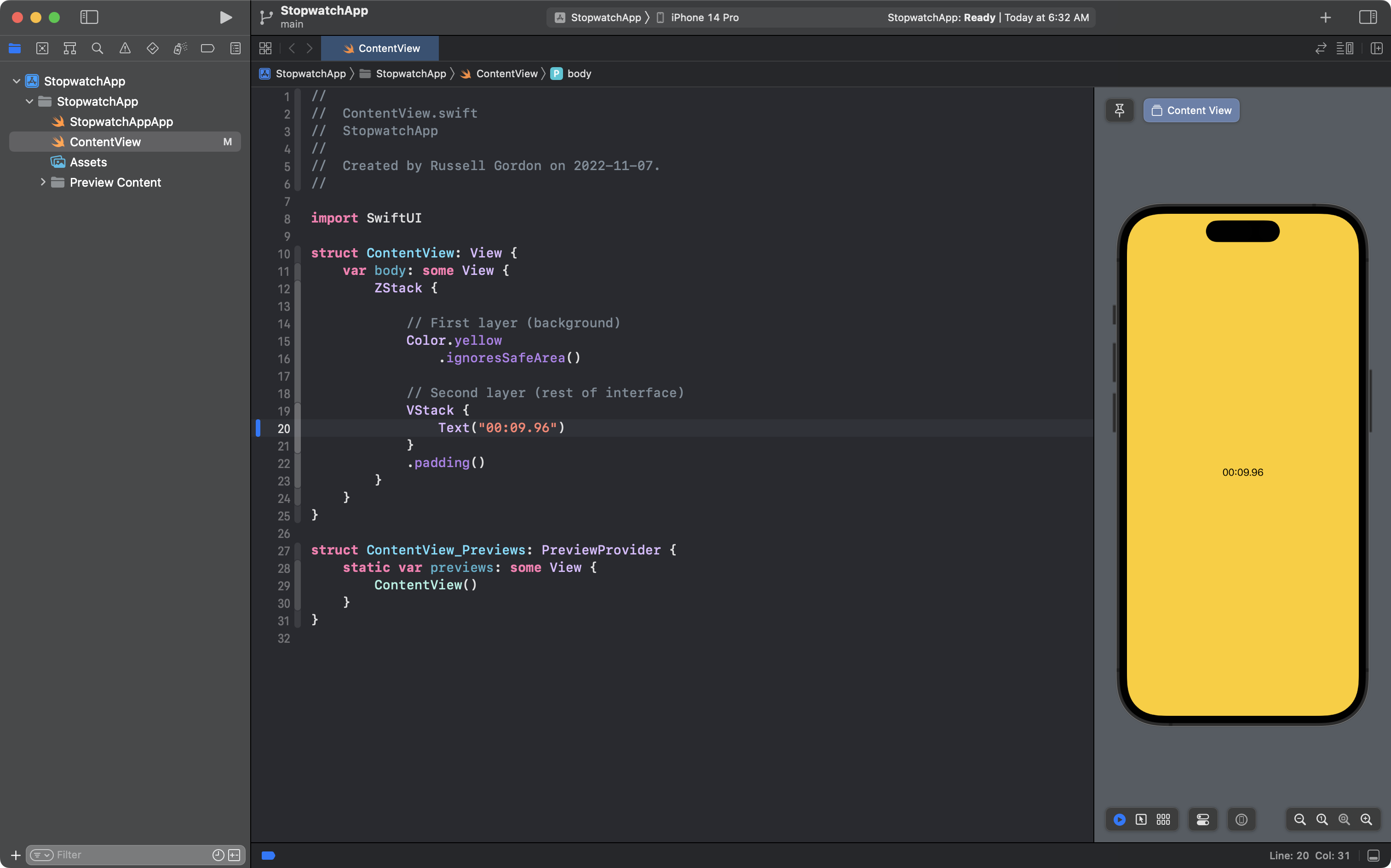
To extend the background color into the safe area, add the view modifier .ignoresSafeArea() to line 16:

The first step of this lesson is complete.
Commit and push your work using Option-Command-C and use the commit message:
Made the background color.
Showing the time
A stopwatch counts up from zero and the current time is the most prominent part of the user interface.
Let’s create that now.
Change the contents of the VStack as follows:
TIP
If necessary, you can restart the preview window by using the keyboard shortcut
Option-Command-P.
The iOS Fonts website is a useful resource for seeing what typefaces can be used to render text in an app. This article by Kelvin Tan also explains a lot about how to format Text views.
However, in the Stopwatch pane of the Clock app the time is shown using a thin weight variant of the SF Pro font, which is the default or system font on iOS. There is no need for a custom font.
Begin by adding the .font view modifier on line 21, and you’ll notice that the placeholder indicates a structure of type Font is expected:
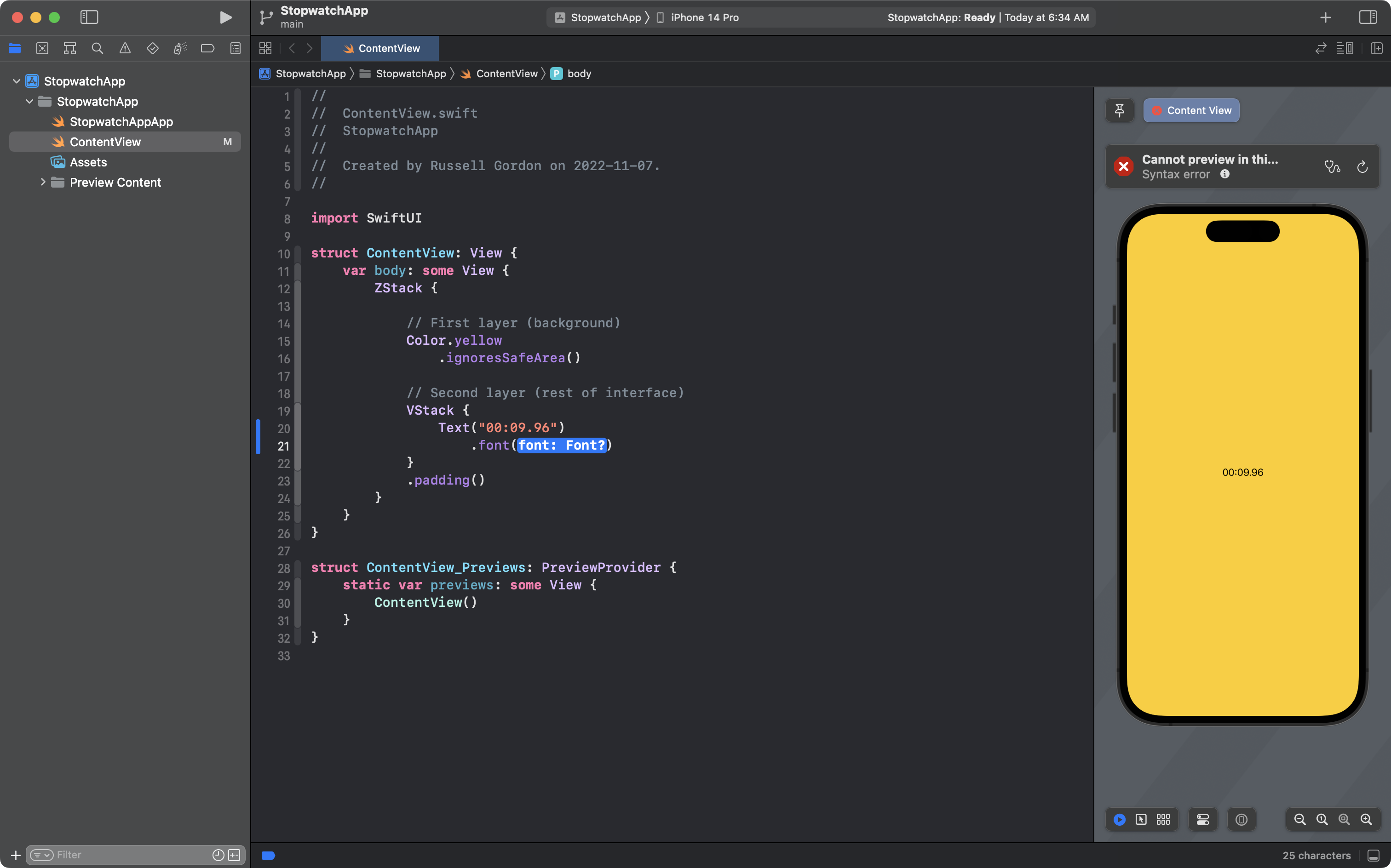
With the placeholder highlighted, press the Return key on your keyboard, remove the question mark that appears, press the . key, and then choose the following option in the autocomplete:
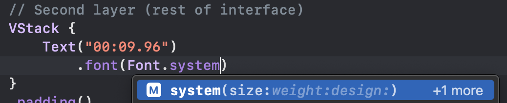
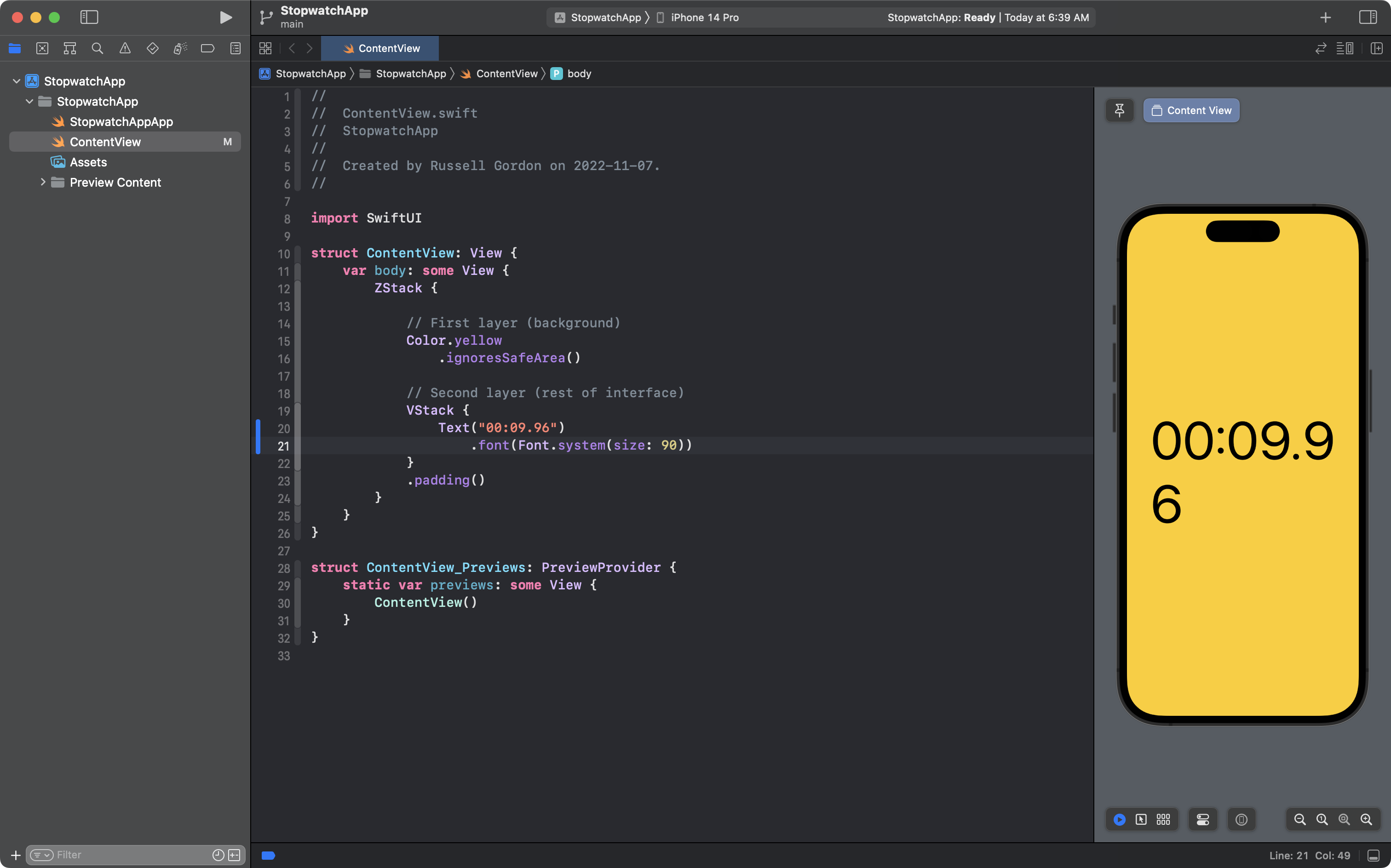
Indicate a size of 90 and we are close to our goal:
Add the weight parameter and provide an argument of .thin:
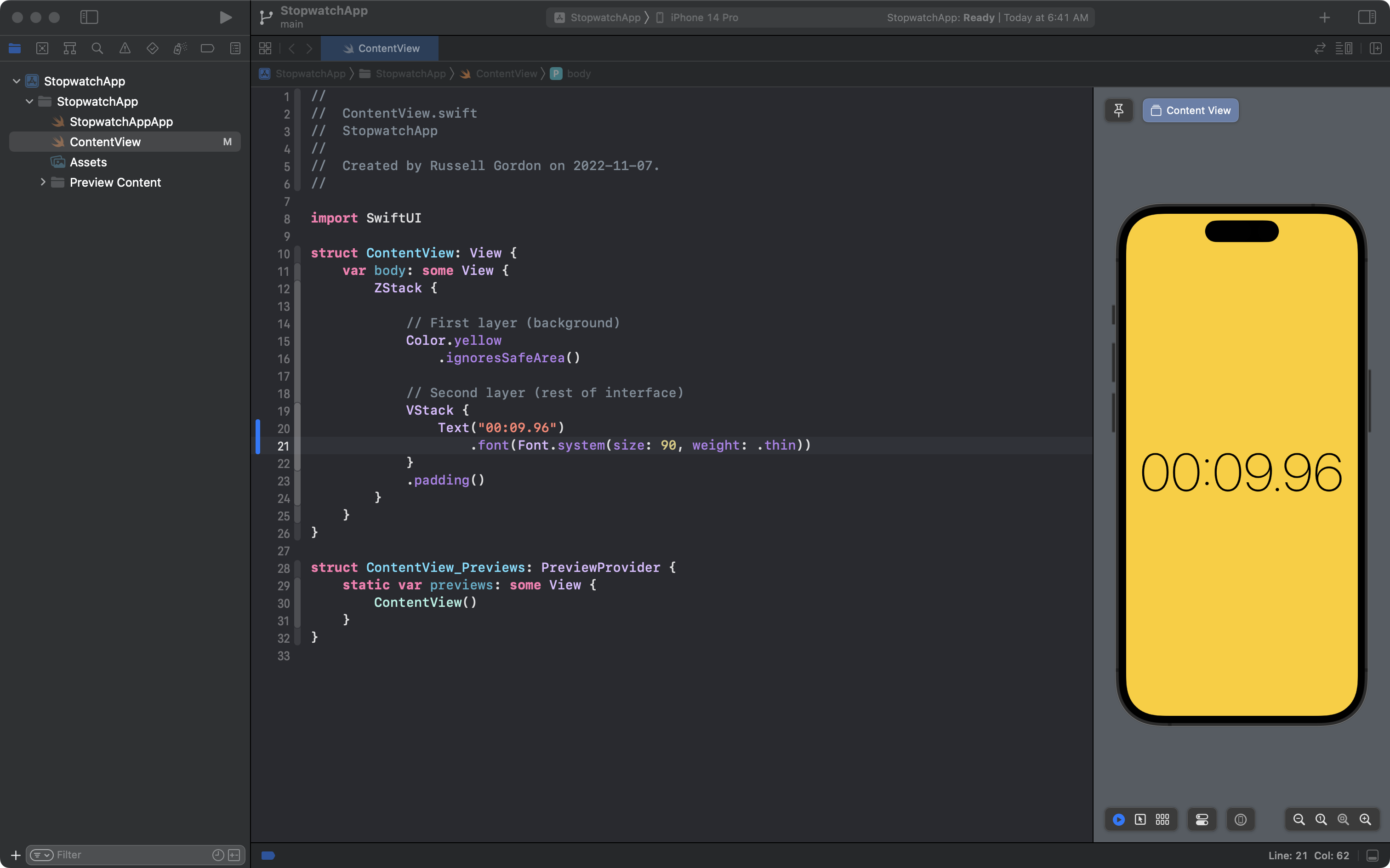
Better!
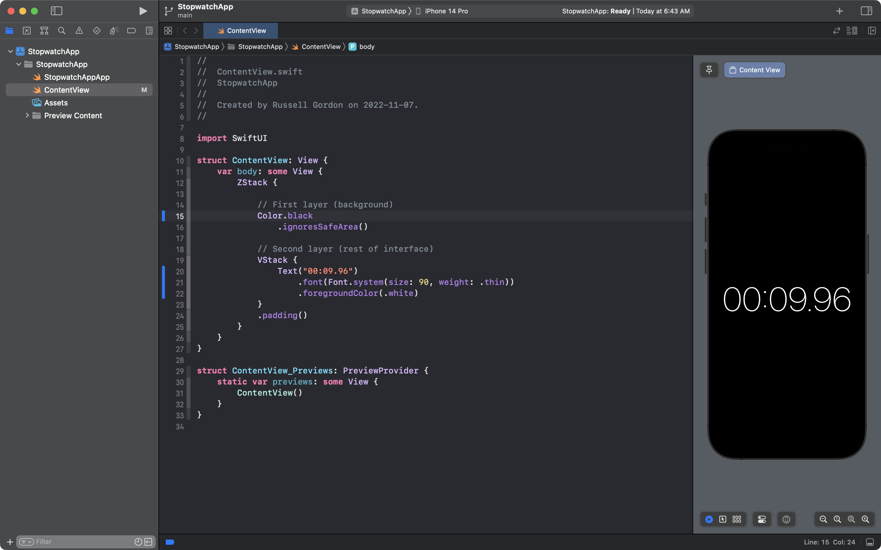
Let’s adjust the colours – first, change the foreground color of the time to white on line 22:

Finally, change the background color on line 15 to black:
This is good progress, so commit and push your work using Option-Command-C with this commit message:
Got the typeface for the time and the colours set up.
Creating the buttons
Next we’ll focus on creating the form of the circular buttons, leaving the precise colors for a later section of this lesson.
Look closely at our goal:
Can you imagine those buttons as a series of overlapping circles, with progressively smaller diameters?
This is the approach we will take:
- Draw a larger grey circle
- Draw a somewhat smaller black circle
- Draw another grey circle, just a bit smaller
Then, we will add the text on top.
If you guessed that this will require a depth stack or ZStack, you are correct!
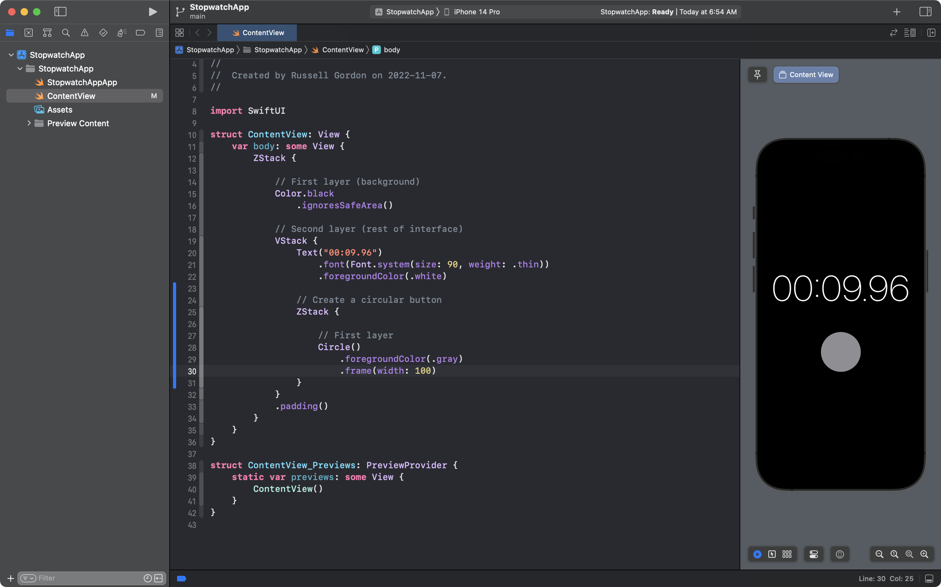
Within the VStack, add a Circle structure, with the view modifiers, as shown on lines 23 to 26:
The shade of grey is not quite dark enough, but we’ll fix that later. The size looks good!
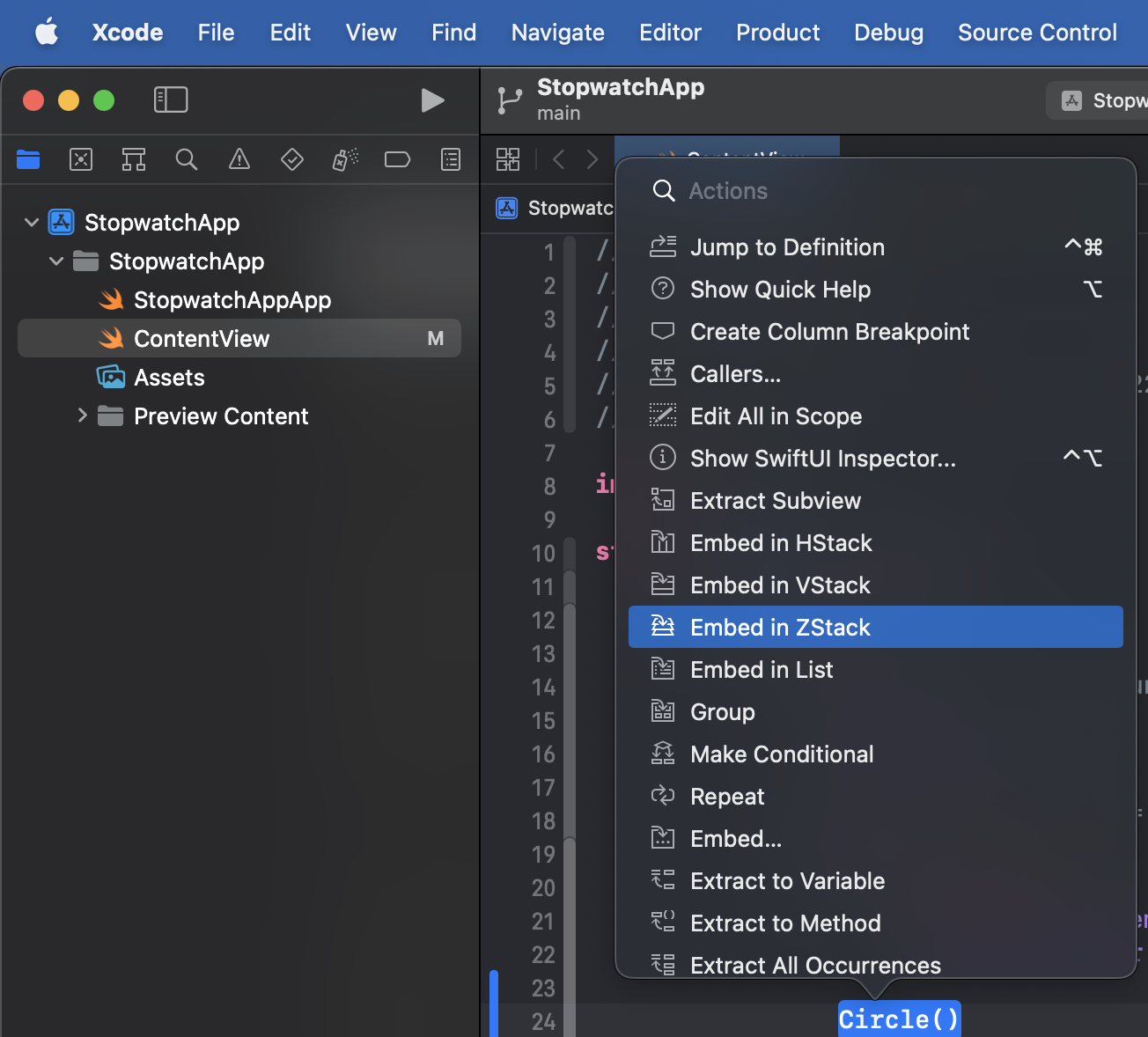
Now we need to embed that first circle in a ZStack, so Command-click the Circle structure and choose Embed in ZStack:
Then add comments, shown here on lines 24 and 27, to keep track of what’s happening:
Now, let’s add the second circle, this time in black, a bit smaller than the first – see lines 31 to 35:
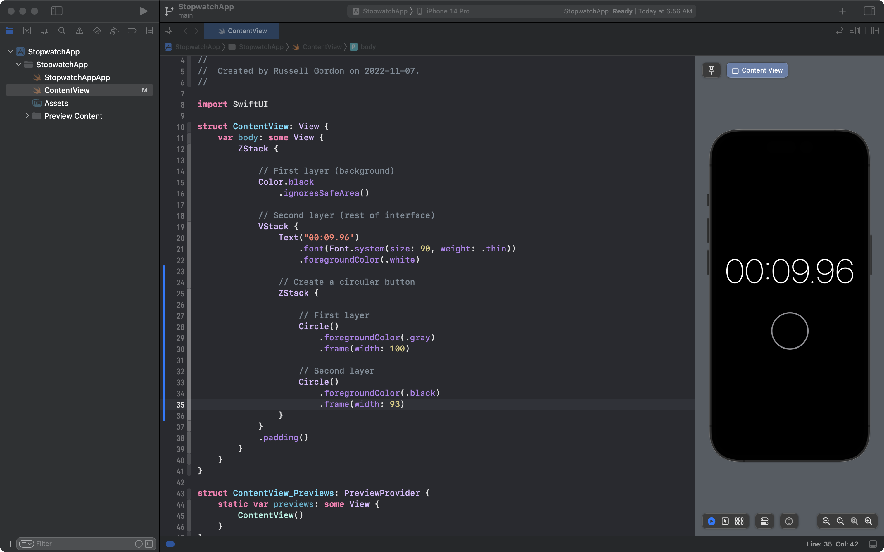
It’s a good idea to add the blank line on line 31 as it keeps the code describing our user interface from running together and becoming hard to read.
As you can see, the ZStack is doing it’s job – the second, smaller black circle sits on top of the larger grey circle in the layer behind it.
Add the third circle, shown here on lines 36 to 40:
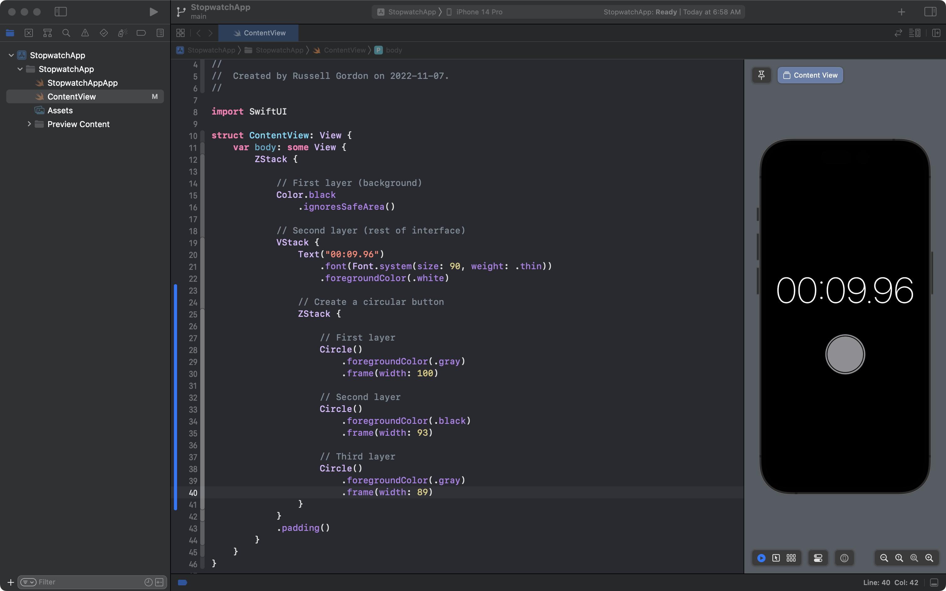
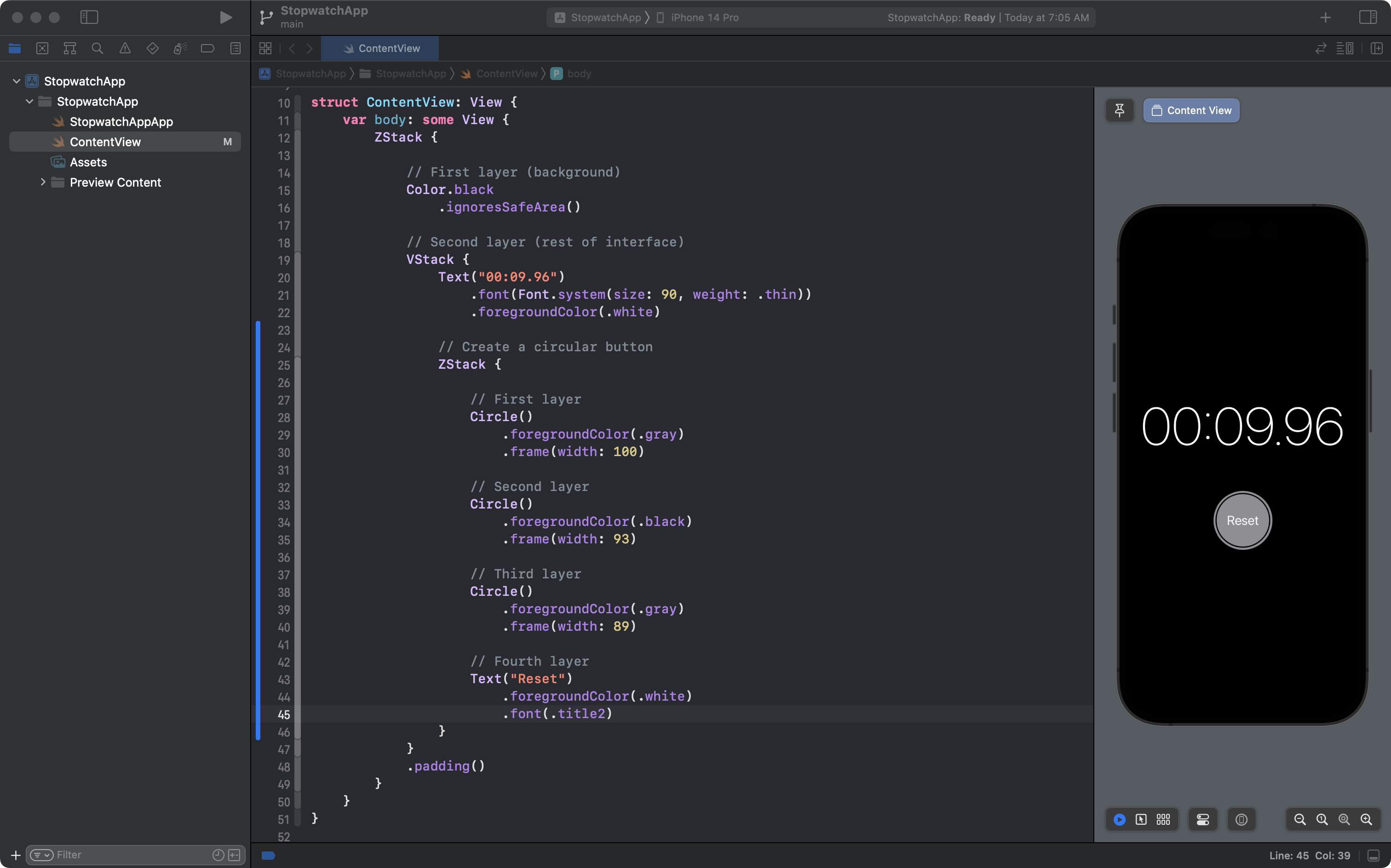
Finally, we can add the text as the fourth layer of the ZStack:
We have successfully described the form of the button!
This is good work, so let’s commit and push with this message:
Got the basic structure of the first circular button completed.
Creating a custom structure
At this point the code within ContentView is getting somewhat long:
And looking at our goal, we know that we need to essentially draw the same button again, just with different colors and text:
Remembering the acronym D.R.Y. – don’t repeat yourself – this is a good time to write a custom structure to create the buttons.
We can then just use our new structure from within ContentView whenever we need it.
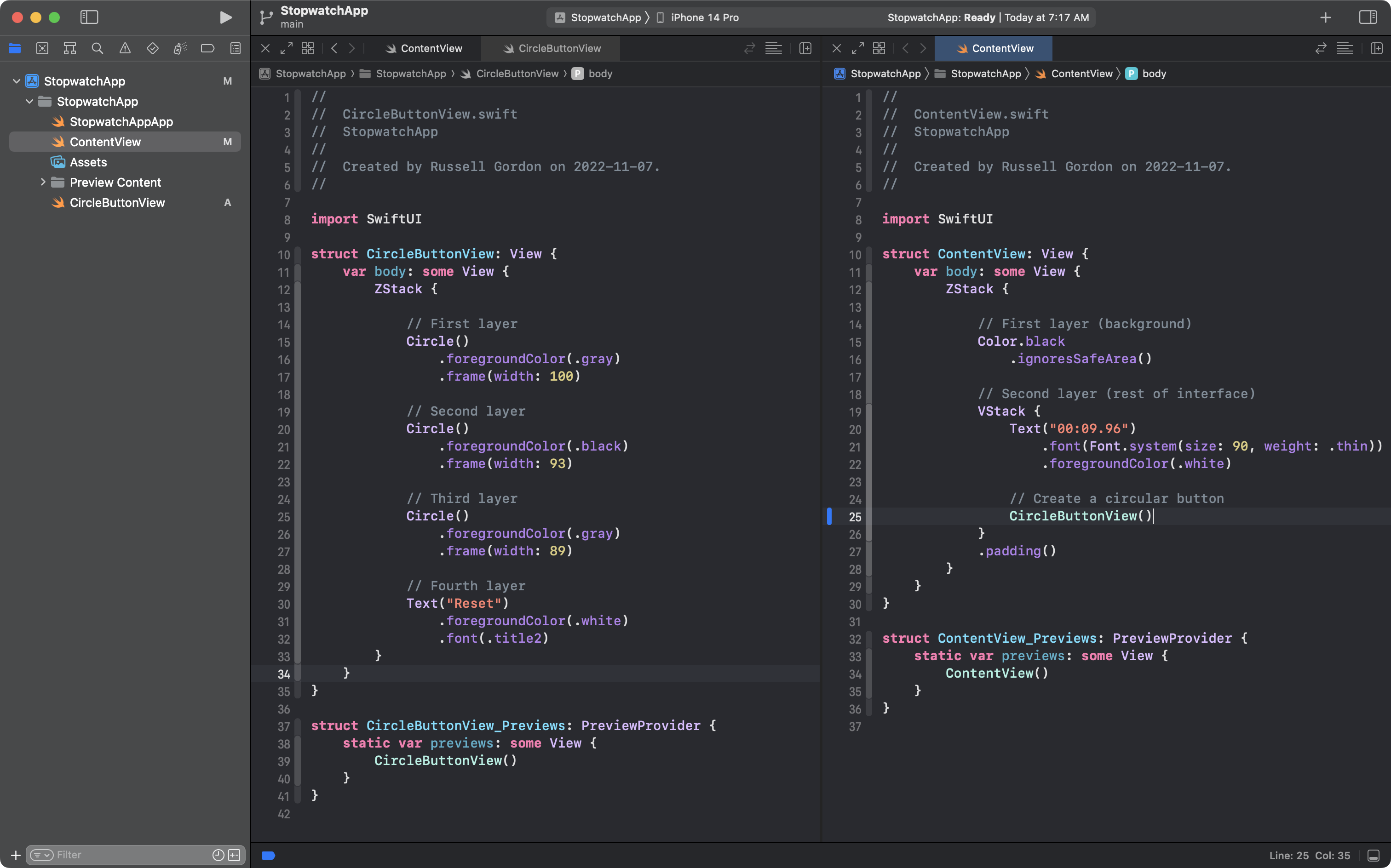
Set up a split screen in Xcode, and create a new file named CircleButtonView, like this:
Then, highlight lines 25 to 46 in ContentView on the right:
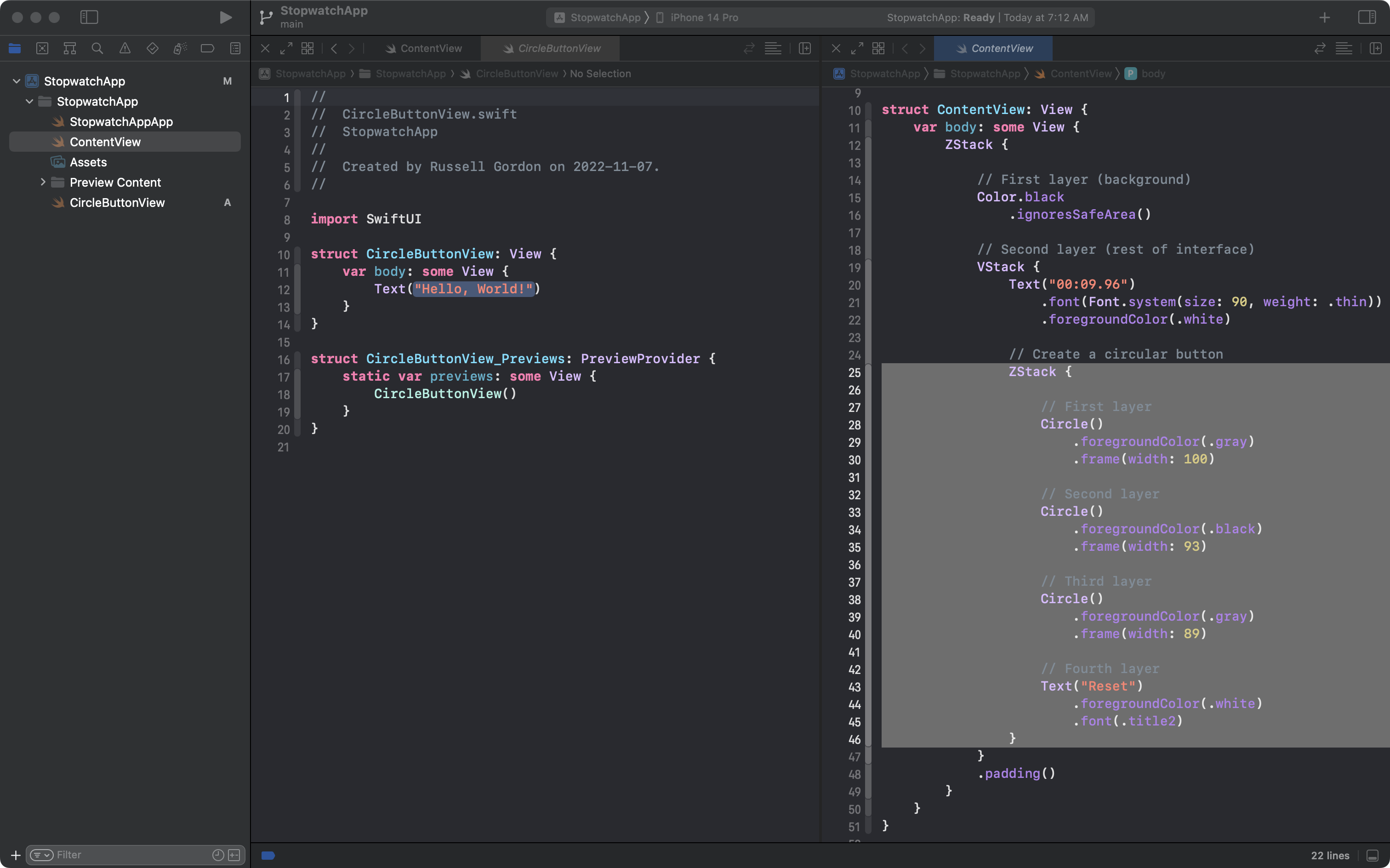
Press Command-X to cut those lines of code into your computer’s clipboard:
Next highlight line 12 in CircleButtonView on the left:
And press Command-V to paste the code into the file on the left:
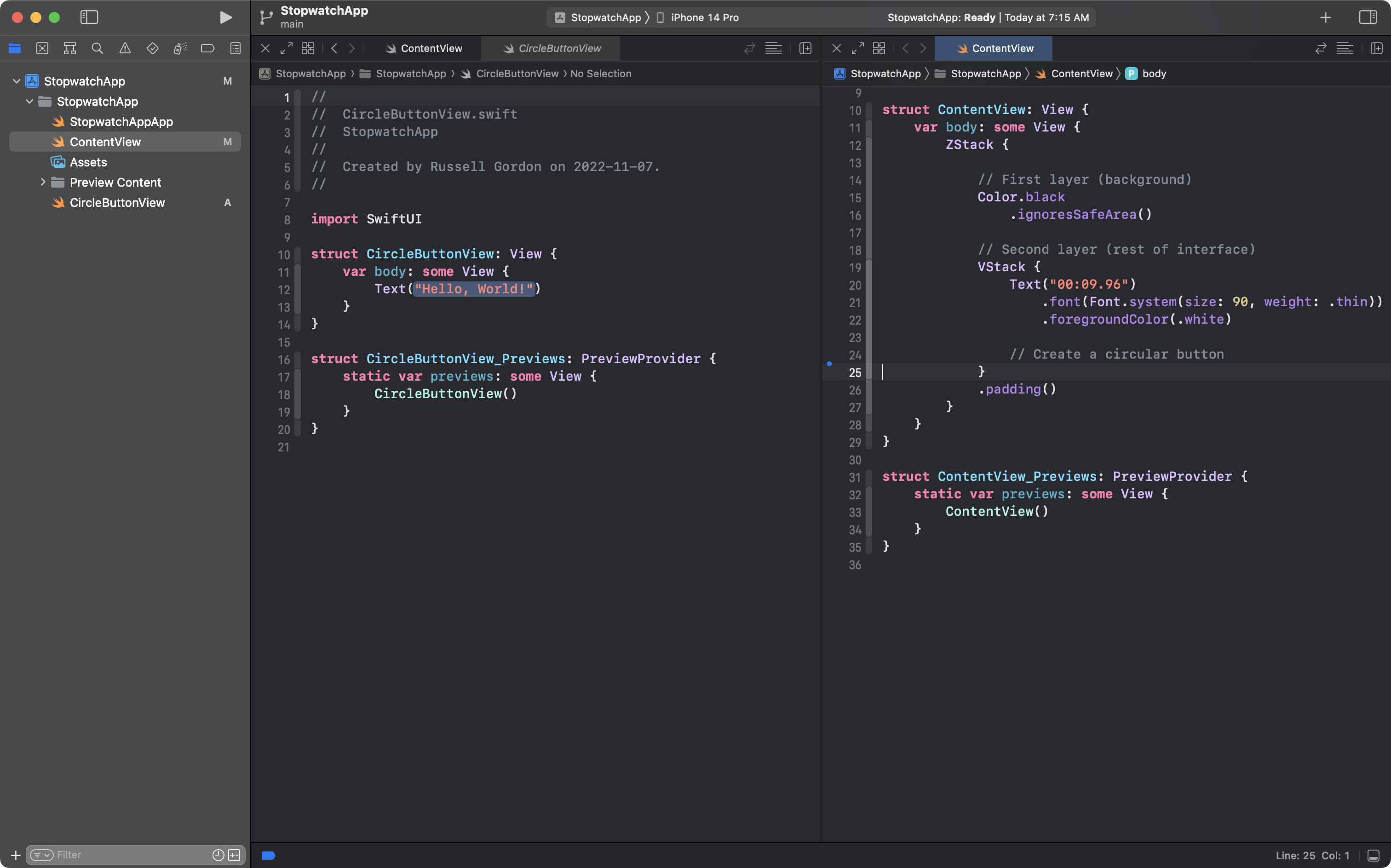
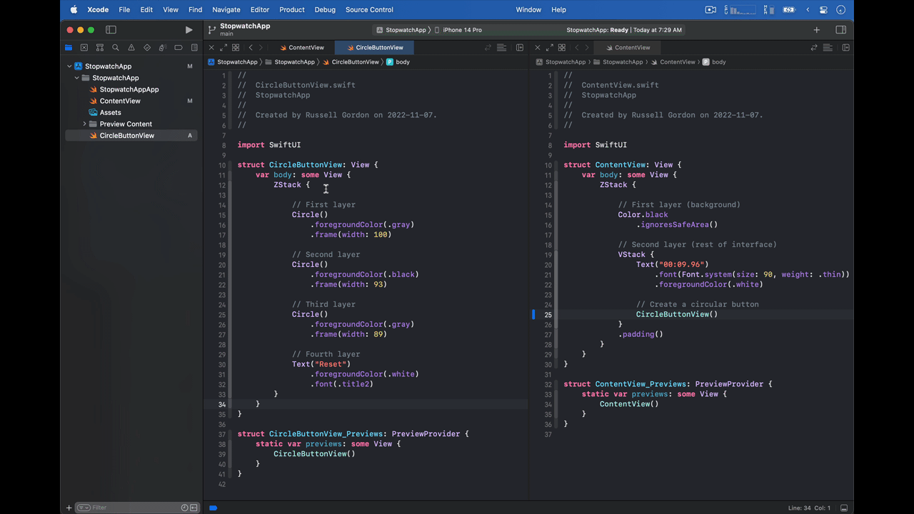
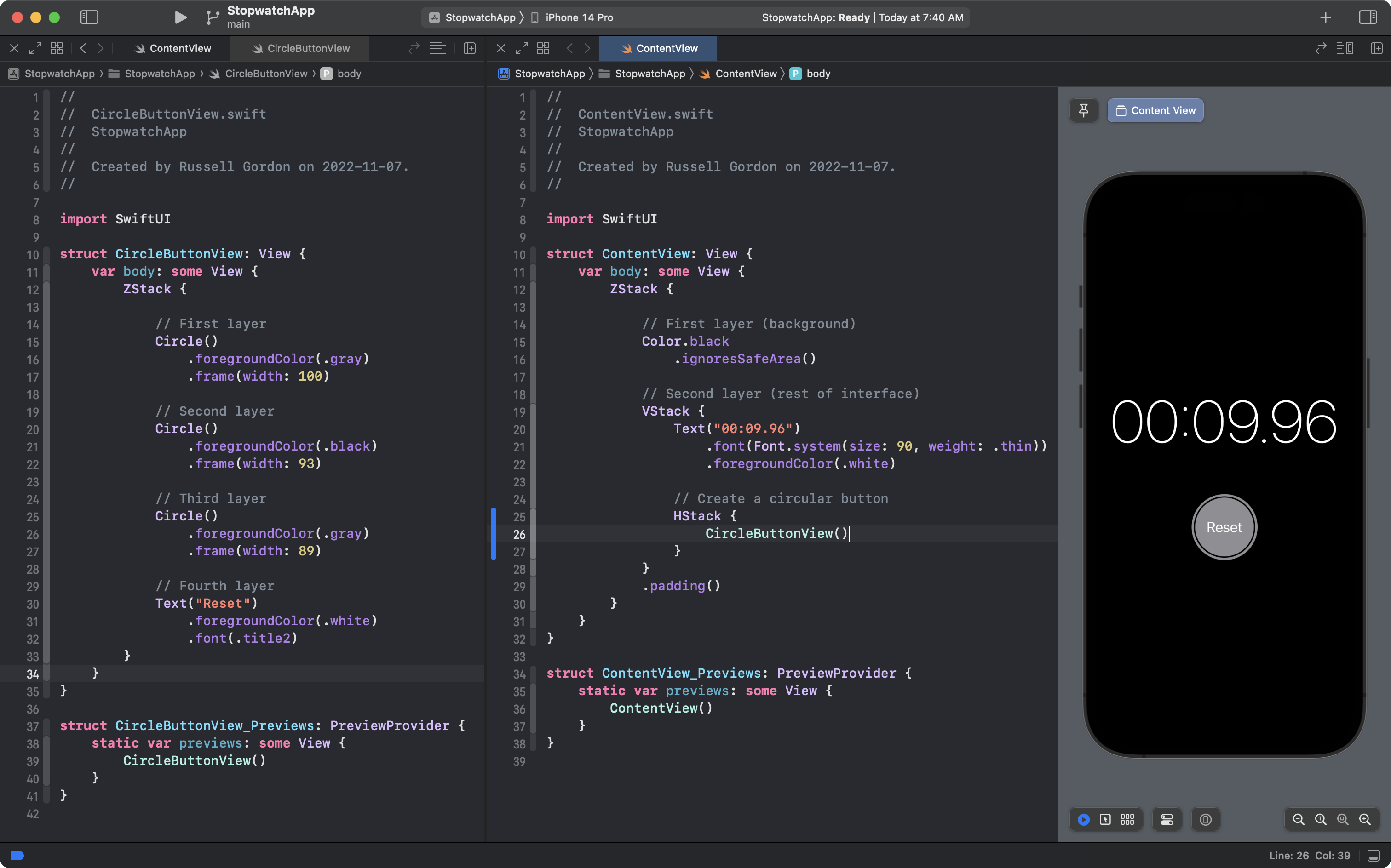
Finally, after the comment on line 24 in ContentView on the right, on line 25, create an instance of the CircleButtonView structure:
If all goes well, after hiding the Project Navigator on the left, and showing the Canvas on the right, the preview of the user interface should look identical, except the code in ContentView is a lot shorter than it was before:
It may not feel like this accomplished much, but it has – let’s commit and save this progress, using the message:
Created CircleButtonView as a helper to make ContentView shorter.
Making the custom structure more useful
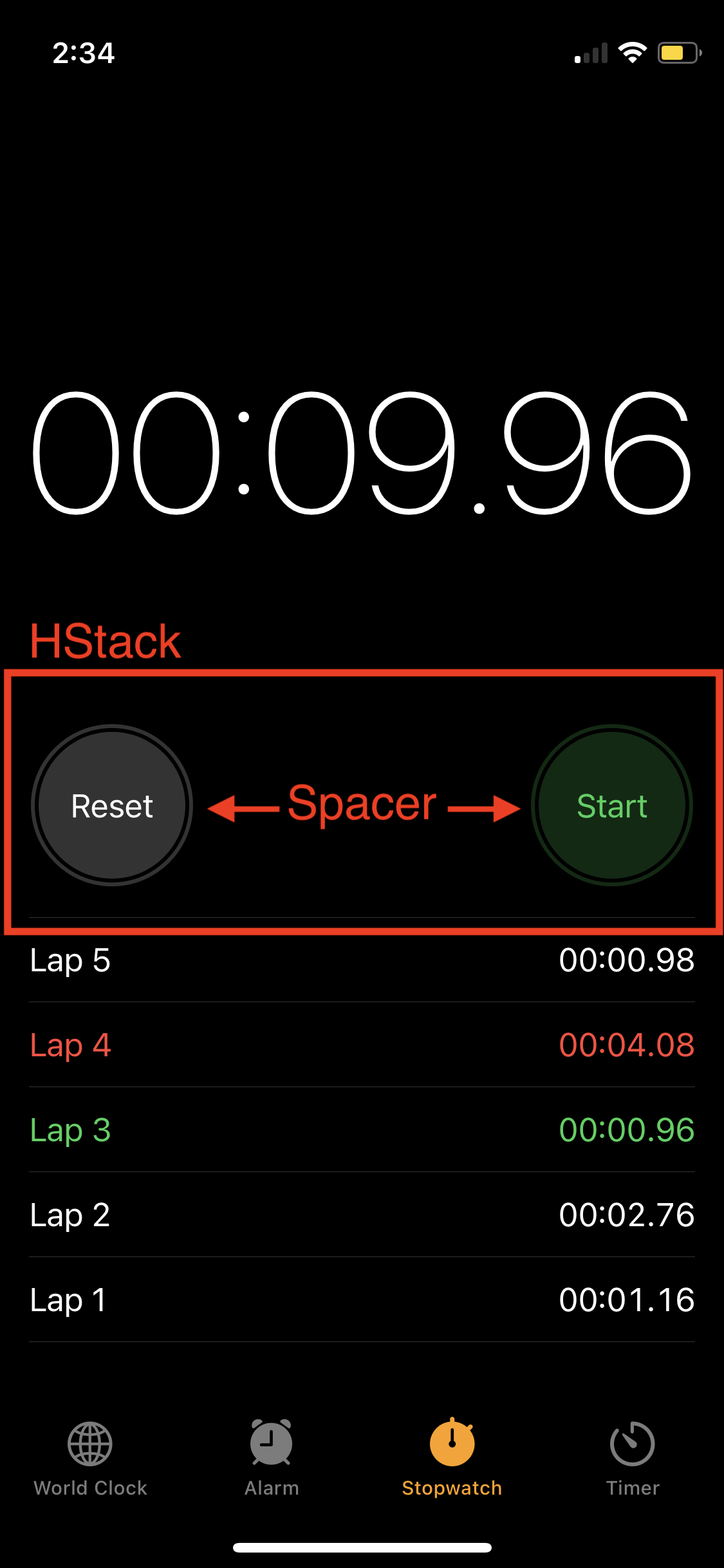
In the interface we are working toward, there are two buttons:
If we ignore the small dots between the buttons, you can hopefully imagine the following approach to layout out that part of the interface:
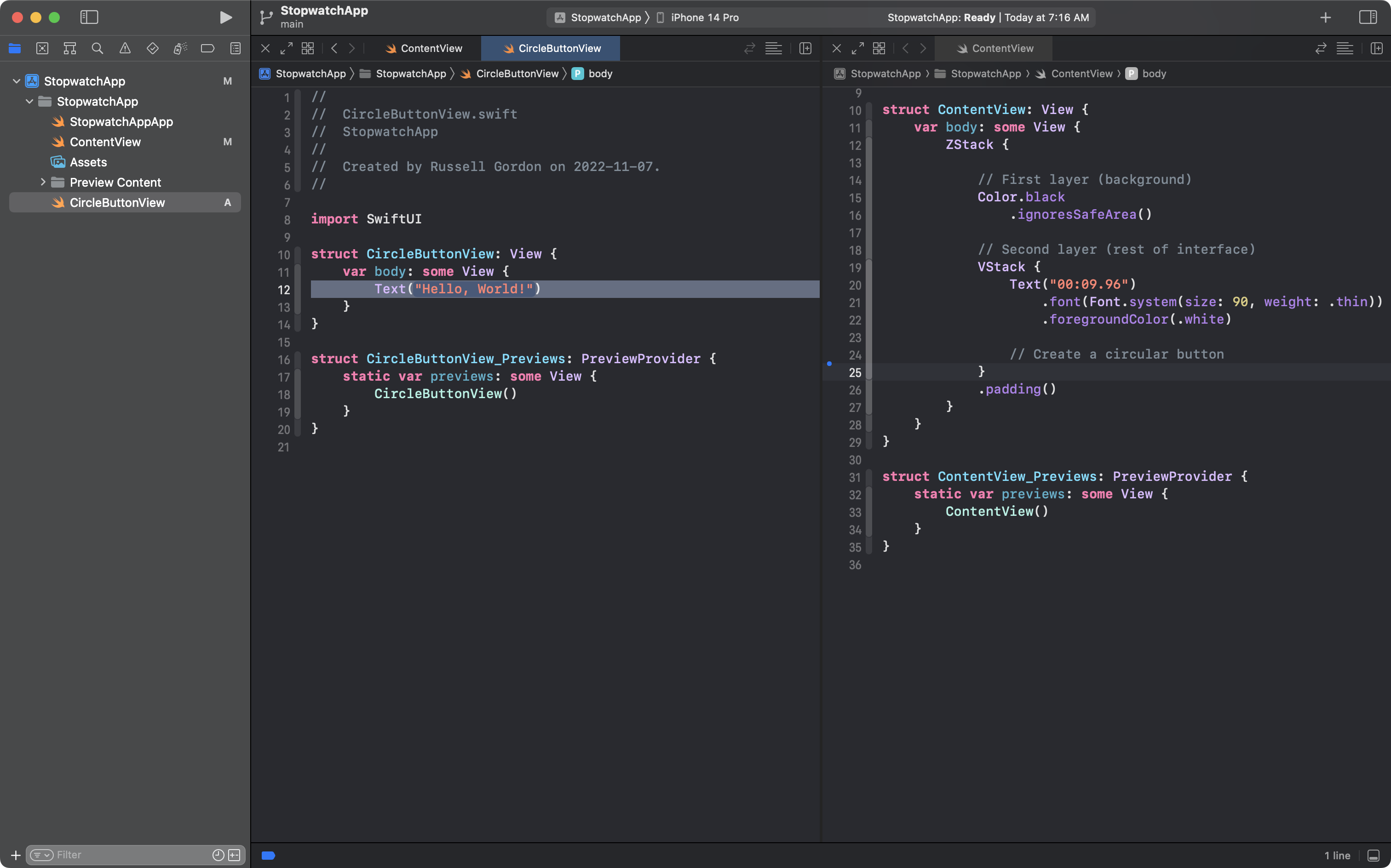
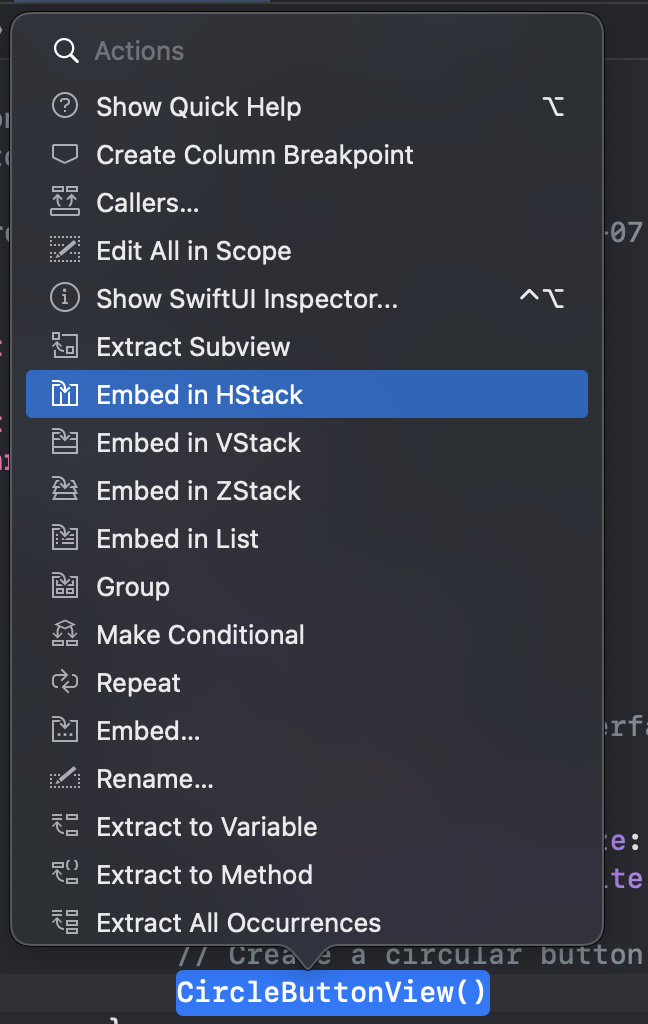
Setting this up in ContentView is pretty quick. Command-click CircleButtonView on line 25 and choose Embed in HStack:
This is the result:
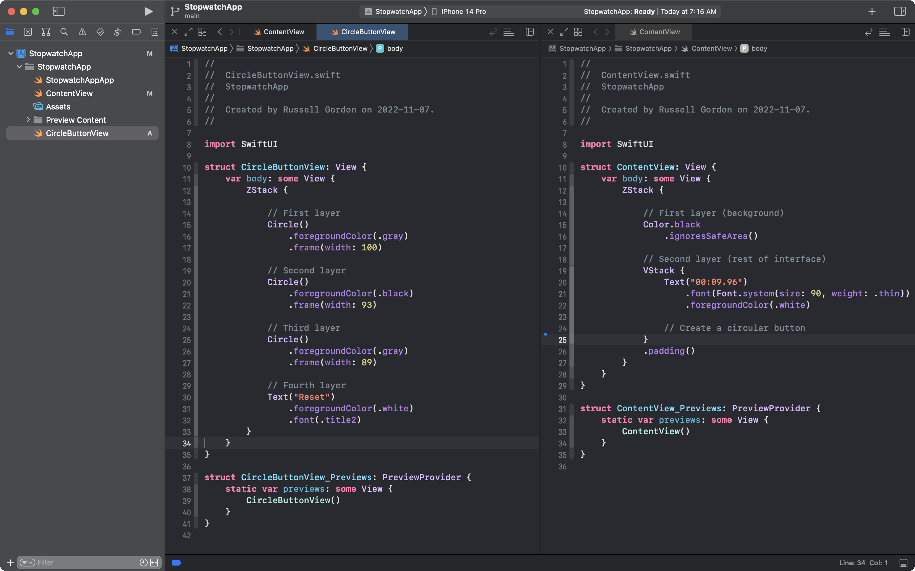
Then, as shown on lines 27 to 30, add a Spacer view and another instance of the button:
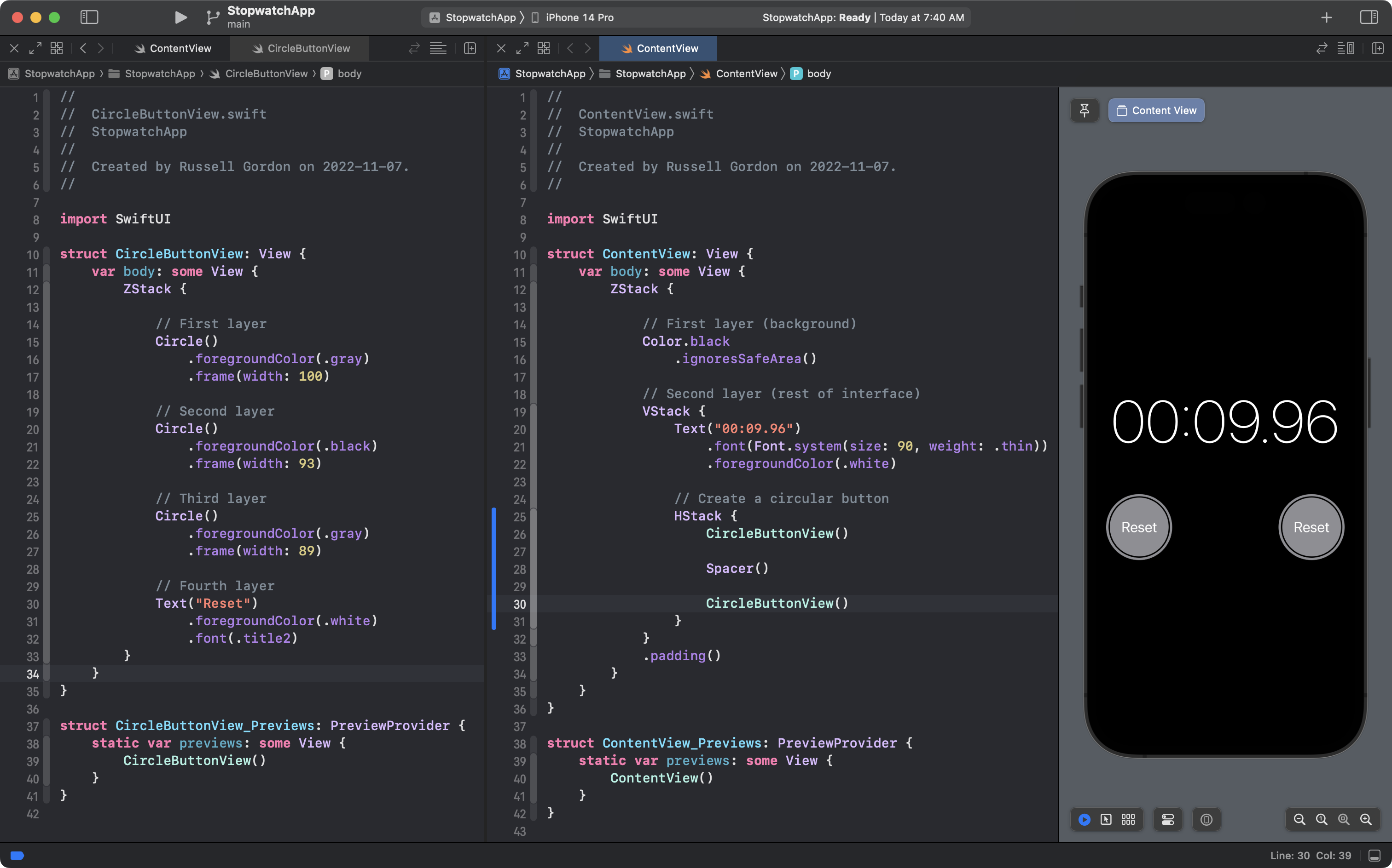
Progress!
Of course, we don’t want two instances of the same button.
We can make CircleButtonView more flexible.
To do this, we’ll add stored properties.
These will become questions (parameters) that must be answered (with arguments) when an instance of CircleButtonView is created.
By answering the questions differently (passing different arguments for the parameters) we can use the same structure, CircleButtonView, to create what appears to be two different buttons from the user’s point of view.
So what questions does CircleButtonView need to ask to do its job?
Look at what varies – is different – between the two buttons in our goal:
What varies is the:
- color of the button
- label for the button
- color of the label
So, add these stored properties to CircleButtonView along with the comments shown:
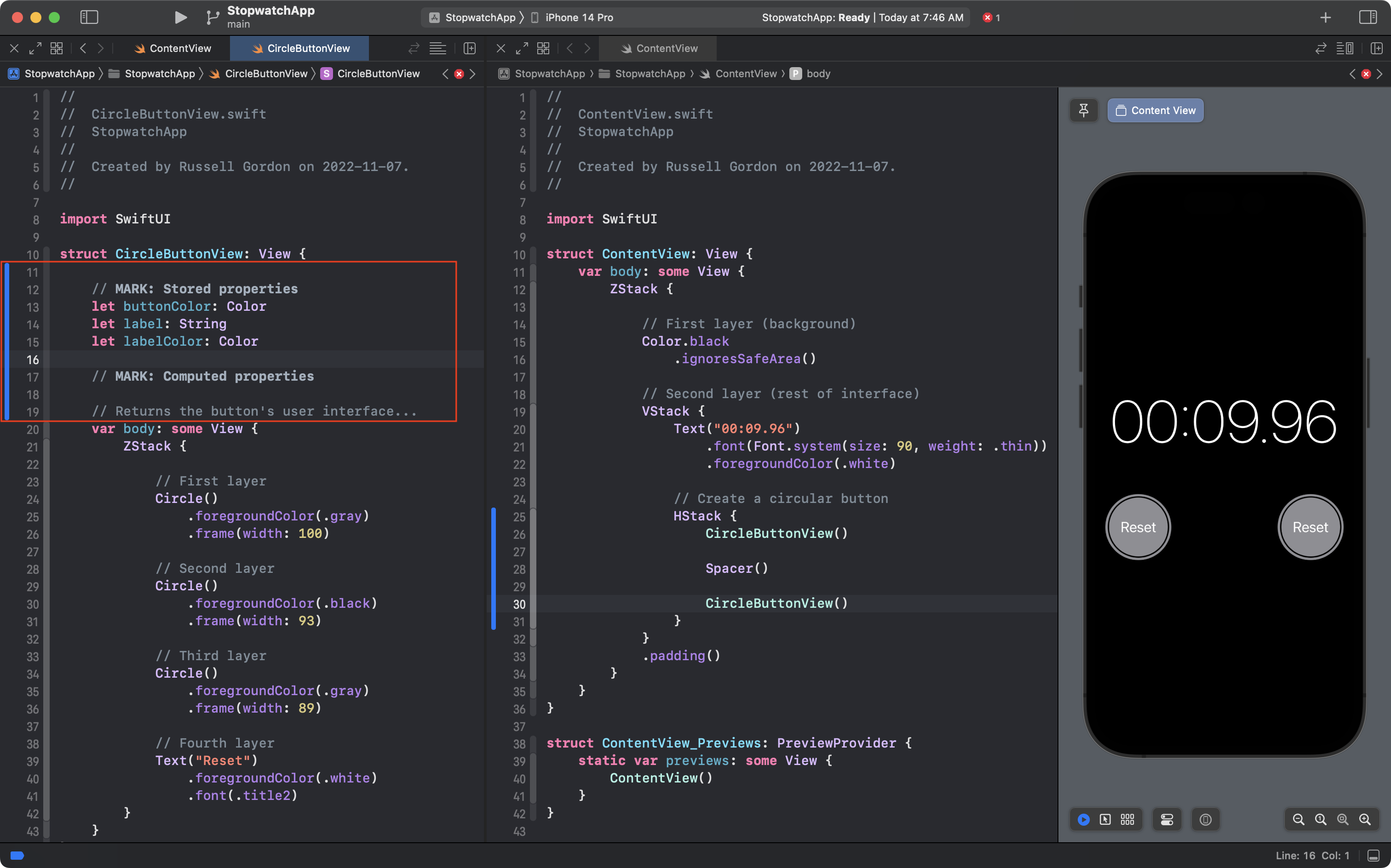
Now that we have added those stored properties, they must be populated with some information – that is why Xcode tells us that we are missing arguments in each location where an instance of CircleButtonView is created:
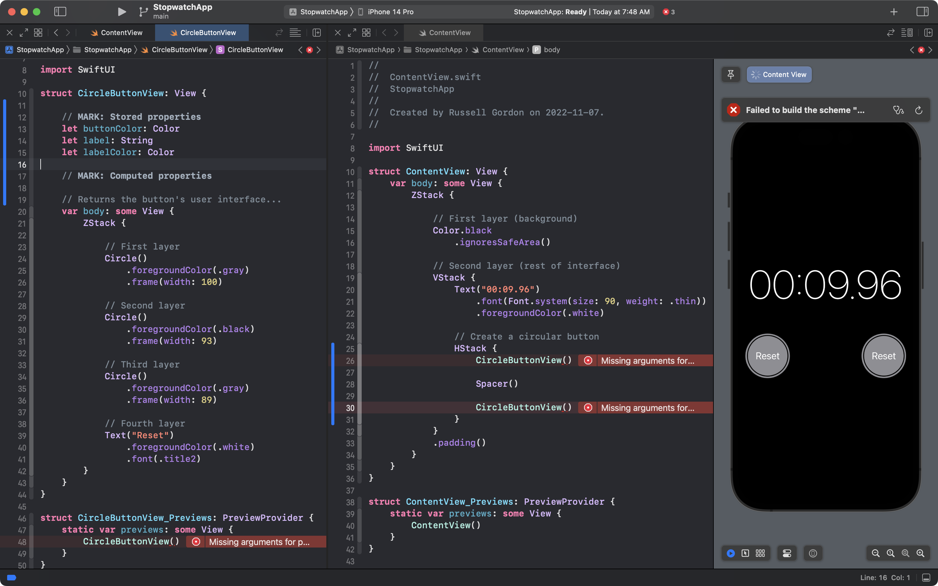
Go ahead now and add the missing arguments:
- at left in the preview structure for
CircleButtonView - at right in
ContentView
… as shown here:
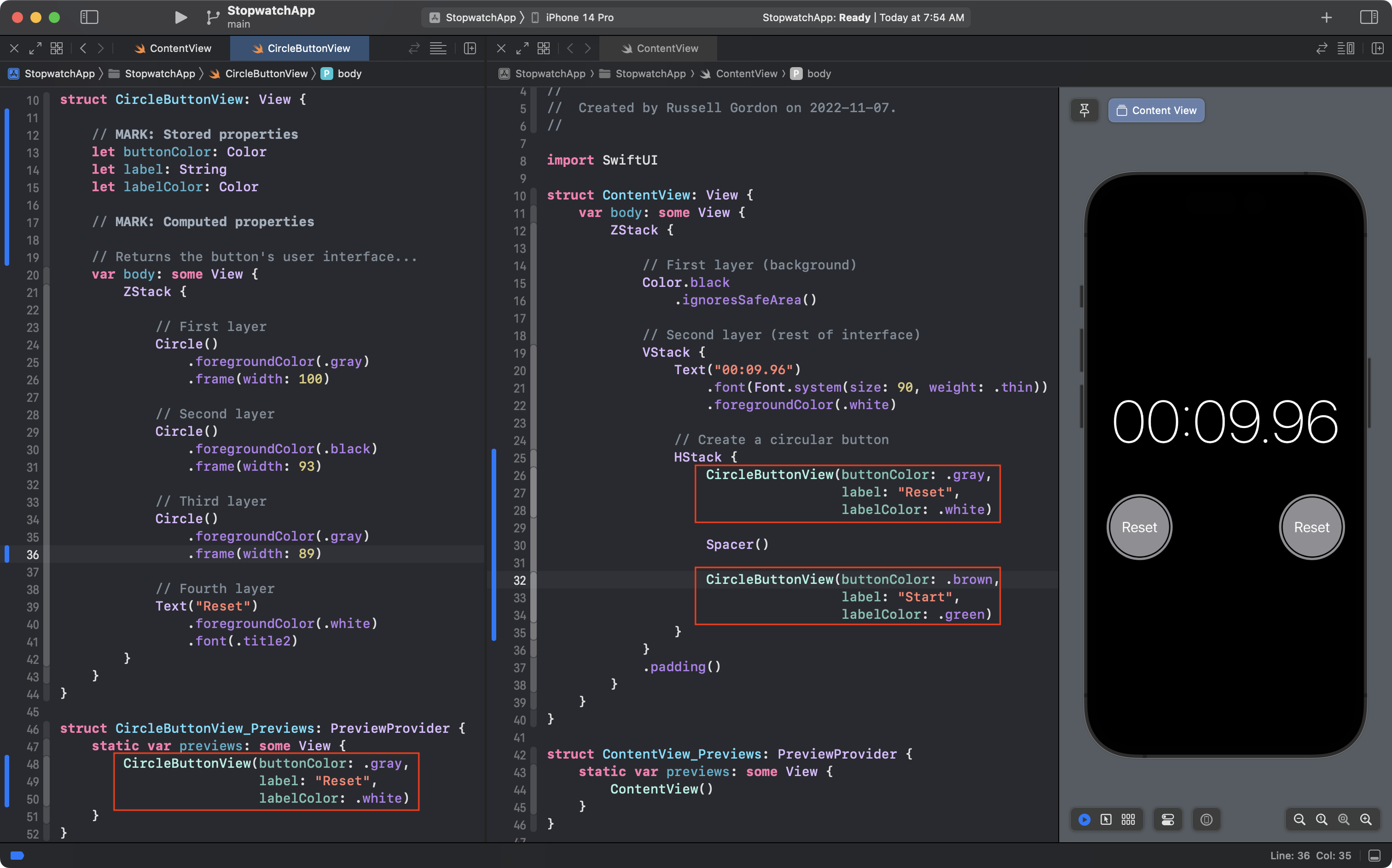
Note that we are now passing different arguments for the second instance of CircleButtonView – on lines 32 to 34 in ContentView.
You might be wondering – if we are passing different arguments – why do the buttons look the same? We still have two grey buttons labeled Reset!
Take a close look at the code for CircleButtonView.
body is the computed property that creates the button’s user interface.
Have we used the values of the stored properties:
buttonColorlabellabelColor
… anywhere within the body property?
We have not.
So, currently, the body property returns the same user interface, regardless of what arguments were supplied when an instance of CircleButtonView was created.
Make the edits marked by the red rectangle in this screenshot to correct the issue:
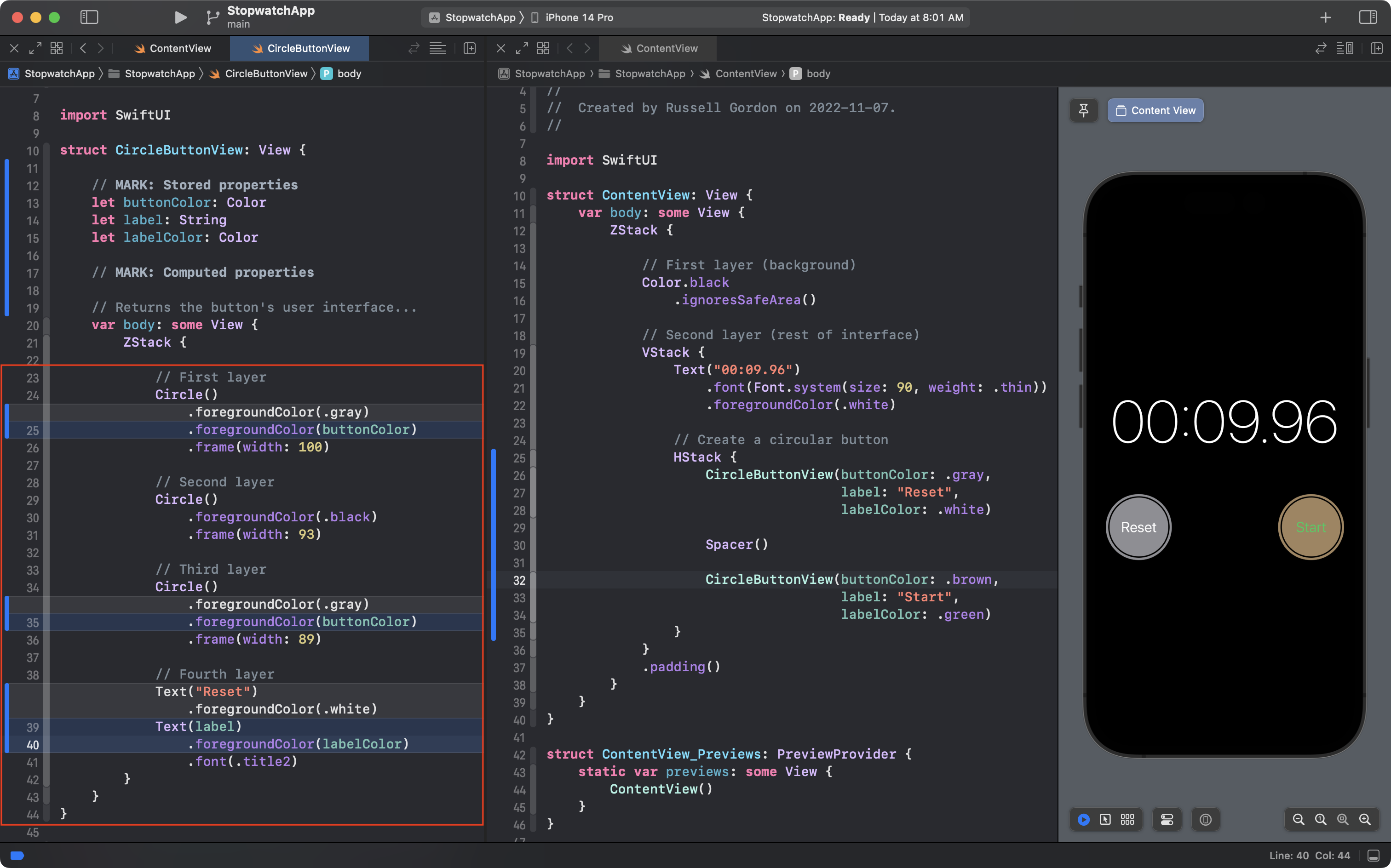
NOTE
In that screenshot, Show Changes was enabled, so the old code is highlighted in grey, and the new code is highlighted in blue.
Notice how where there used to be literal values, we are now using the stored properties, which will hold different values based on the arguments supplied when an instance of CircleButtonView is created.
As a result, we now see what appears to be two different buttons in the user interface:
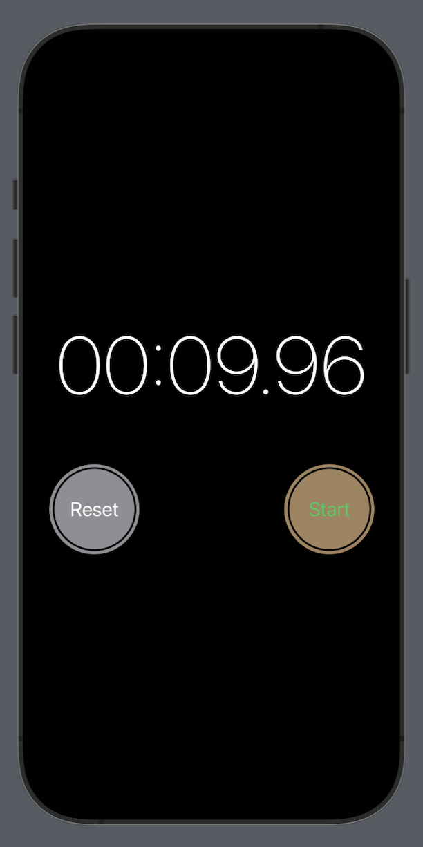
However, as the software developer, know that both buttons are created using the same helper structure – CircleButtonView.
This is an example of applying abstraction to make the overall length of code in our project shorter. 🎉
The alternative to using CircleButtonView as a helper structure would be to copy and paste the contents of the ZStack that creates the button – twice – within the body property of ContentView.
However, if we did that, we would be repeating a lot of code – which is not ideal.
We’ve made a lot of progress here that we don’t want to lose.
Commit and push your work with this message:
Added stored properties to CircleButtonView so we can use it to show multiple buttons. We do this by providing different arguments for the parameters when an instance of CircleButtonView is created.
TIP
Now continue with part 2 of this lesson.